bitte ein bit
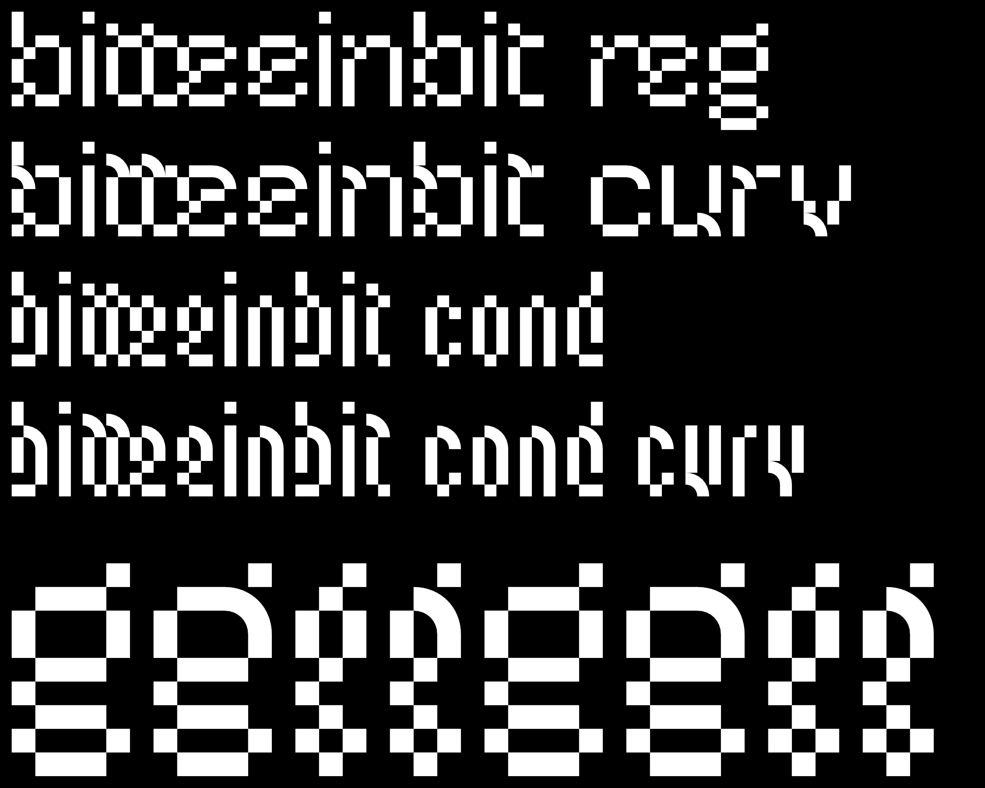
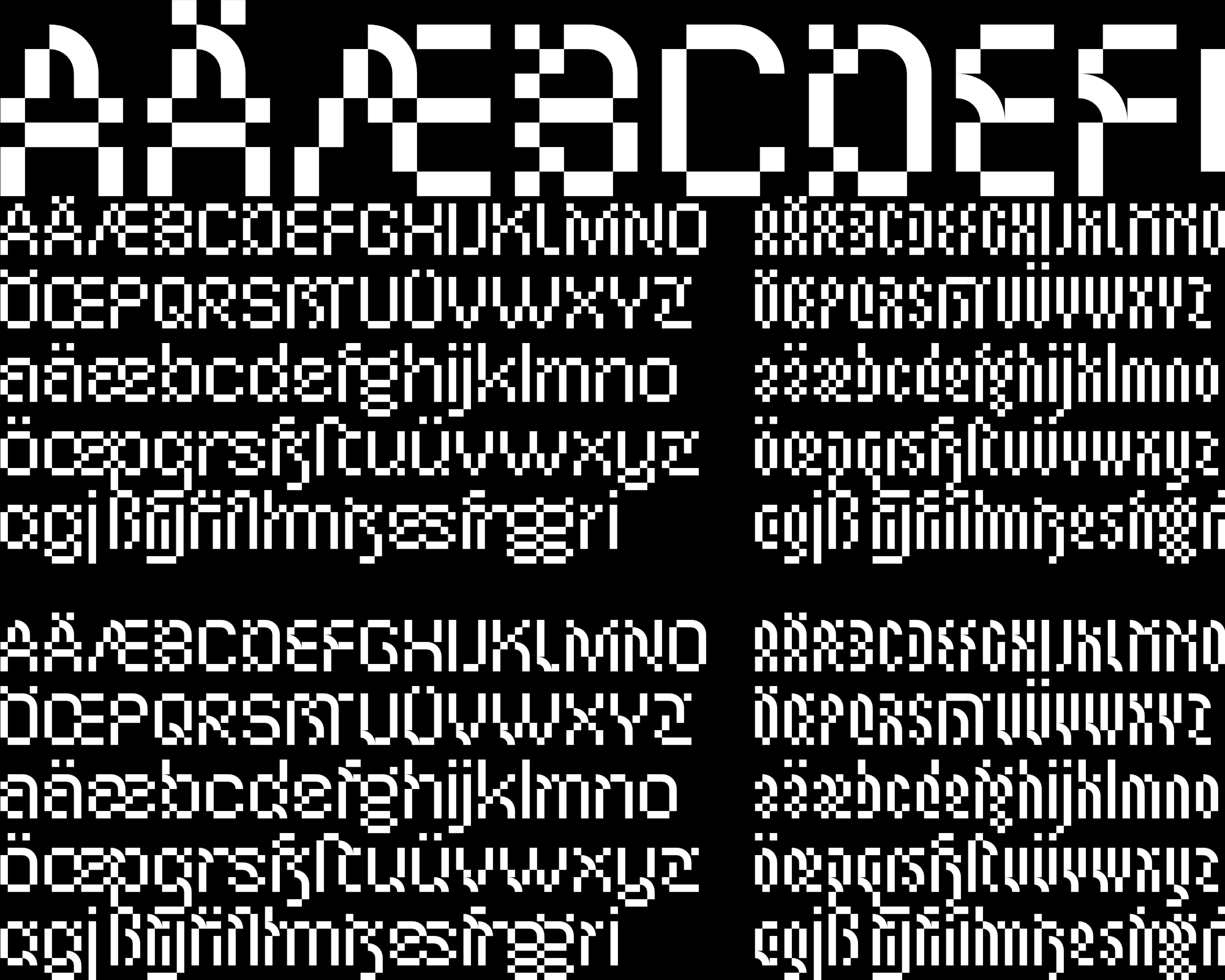
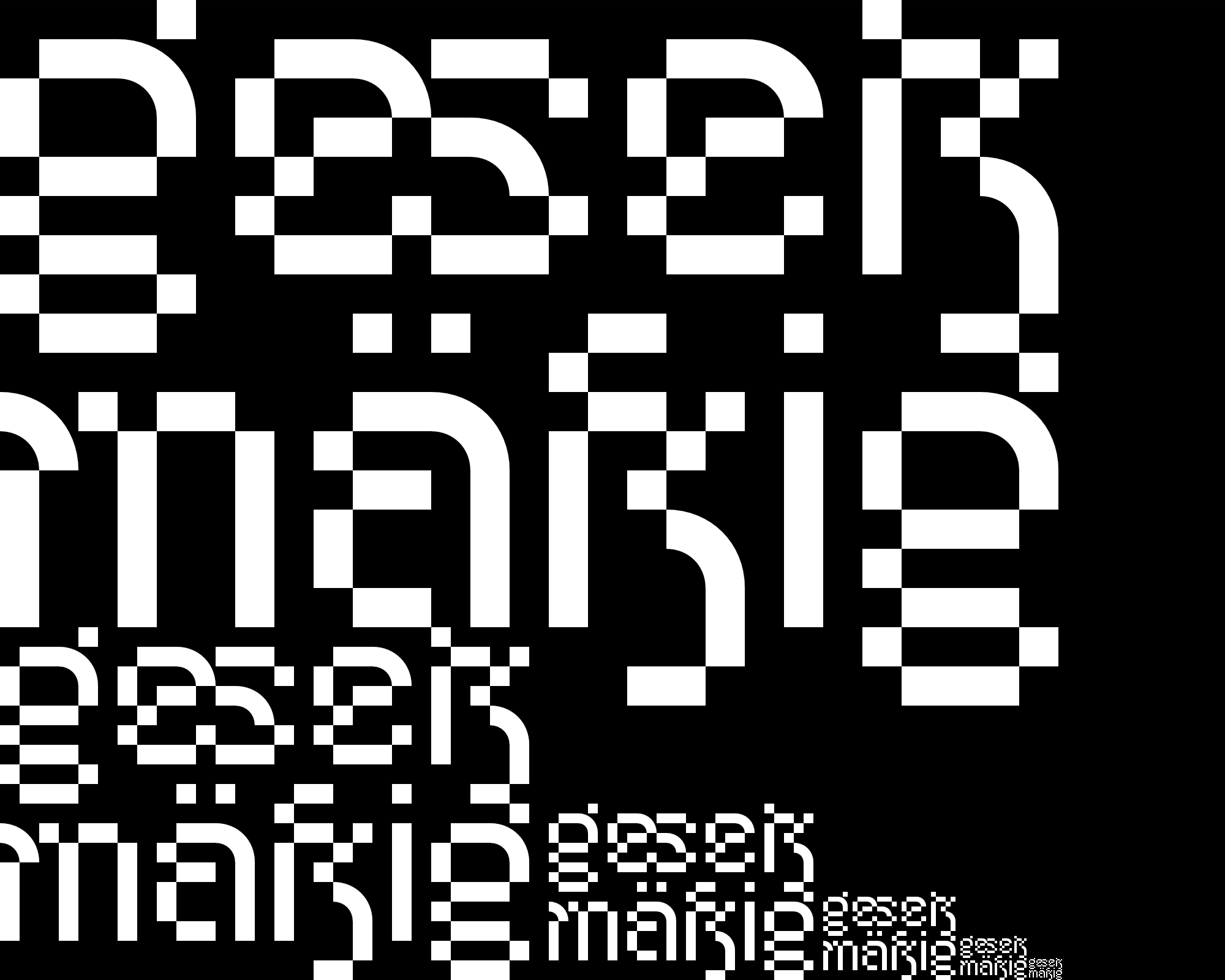
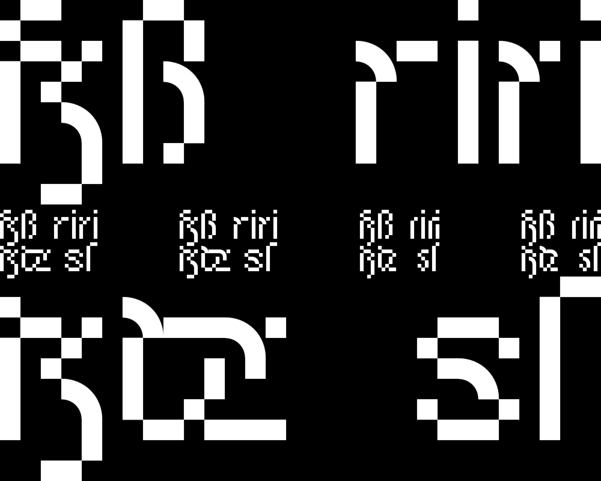
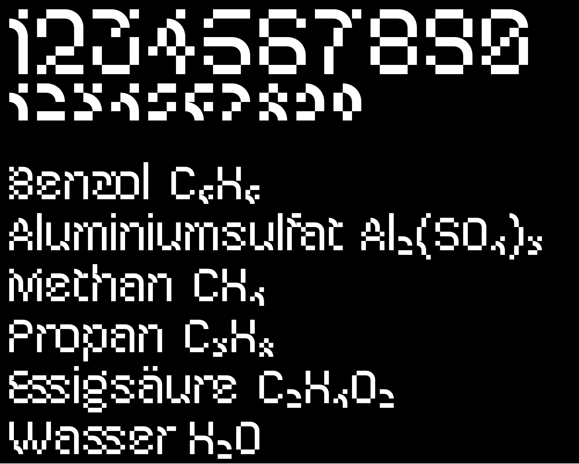
a futuristic pixel font with letters and ligatures (some based on blackletter), in 2 widths (reg and curv), each with the variant curv,
which also contains curve elements.
in order for these elements to have space, there are never
three pixels that border each other.
themes: fonts&lettering
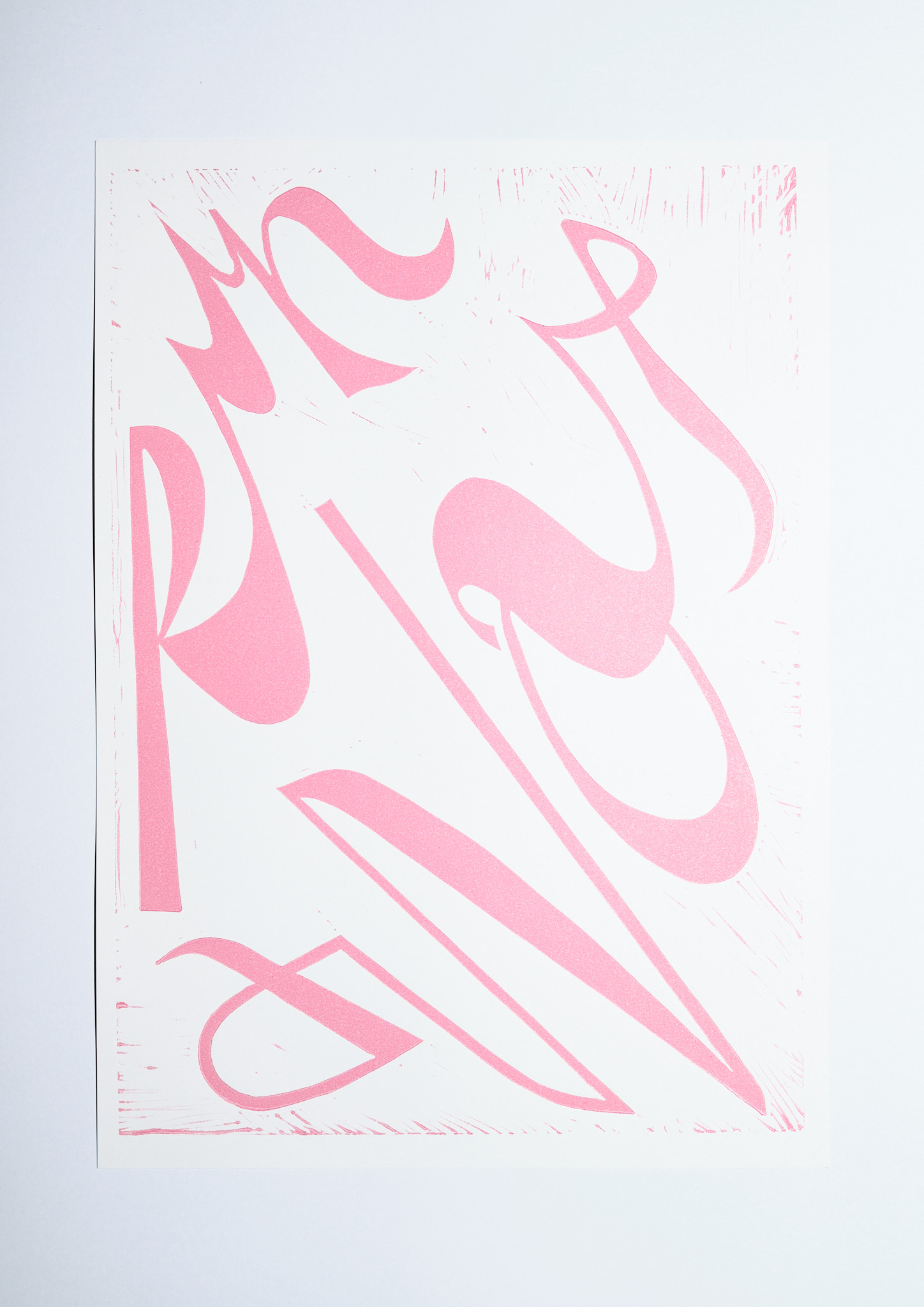
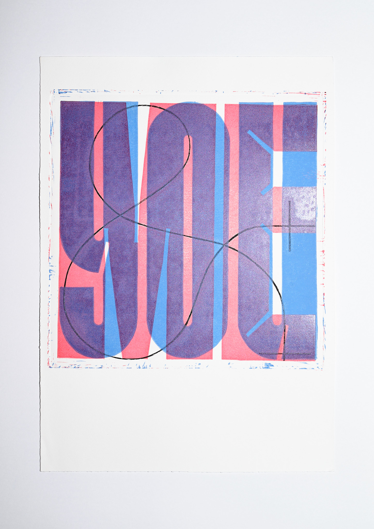
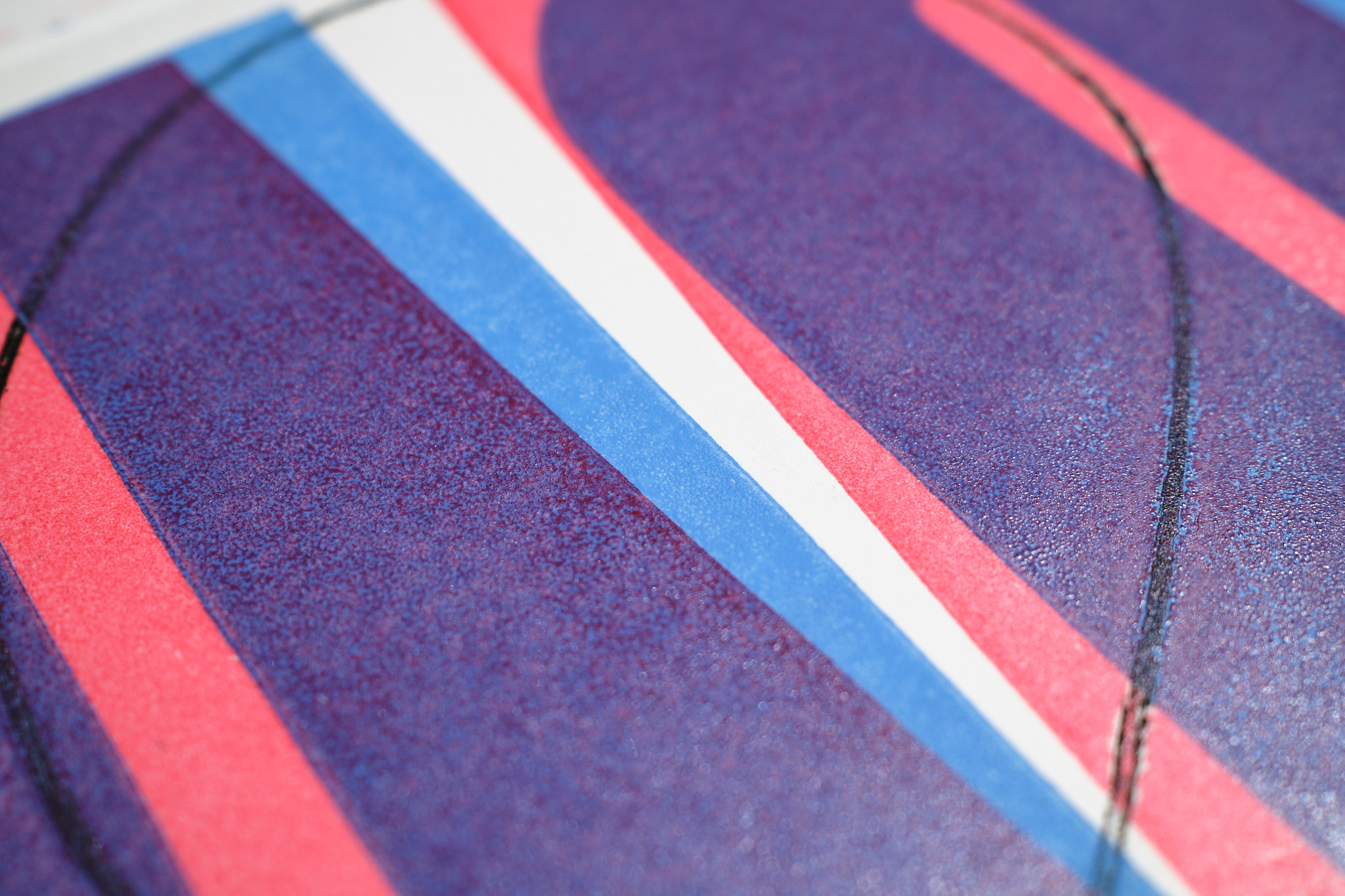
type prints
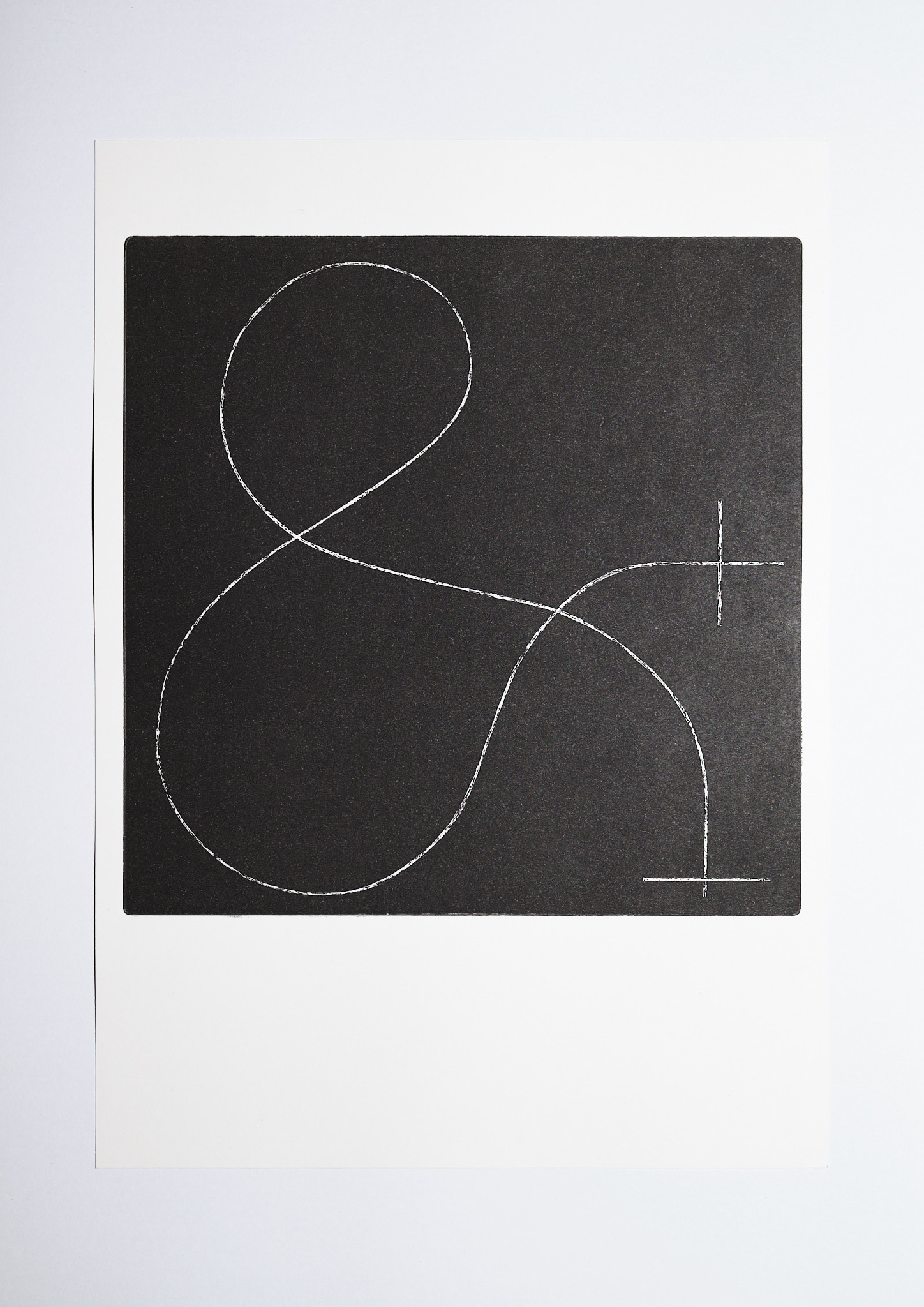
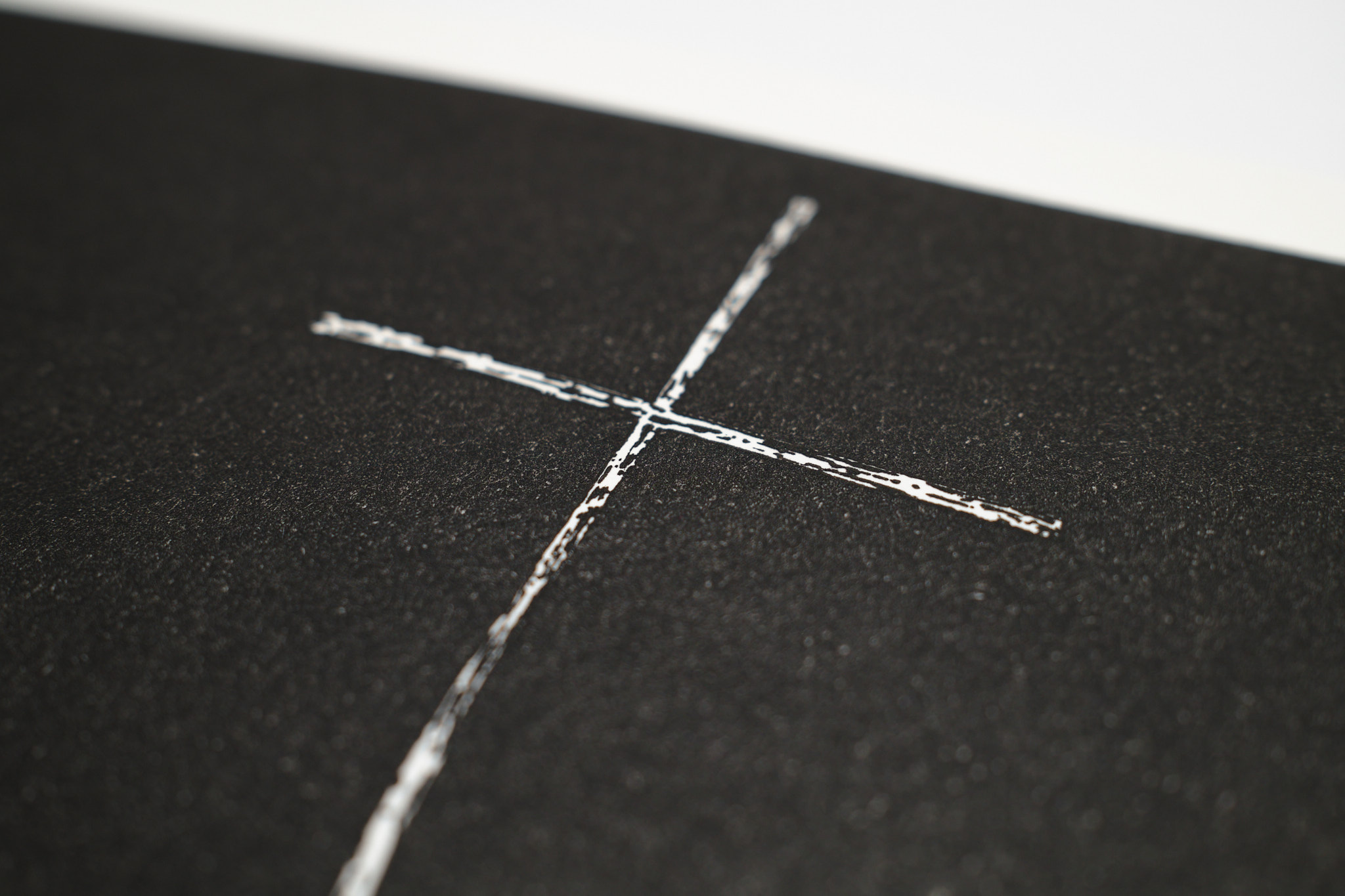
a series of handmade typographic linocut and aquatint copper plate prints, made at die graphische design school.
contact me to purchase.
themes: fonts&lettering, print

oct
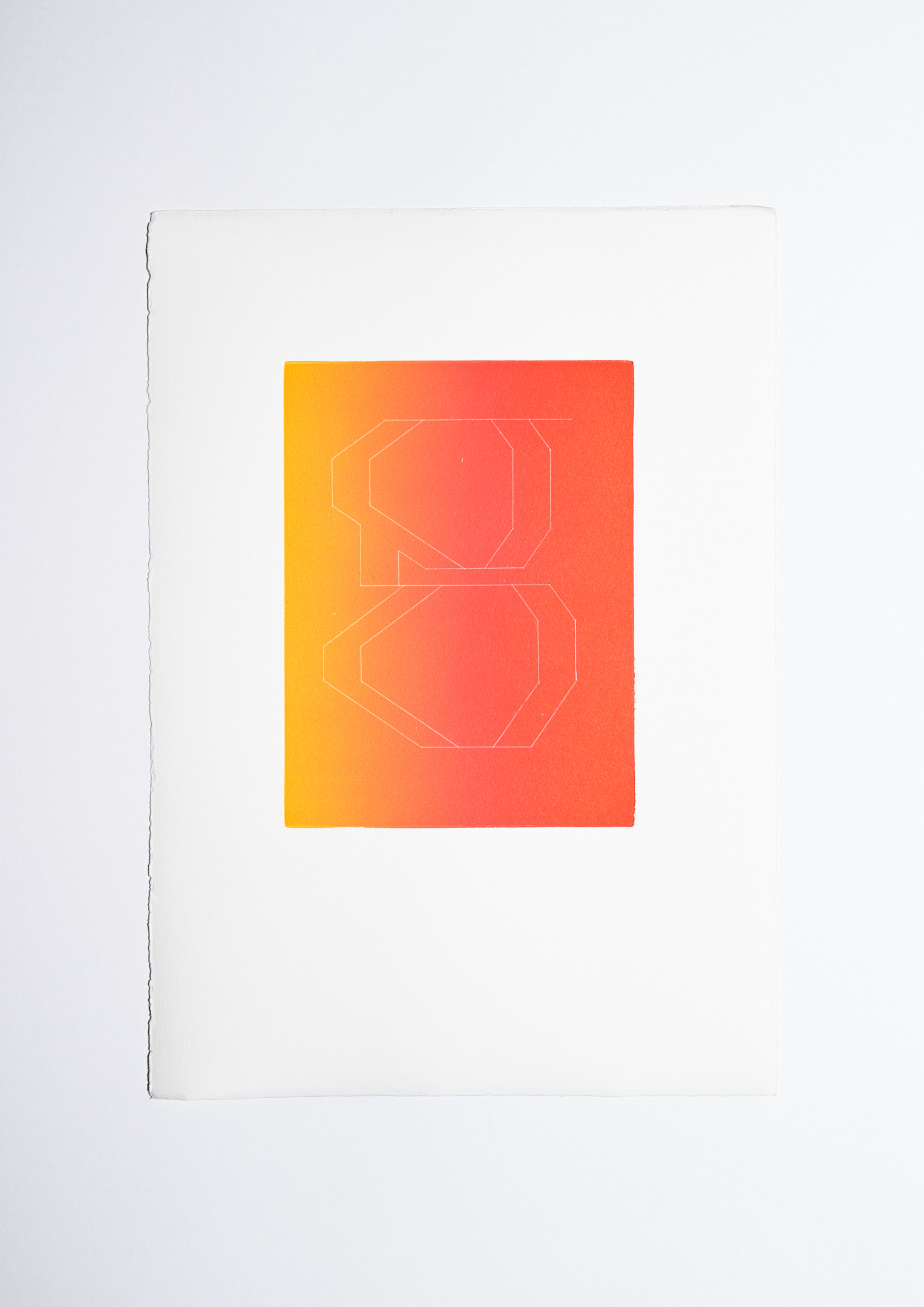
an octagonal didone font, based on a typecooker.com prompt


oct was based on a series of aquatint copper plate prints.
contact me to purchase.
themes: fonts&lettering

teesdorf snapchat geofilter
custom snapchat geofilter for teesdorf, photo is my portrait of hotbabemusic

themes: fonts&lettering
