hello! my name is jakob sohm.
i am a graphic designer and photographer working and living in vienna.
swipe left to see my work or click to read more about me.
contact me:
hallo@jakobsohm.at
+43 699 13183688

mxr
work from my employment as intern at the advertisement production company mxr. in this time i did vfx, motion graphics, video editing, sound design, and on-set production assistance.


themes: animation, motion design, vienna
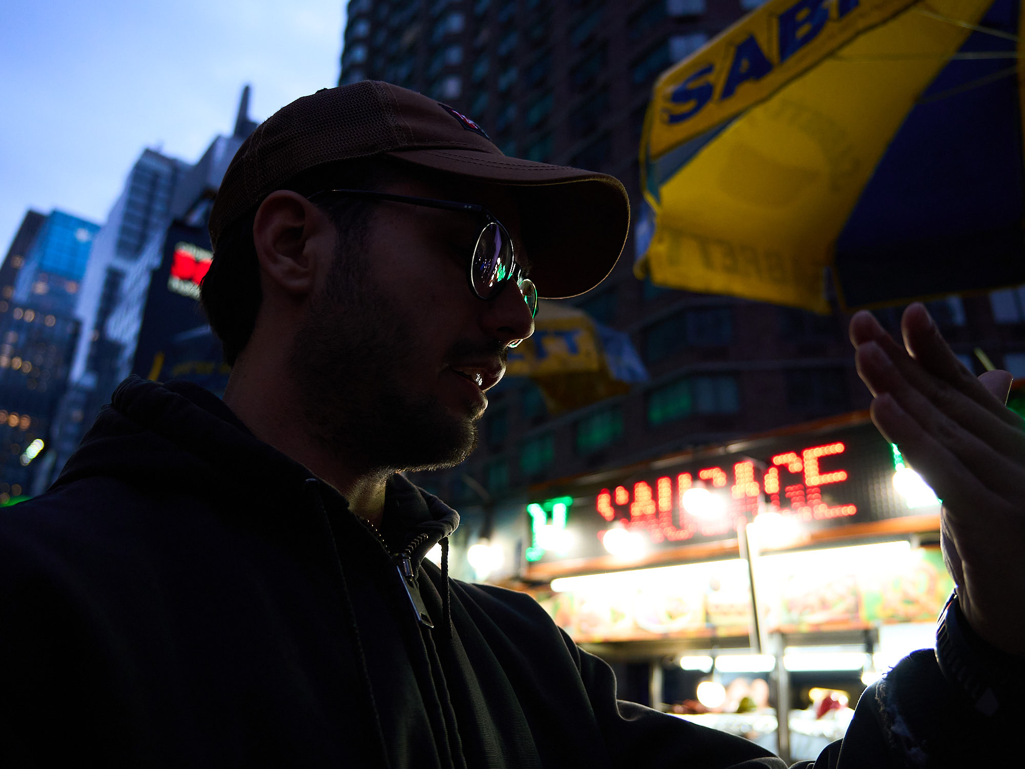
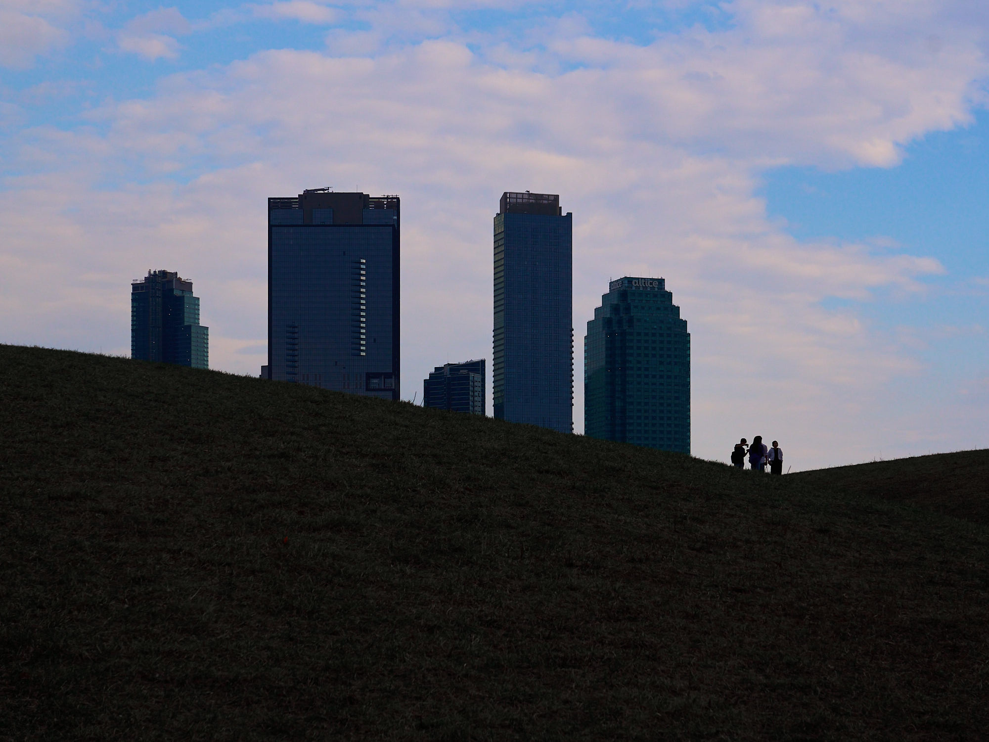
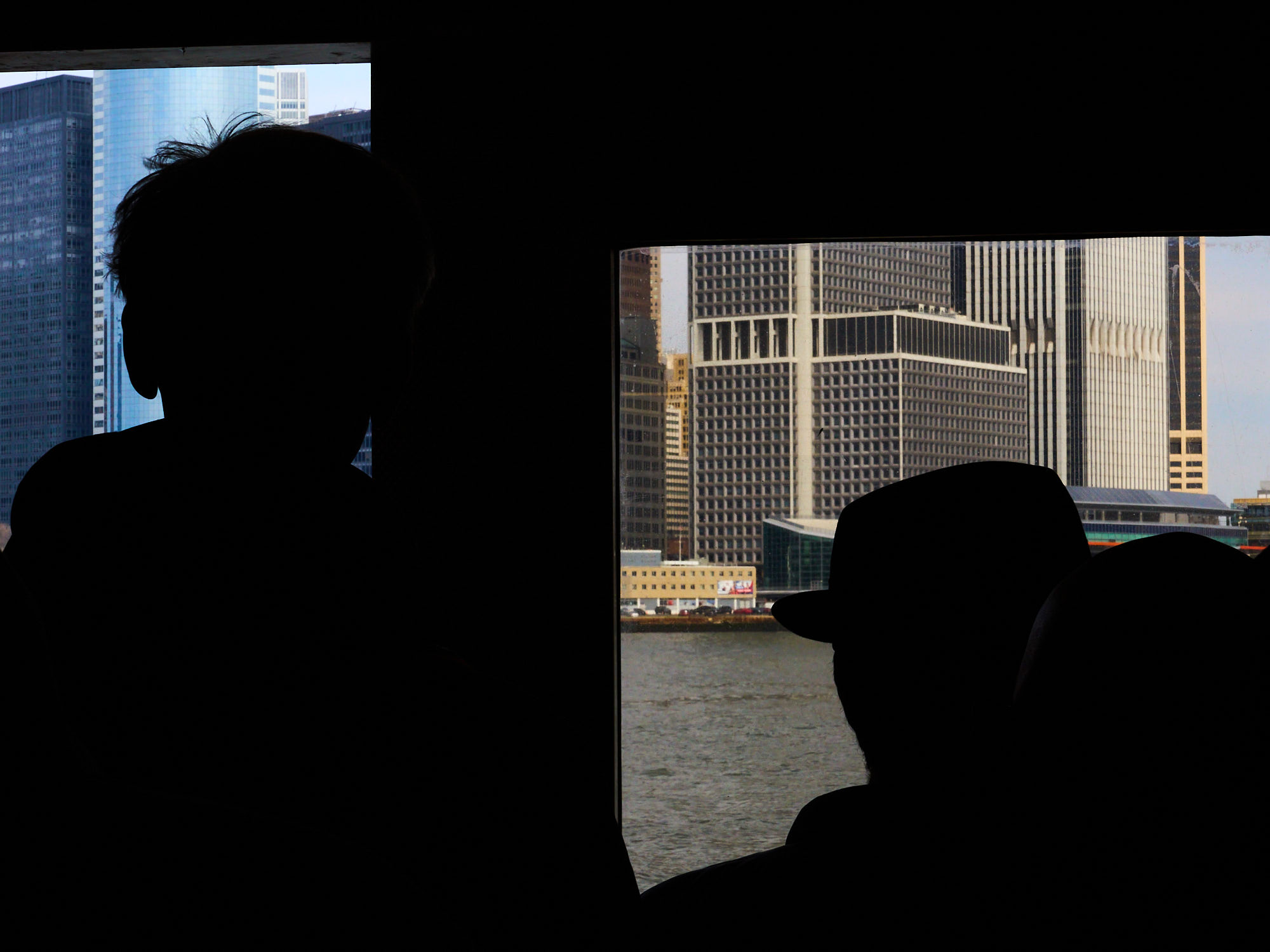
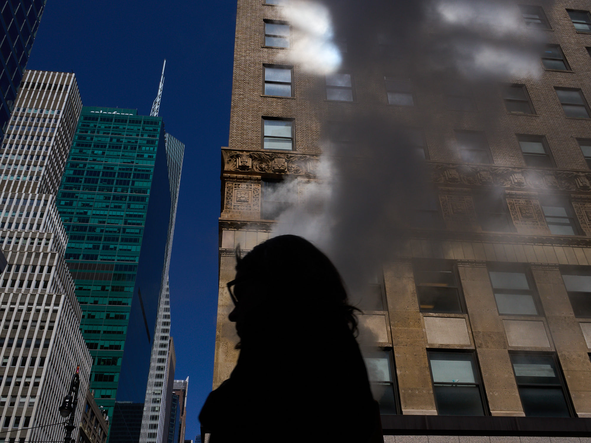
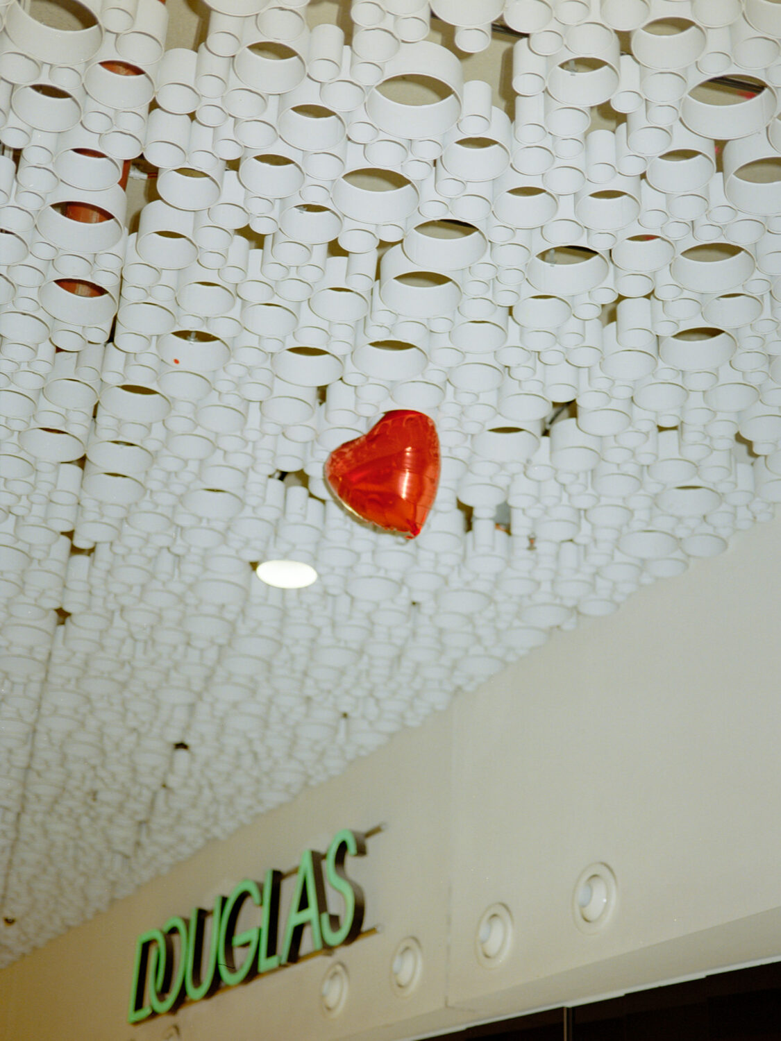
in the belly of the beast – nyc
my family and i met my brother paul in new york city to see him perform at the calarts east coast showcase. i made a lil travel video and took a lot of photos.
the experience was bizarre, as i had this strange feeling that i had already been there. i recognized places and streets, feeling like i had seen them before. because i had. i had seen them in films, videos, photos, and other media. clearly, because of the long standing cultural (propaganda) dominance of the u.s. empire.
walking through the streets of the city, my heart was broken again and again. on every corner of every street, a human with no place to go, living with no roof over their heads. a person whose ‘american dream’ had been crushed by the realities of a completely desolidarised society. the end stage of capitalism.

graduation exhibition documentation for paul mittnik
paul mittnik is an artist with a background in fashion design. he studied in the field “art and space” at the academy of fine arts vienna, and hired me to document his final exhibition there. paul’s works are often described as wearable sculptures, and often have autobiographical aspects. that’s why i documented the exhibition space as he had arranged it, but also had him wear some of the pieces in portraits.
paul’s instagram: instagram.com/paulmittnik
the photos and text about the exhibition in the bildende archive: abschlussarbeiten.akbild.ac.at (search for mittnik)
interview with paul: les-nouveaux-riches.com/zwischen-skulptur-und-mode


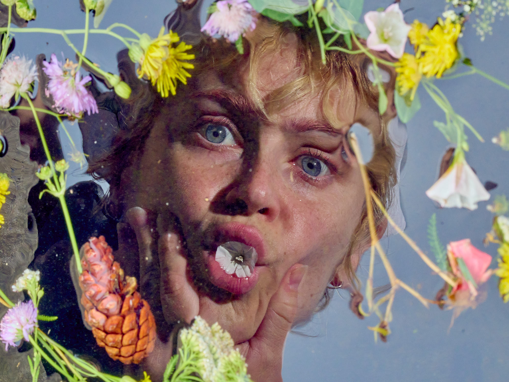
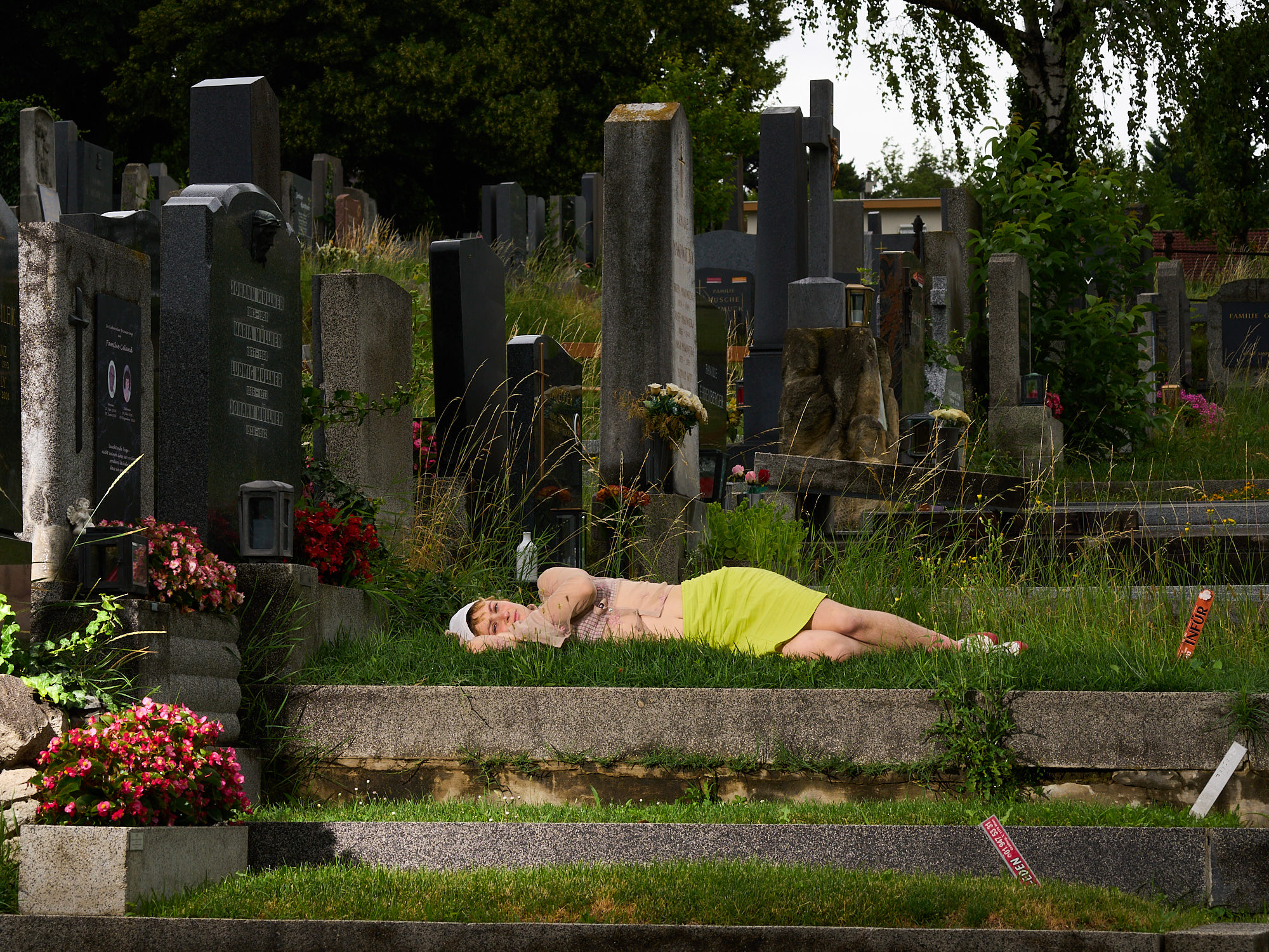
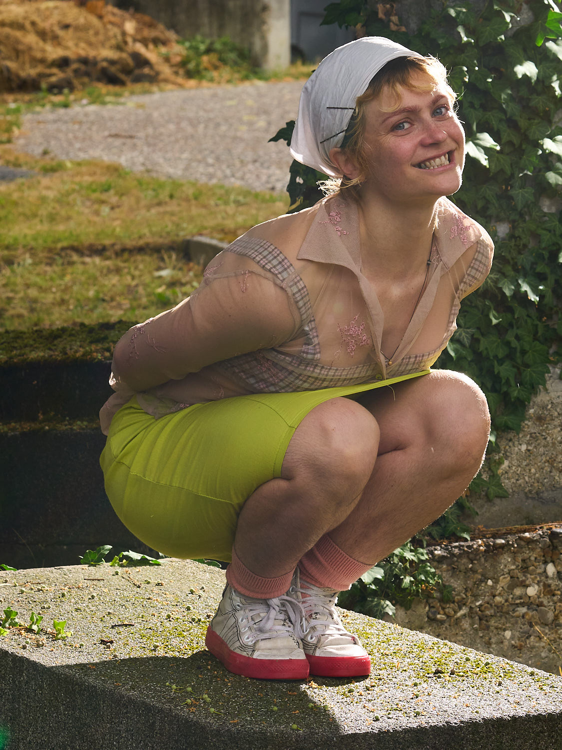
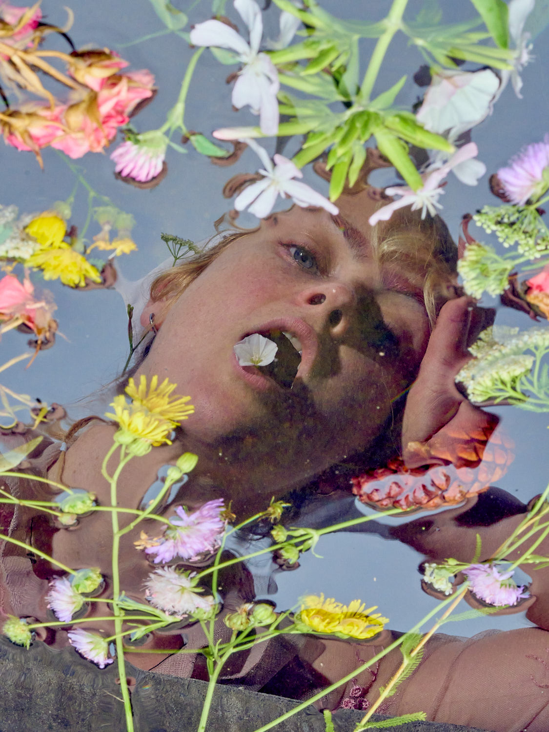
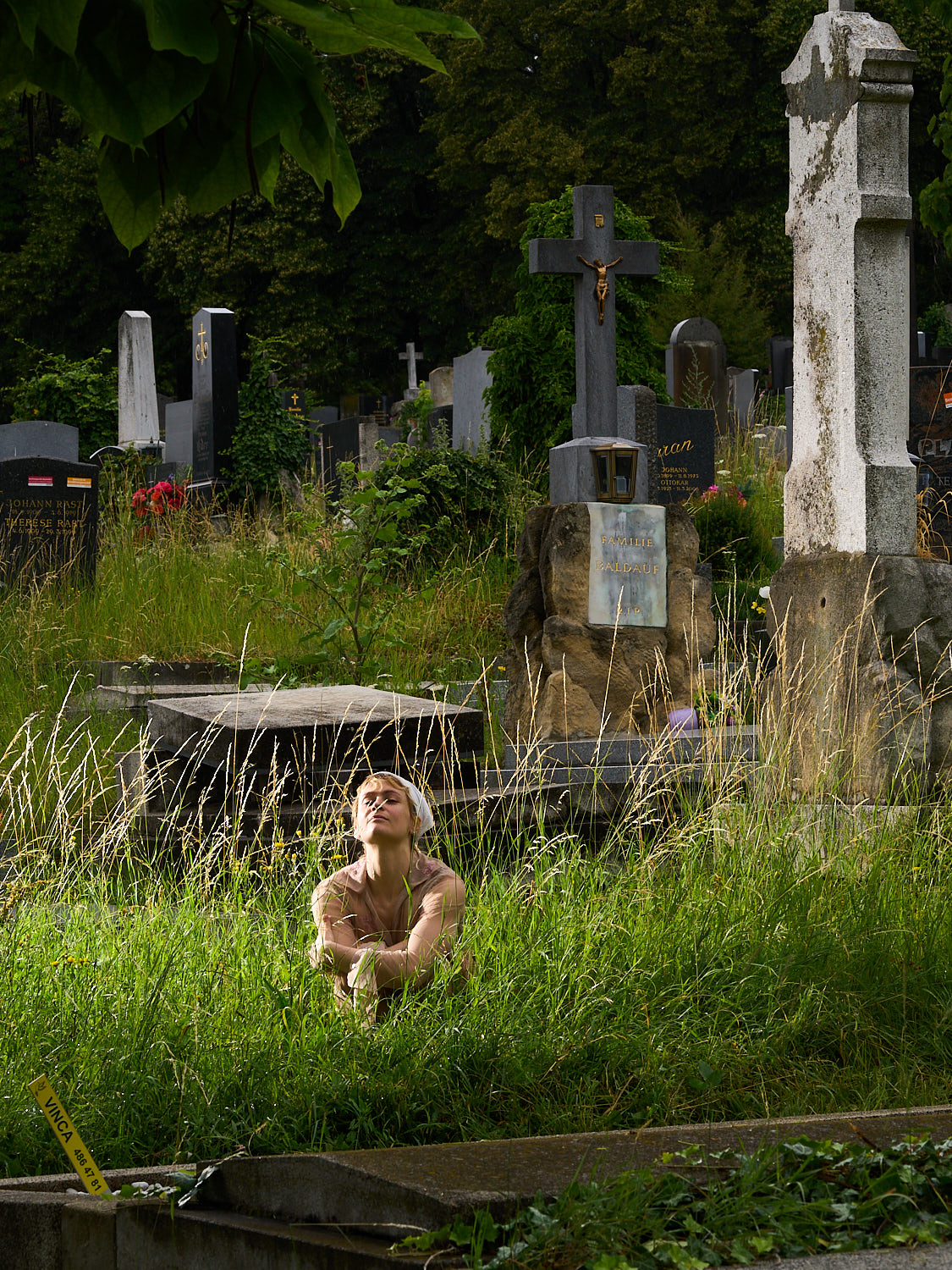
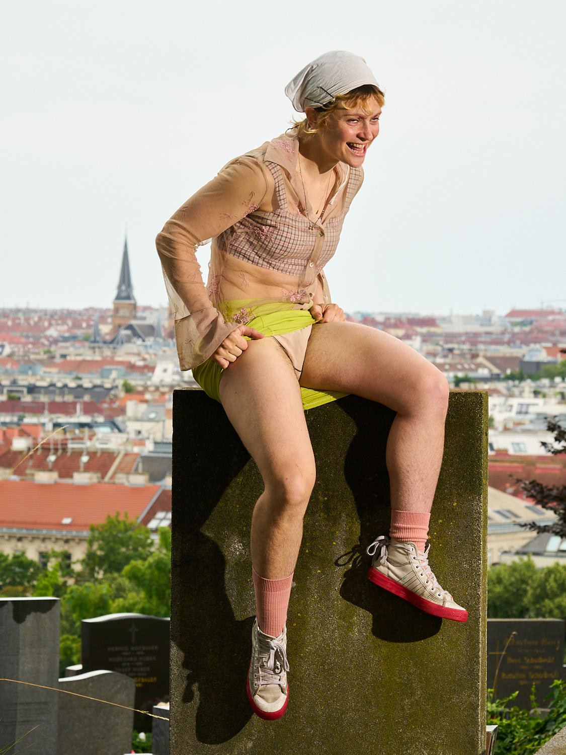
portraits for rebecca lynn sprague
rebecca makes dark, melancholic, beautiful singer-songwriter-type music. she asked me to take portraits of her, but wanted them to reflect her quirky, giddy, fun personality to contrast the heaviness of her music.
she told me that she practically grew up in cemeteries because her mother is a stonemason. that’s why we made most of the portraits at the hietzing cemetery.
see her paintings and listen to her music here: rebeccalynnsprague.com
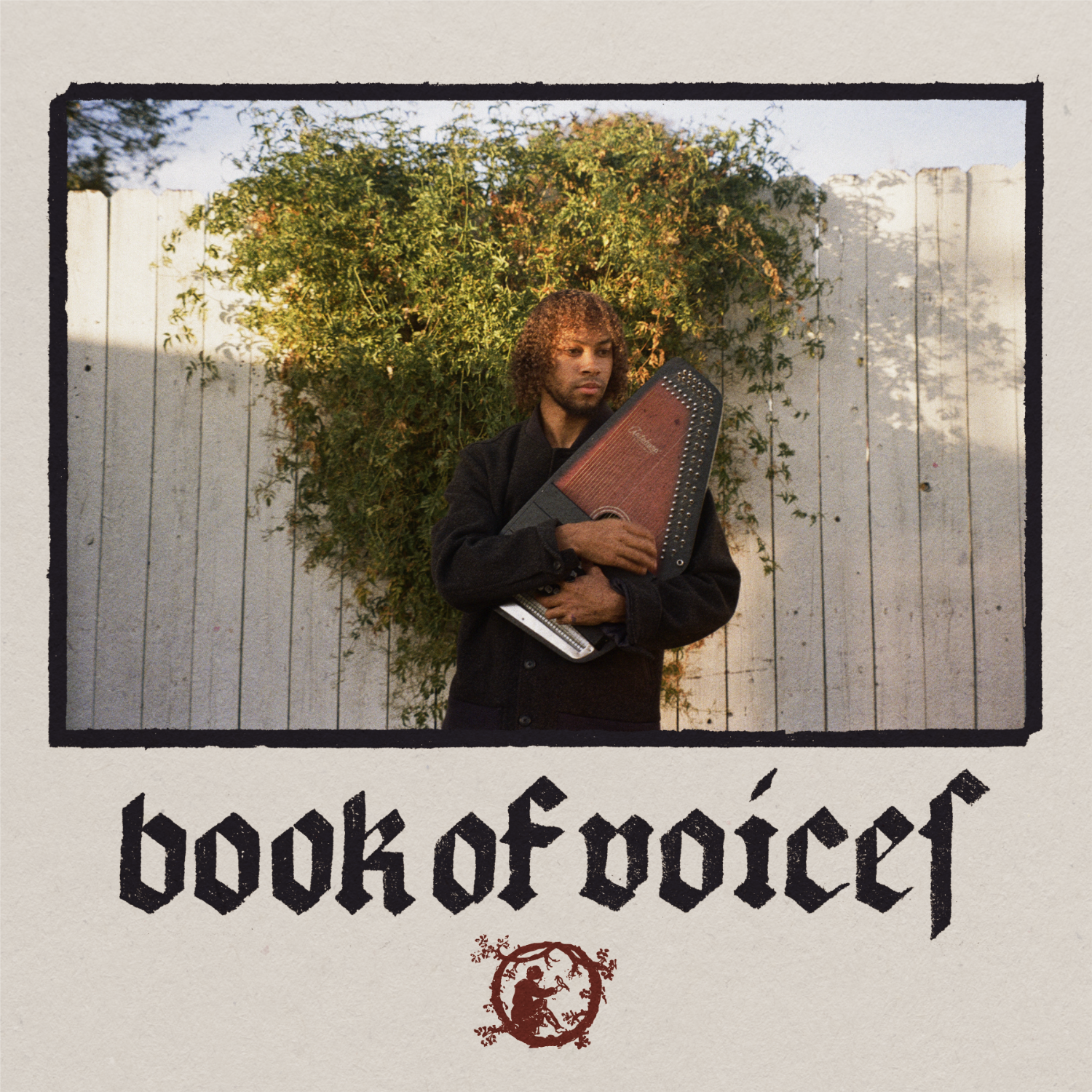
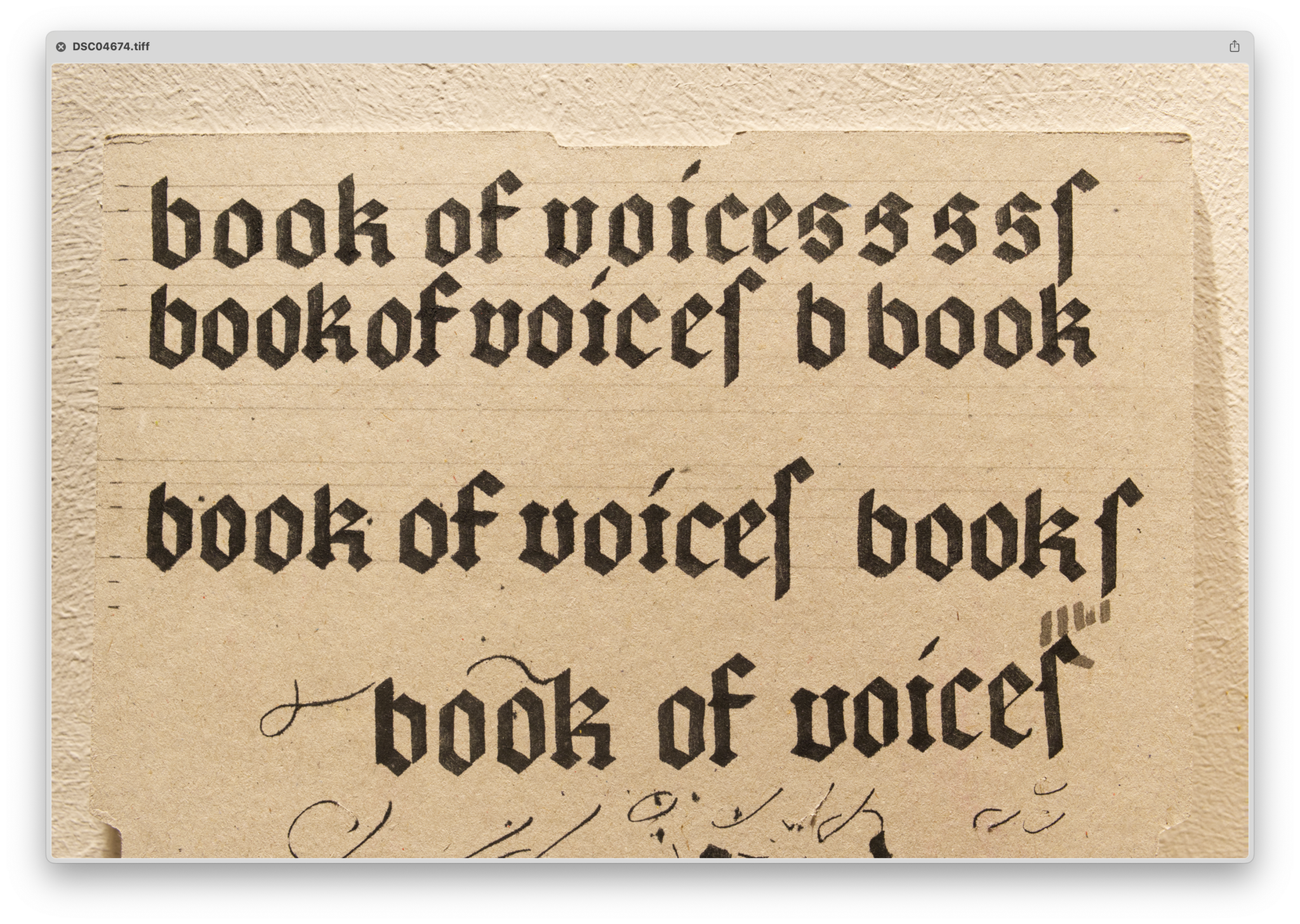
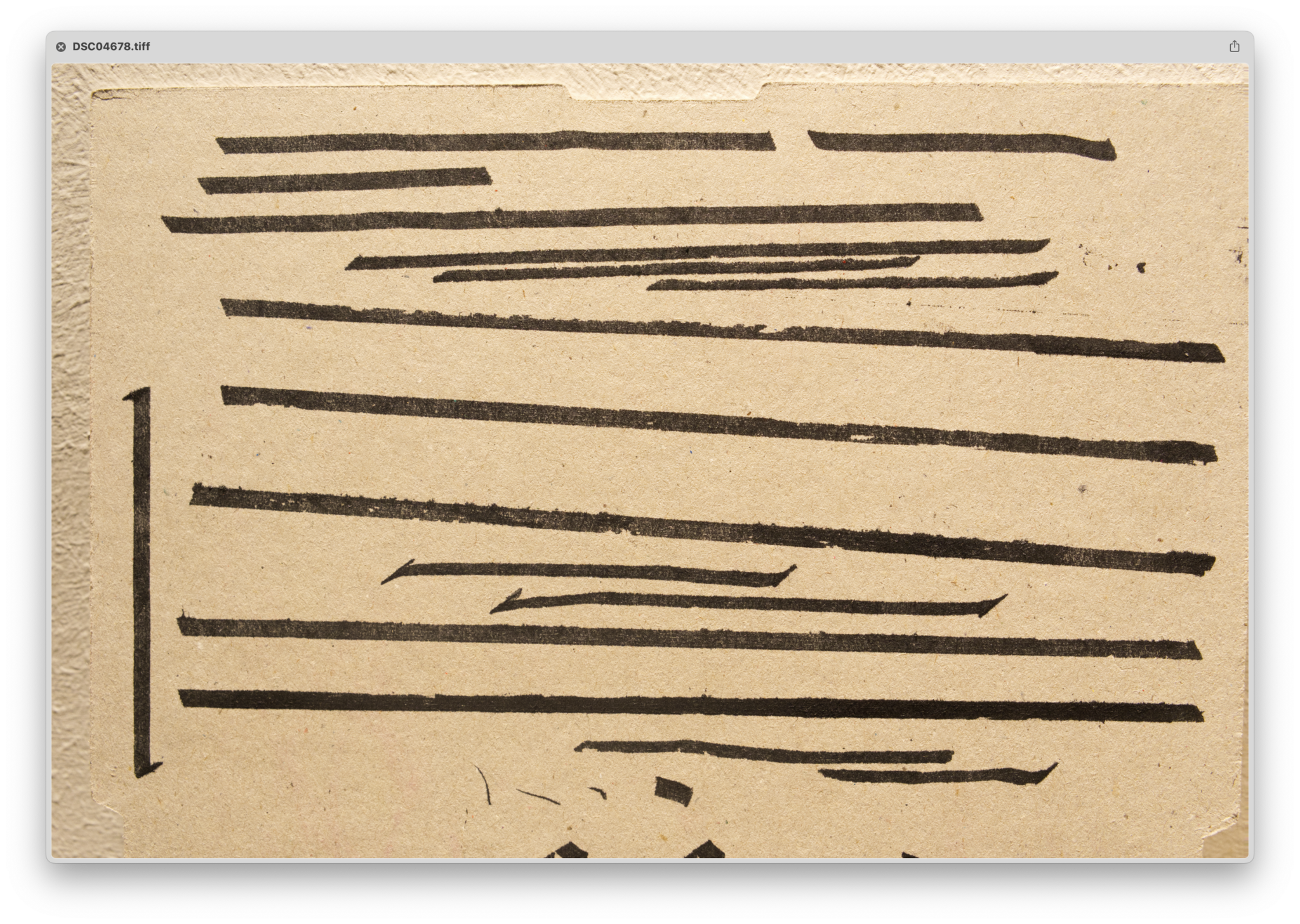
book of voices album cover
album cover for the self-titled ep. book of voices is a side project of muco, where he plays medieval songs in old and middle english. that’s why i decided to unpack my calligraphy skills and write the title in an appropriate blackletter style.
themes: fonts&lettering, muco, music
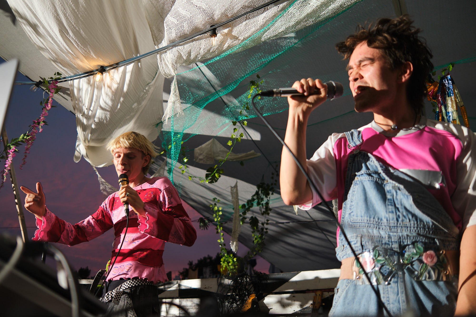
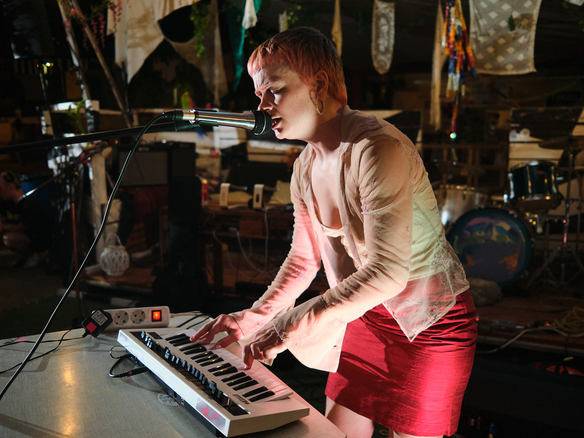
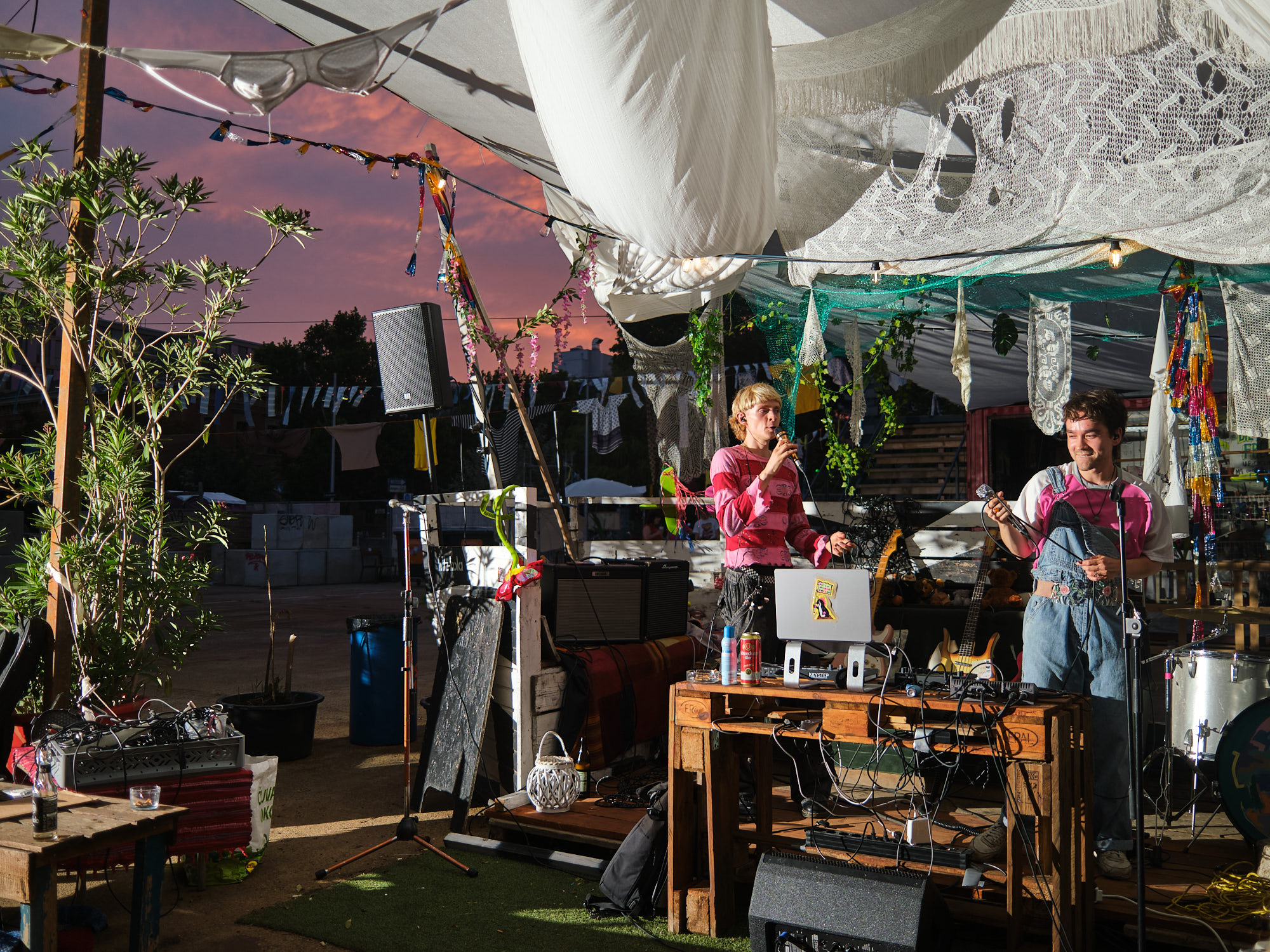
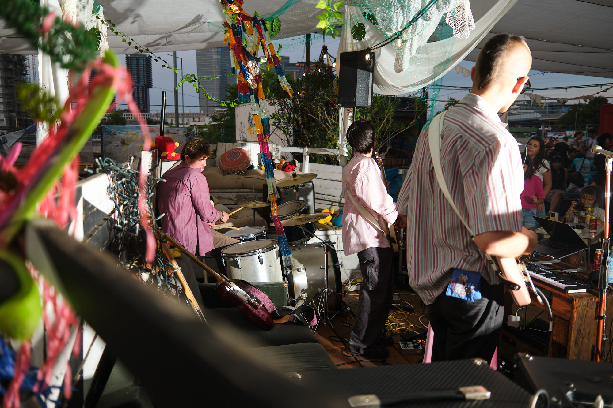
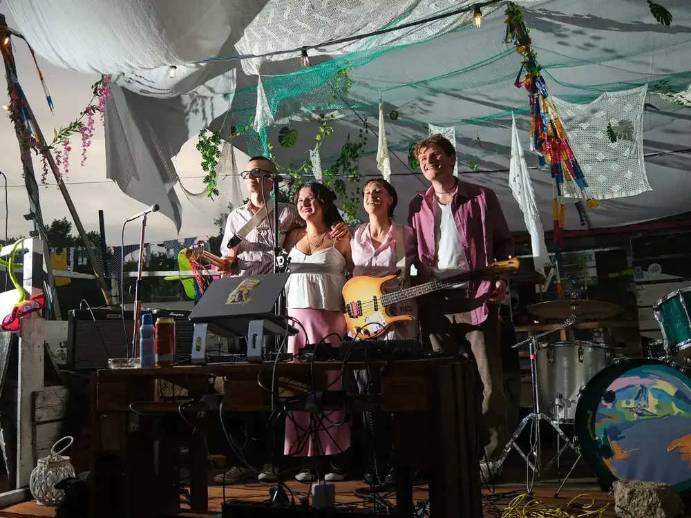
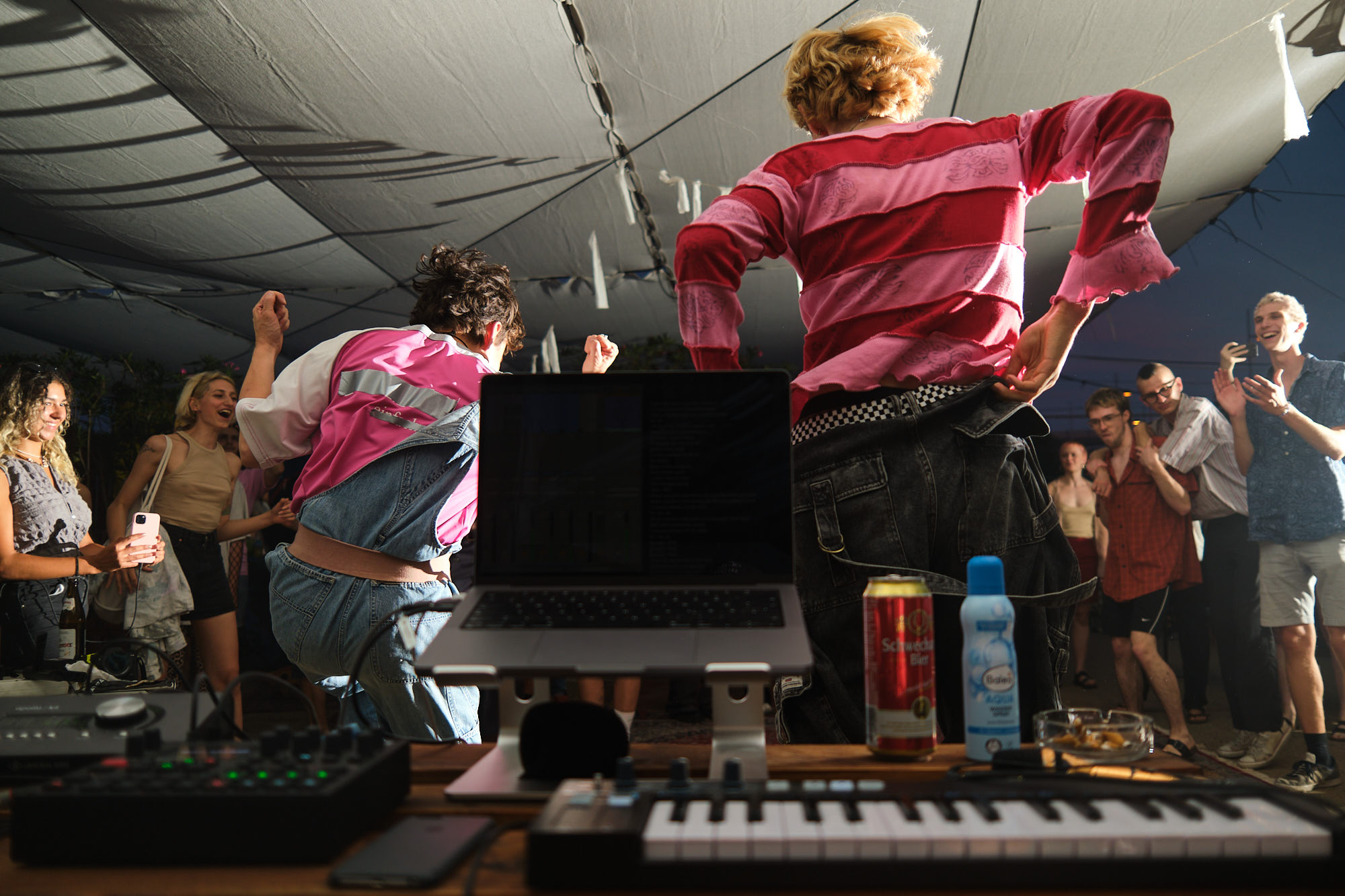
artist1topf concert
concert photography for artist1topf at wild im west on 2024-08-09.
artist1topf is a new format where each band plays one set together with the previous band, one set alone, and one with the next band.
hire me for your concert!

lomography
work from my employment as digital designer at the photographic equipment retailer lomography. in this time i created product identities, ad banners, social media posts and animations, illustrations and newsletters.
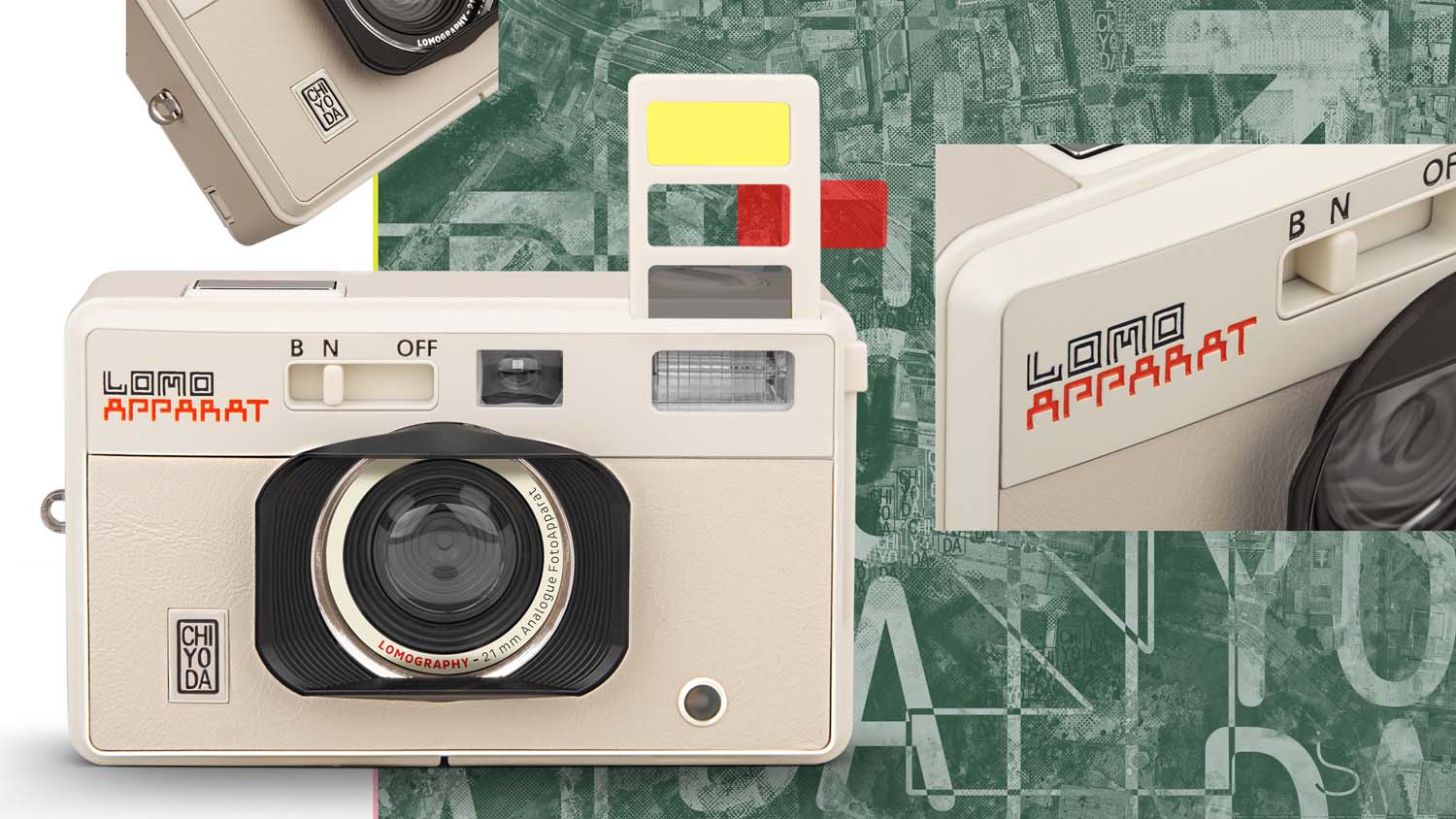
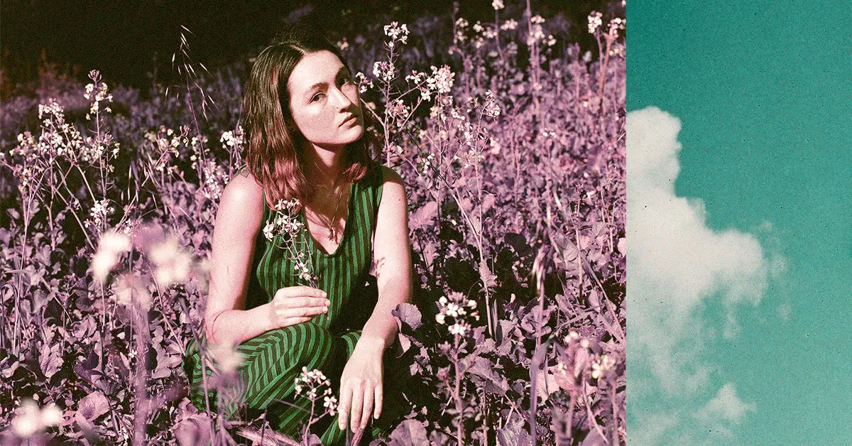
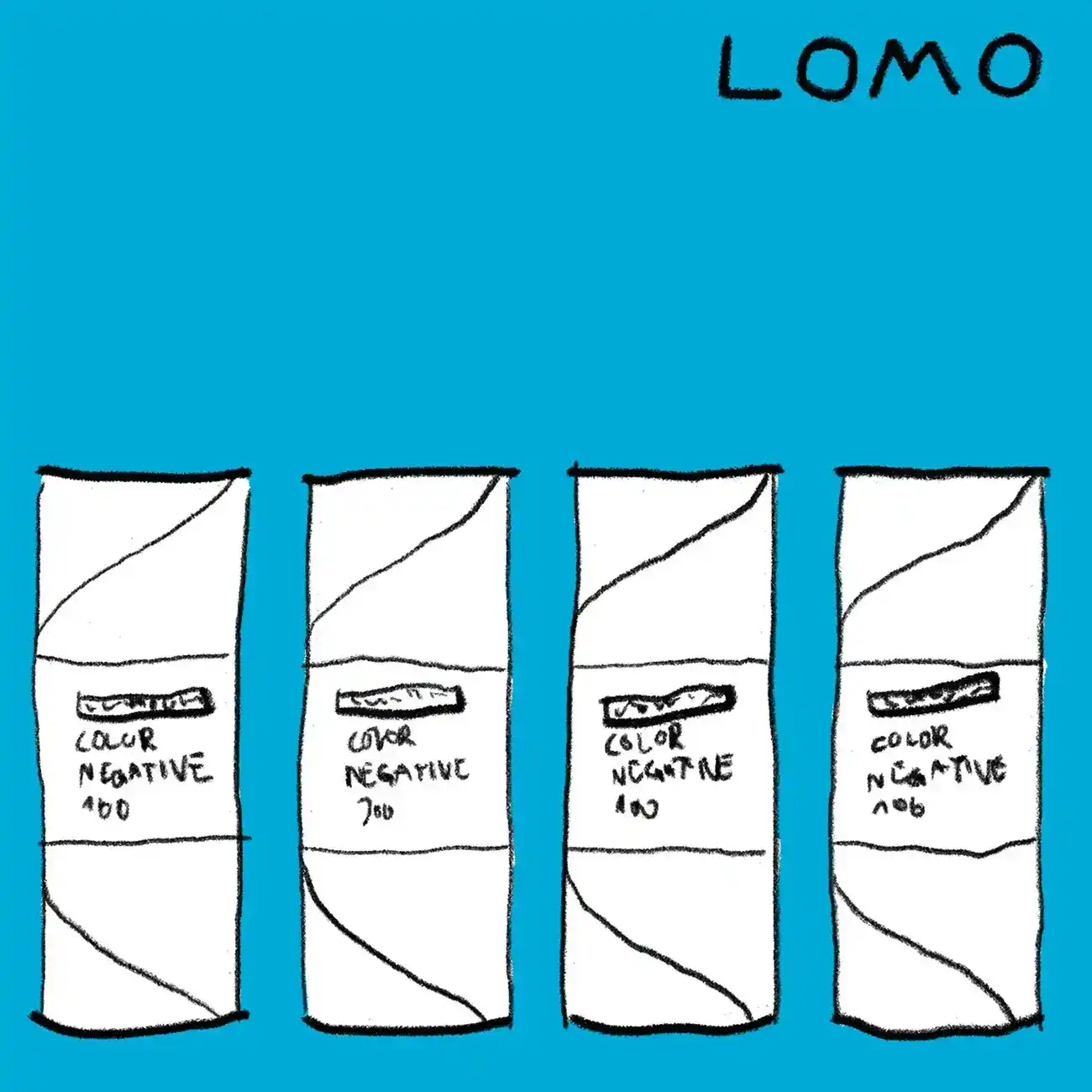
themes: animation, fonts&lettering, identity, illustration, logo, lomography, motion design, poster, print
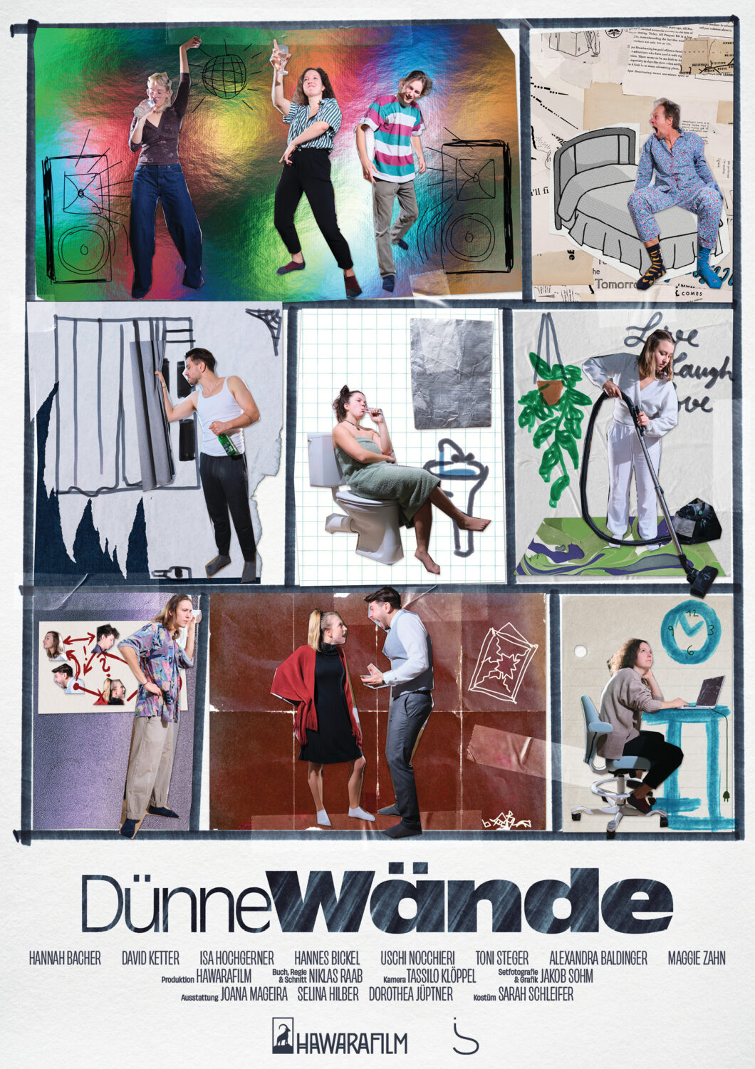
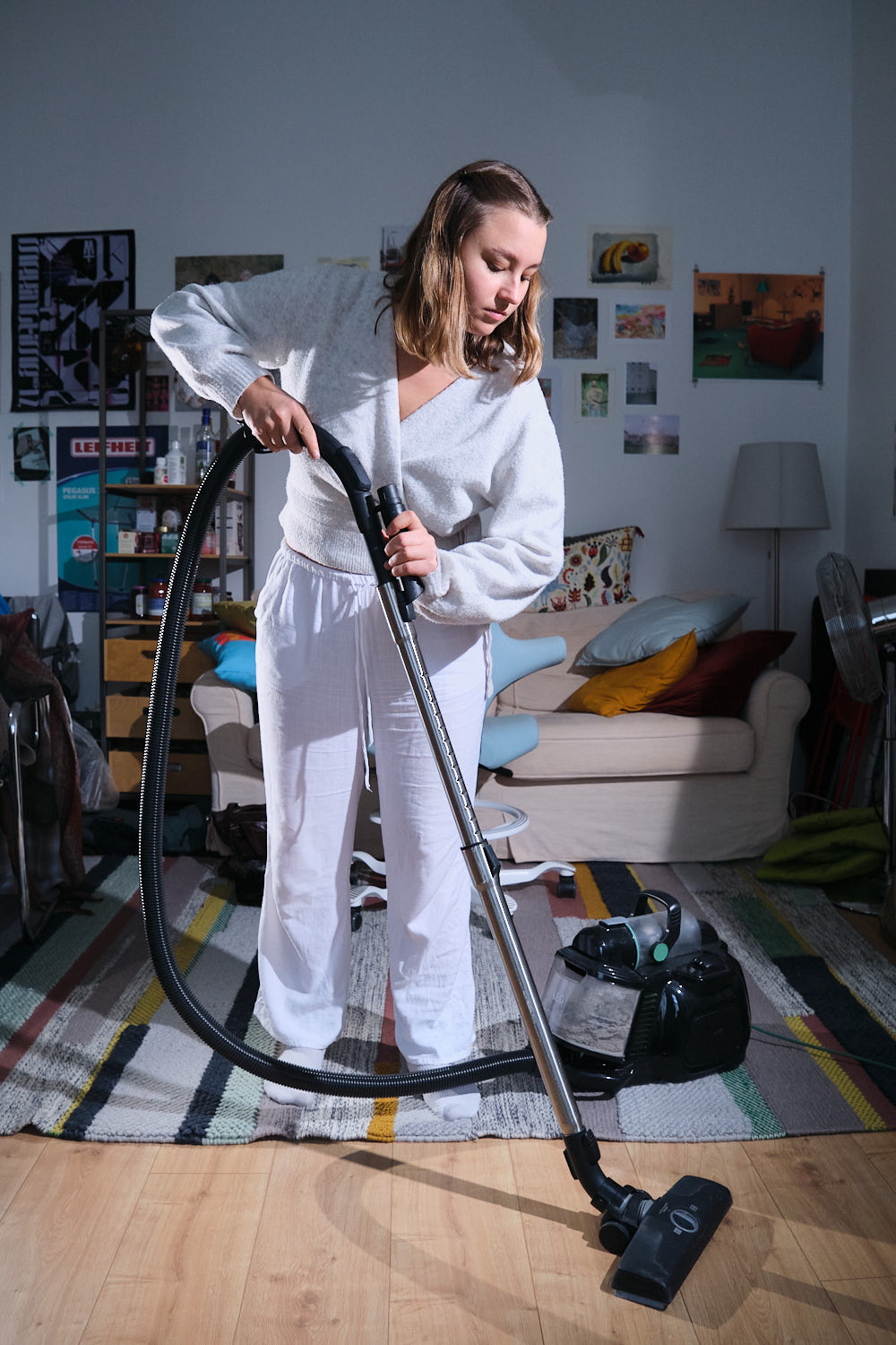
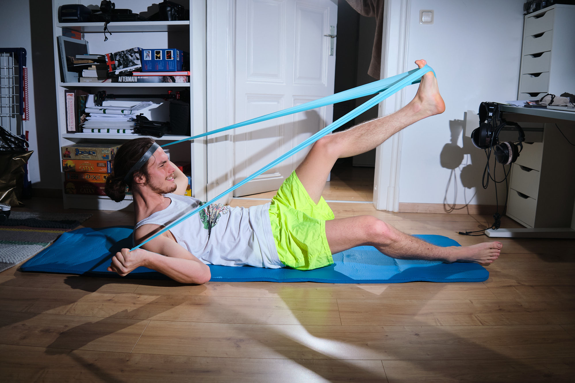
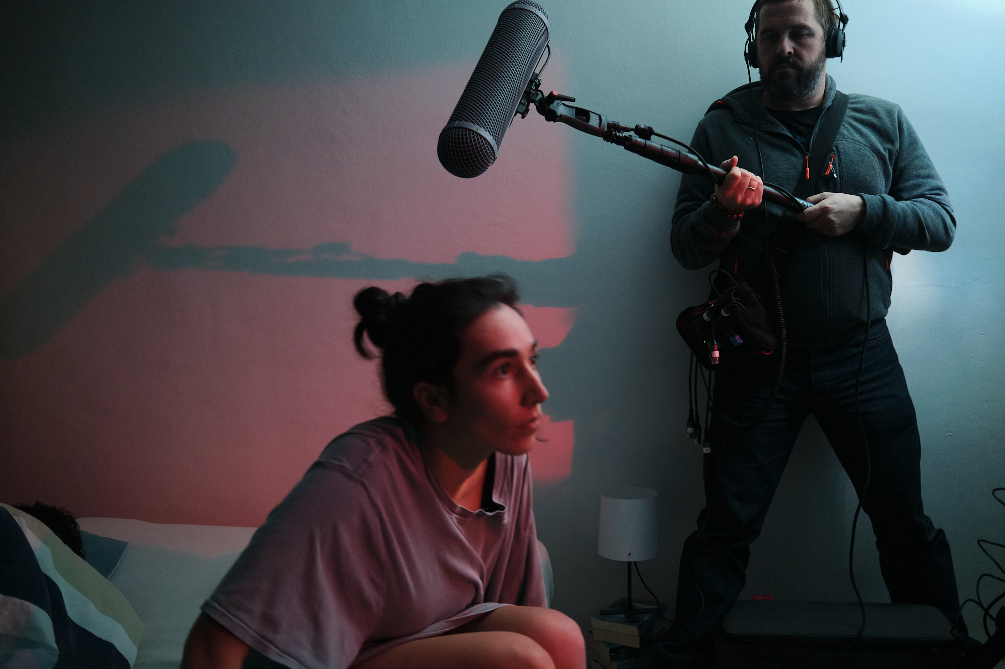
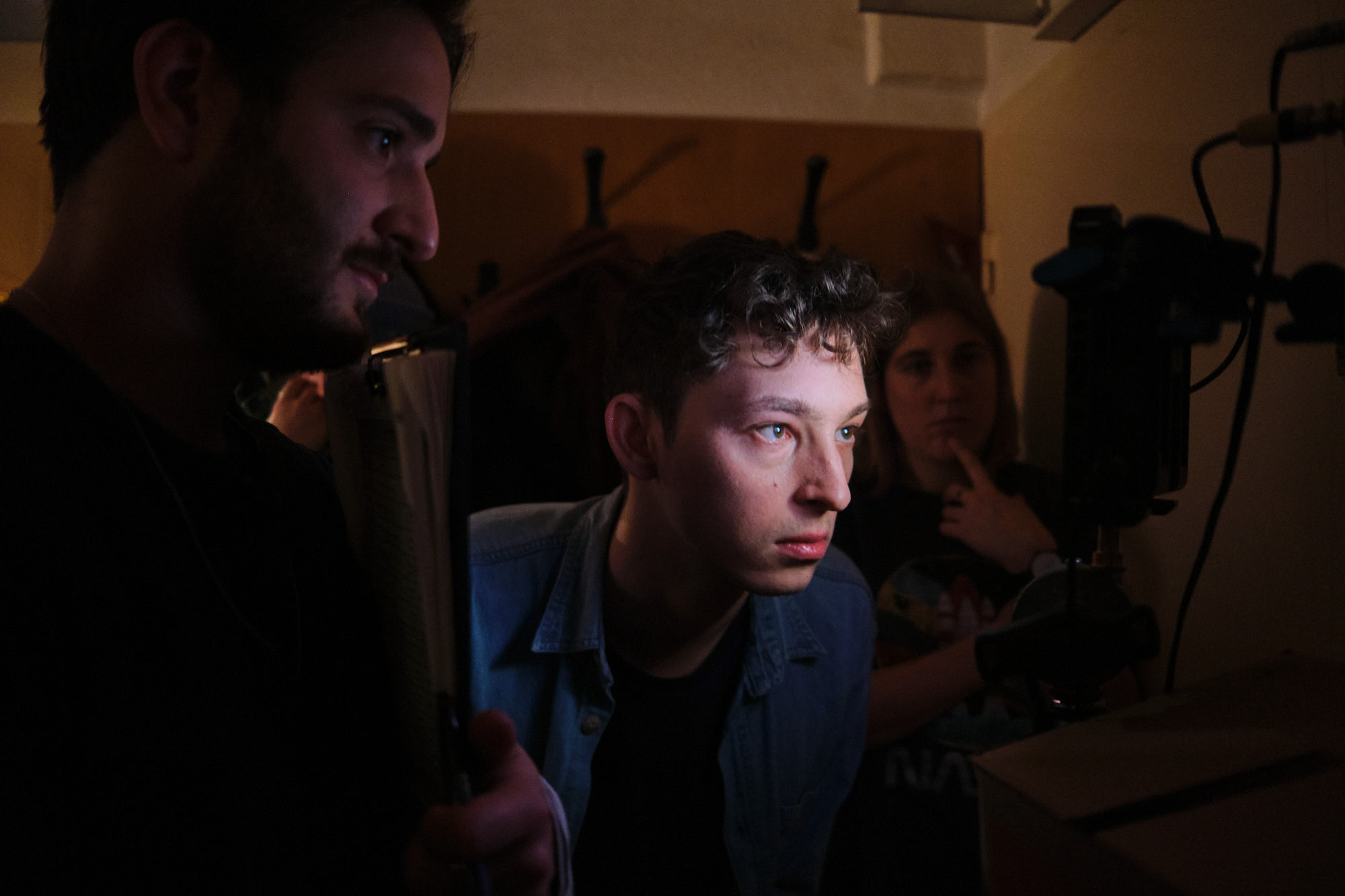
dünne wände
graphic design and set photography for „dünne wände“ (thin walls), a short film about how city residents affect, annoy, anger each other — through their walls.
written and directed by niklas raab. read more about the film on hawarafilm.com
the poster was designed to look like a collage — a reference to the home improvement intro
read the project folder and admire the design here
themes: portrait, poster, print, short film, vienna
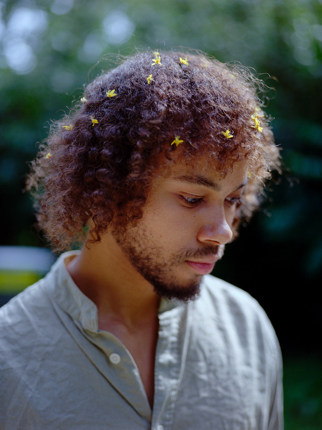
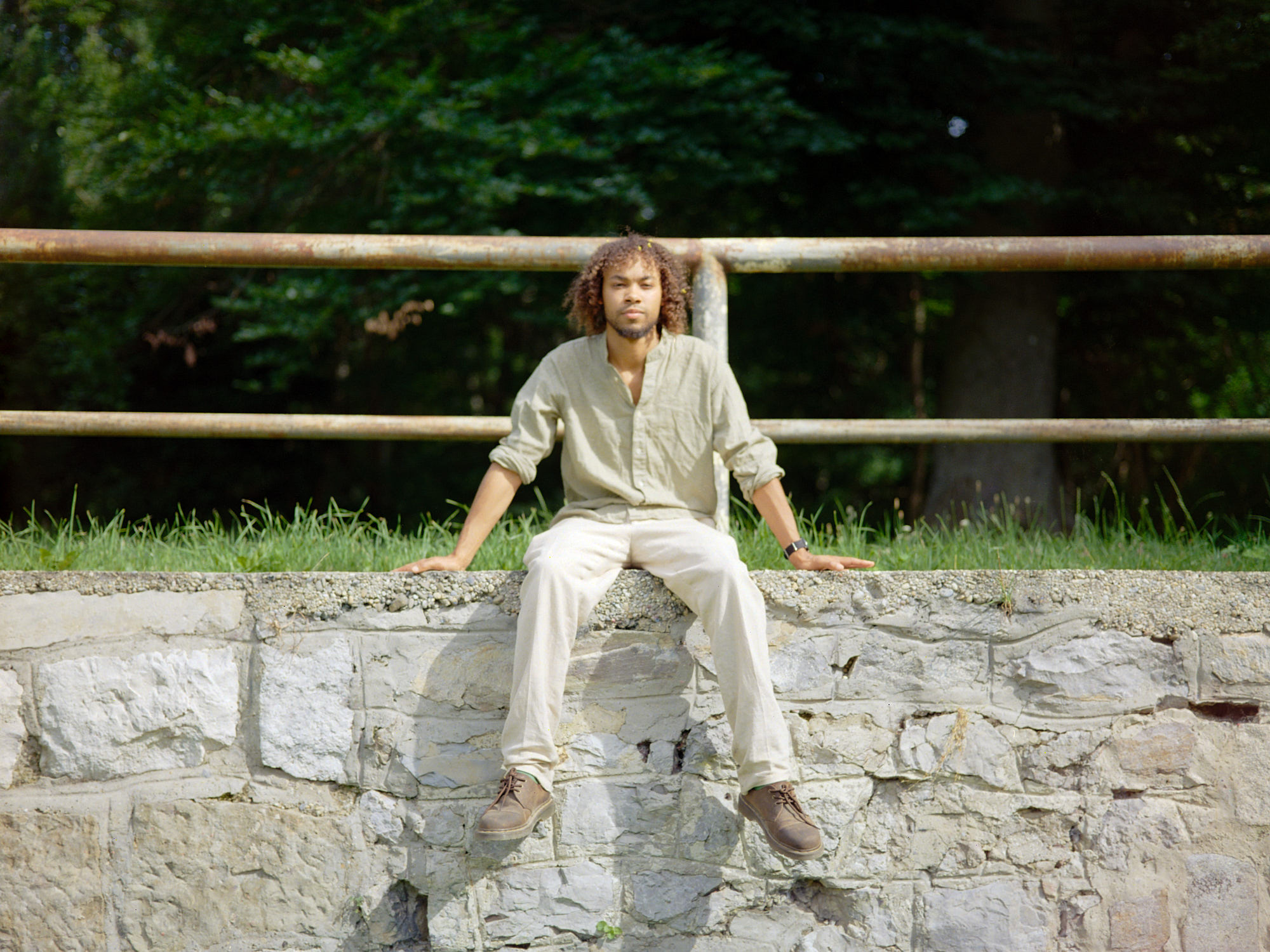
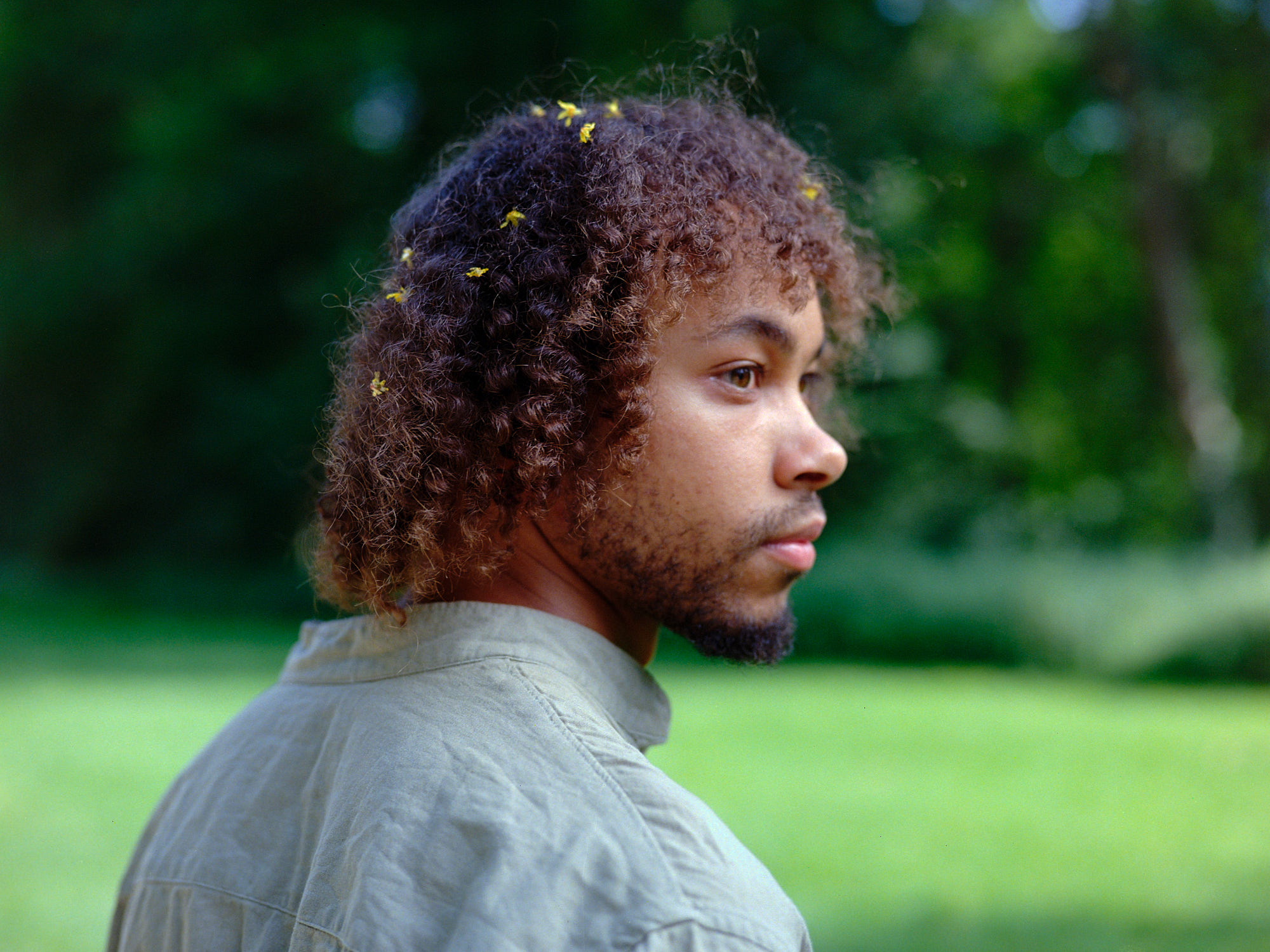
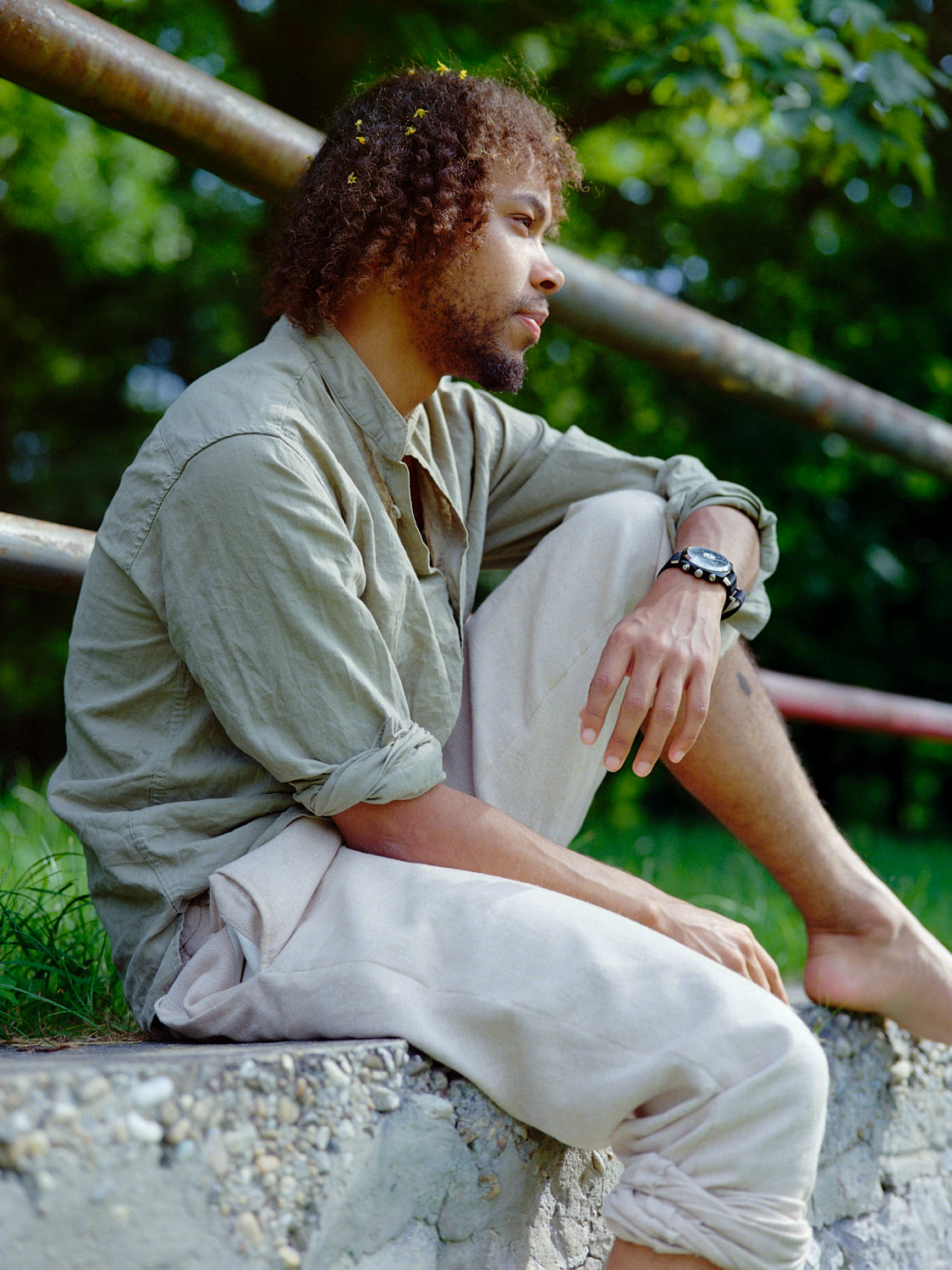
portraits for muco
when oli a.k.a. muco visited vienna, he asked me to take portraits of him to accompany his music. i happily obliged of course, and we went for a walk in the vienna prater. i wanted the pictures to reflect the dreamy mood of his work, which i hope comes across.
listen to his music here

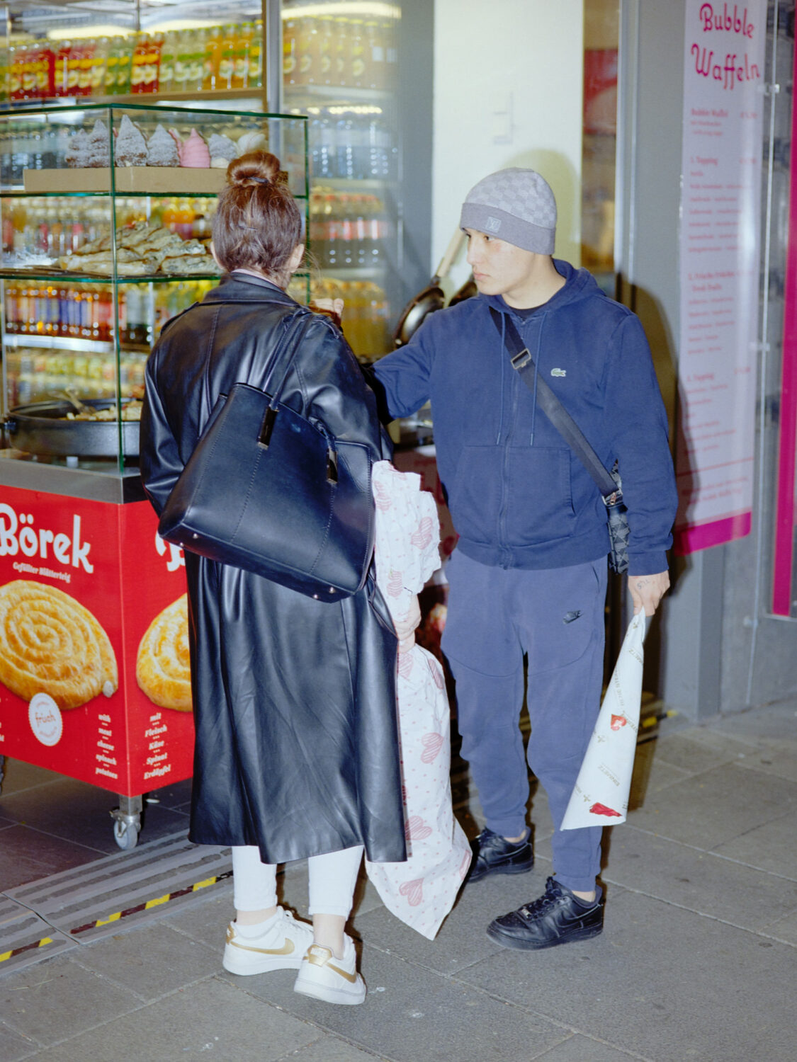
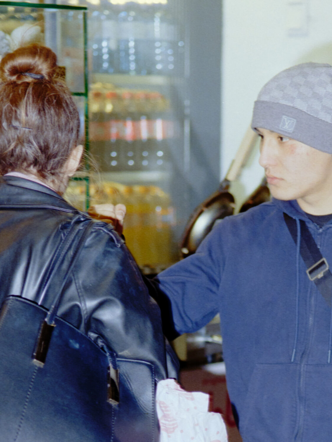
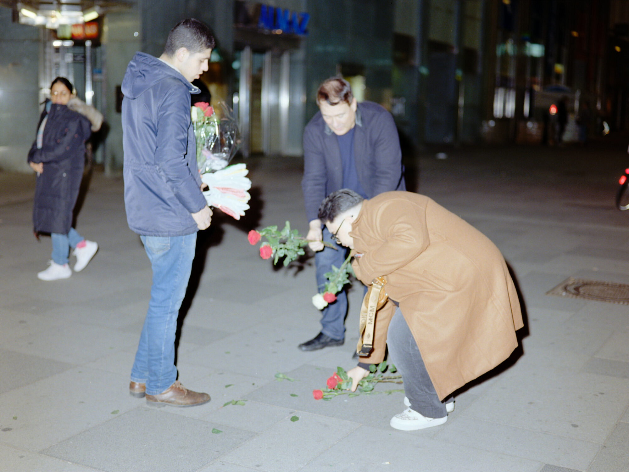
valentine’s day