
marmorstein jewelry
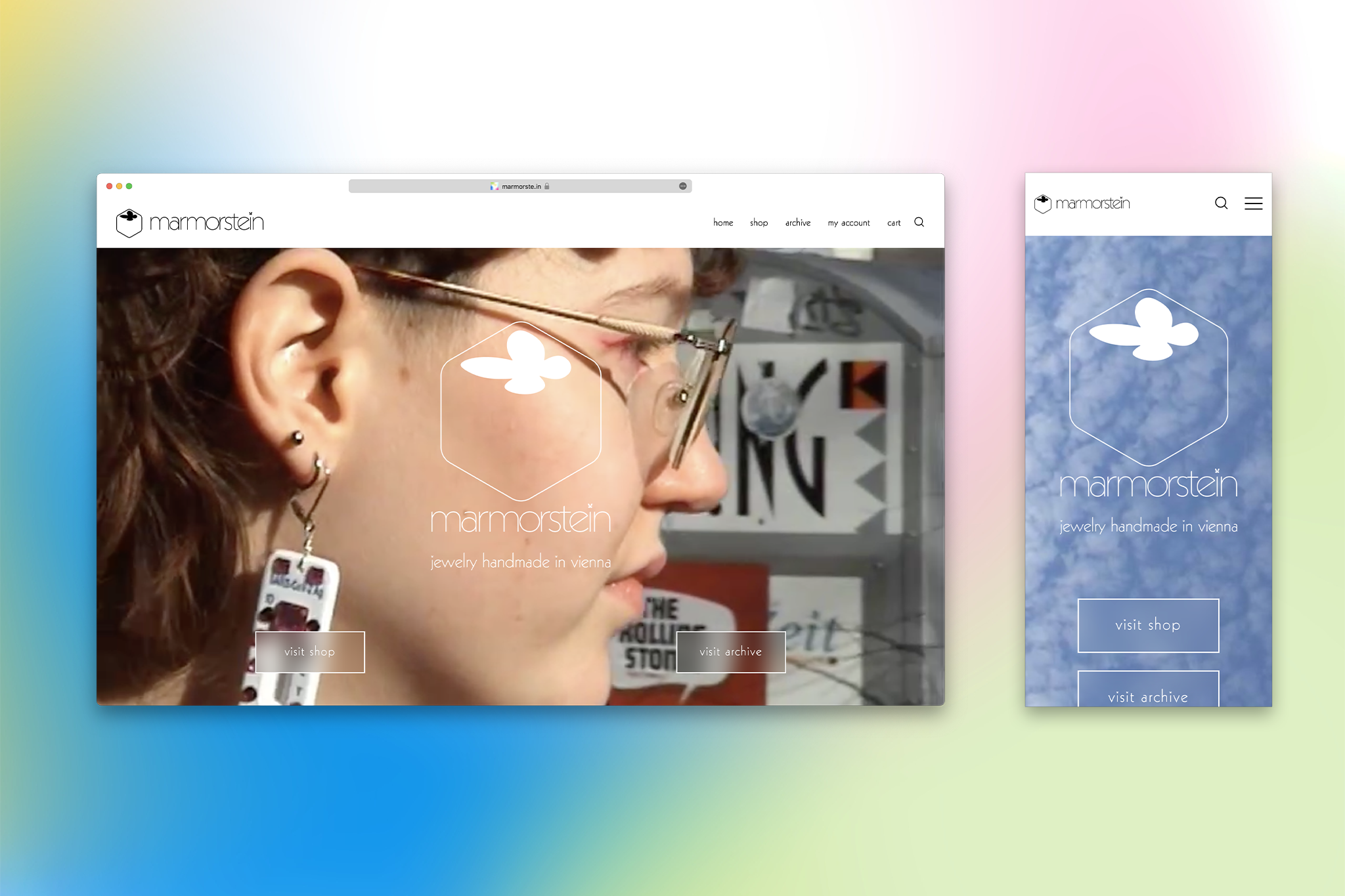
identity, graphic design, business card, customized font, videography, website design with shop and programming for marmorstein jewelry. for the shop, visit marmorste.in (web archive link)
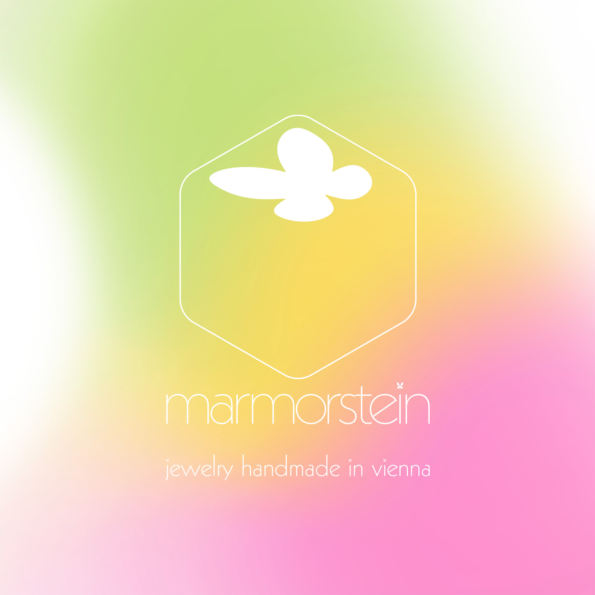
marmorstein jewelry is handmade in a colorful, cute and elegant style that is partly inspired by the 2000s. the name means “marble stone”, and is a traditional jewish name, taken from the founder and designer lili. the name of the brand is therefore not only a reference to lili’s heritage, but also the craft.
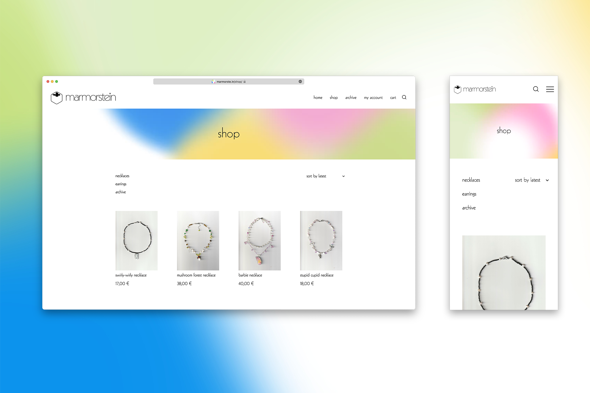
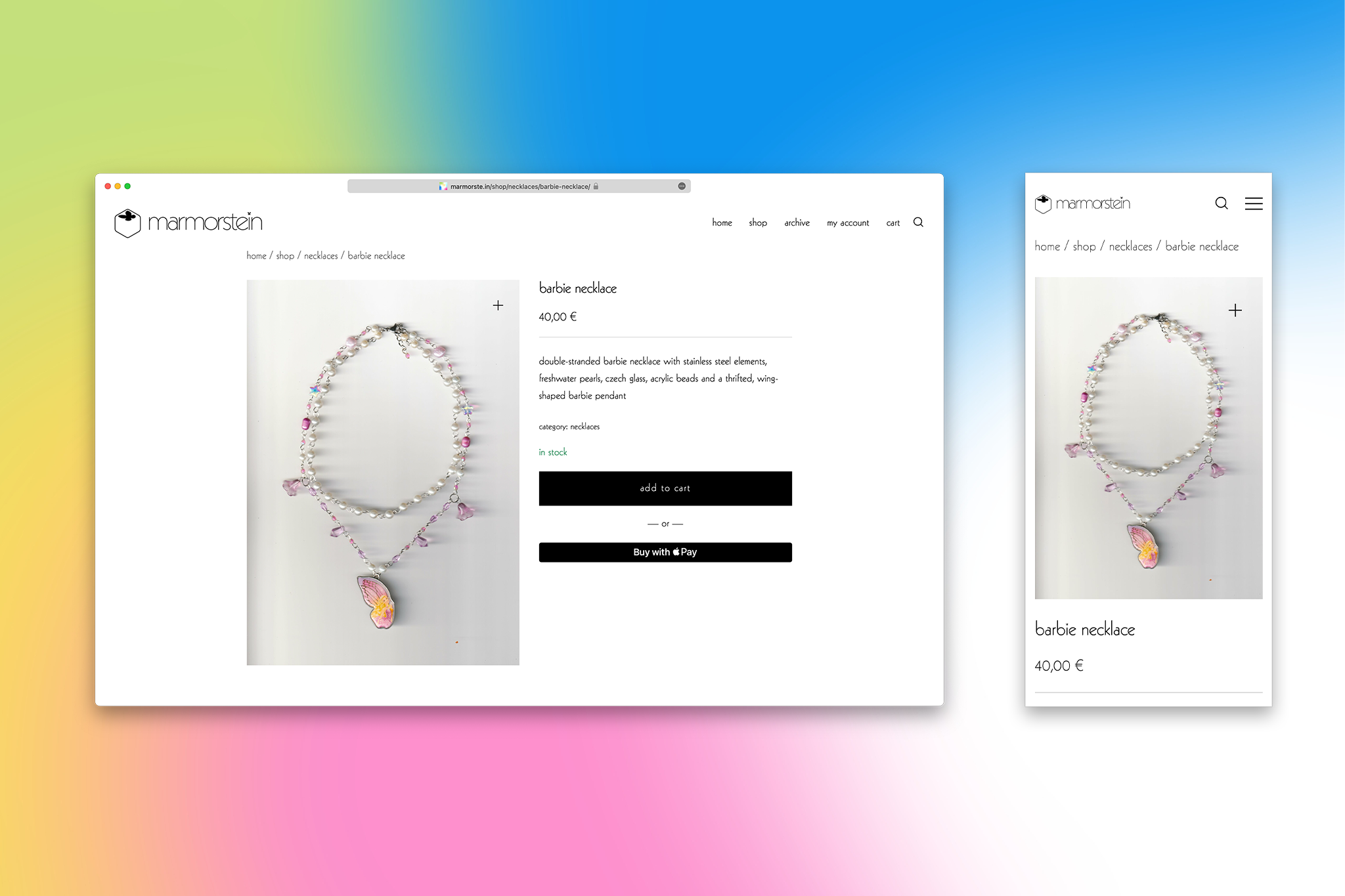
goal of the design was to create an atmosphere which complements this style in its liveliness, but stays classy and somewhat timeless. in terms of ui, the philosophy was to stay within expectations of an online shop, with details to make the experience unique and true to the brand.
website
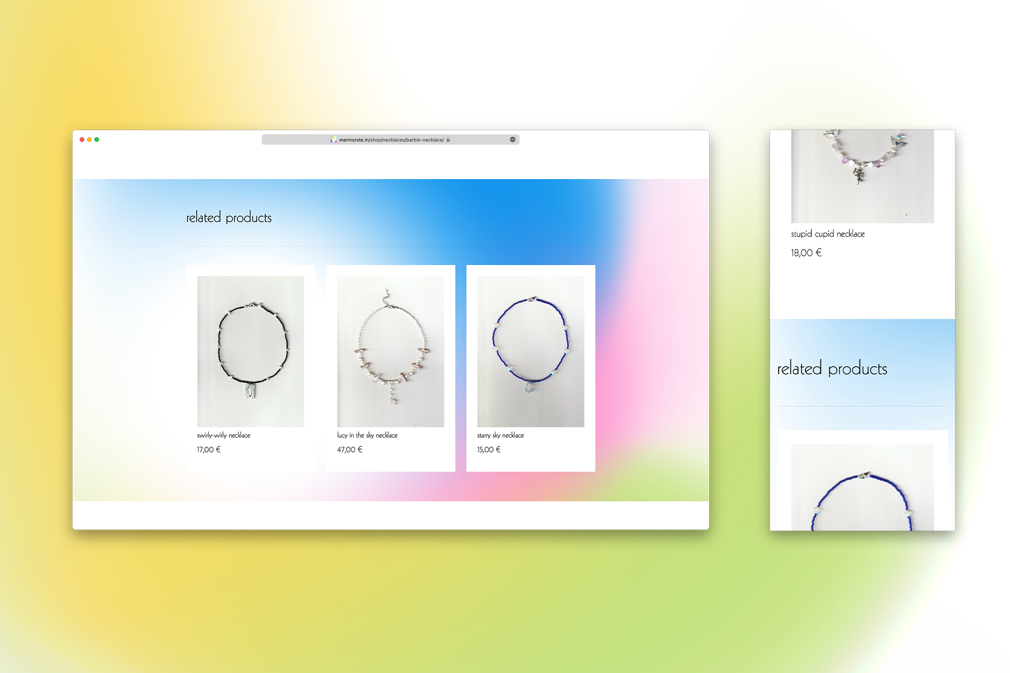
design
for the logo, kabel neue was used for its improved legibility, cleaner shapes and range of weights, whereas on the website and otherwise, the customized version of the original 1927 kabel is used for its rawness, quirkiness and analog charm.
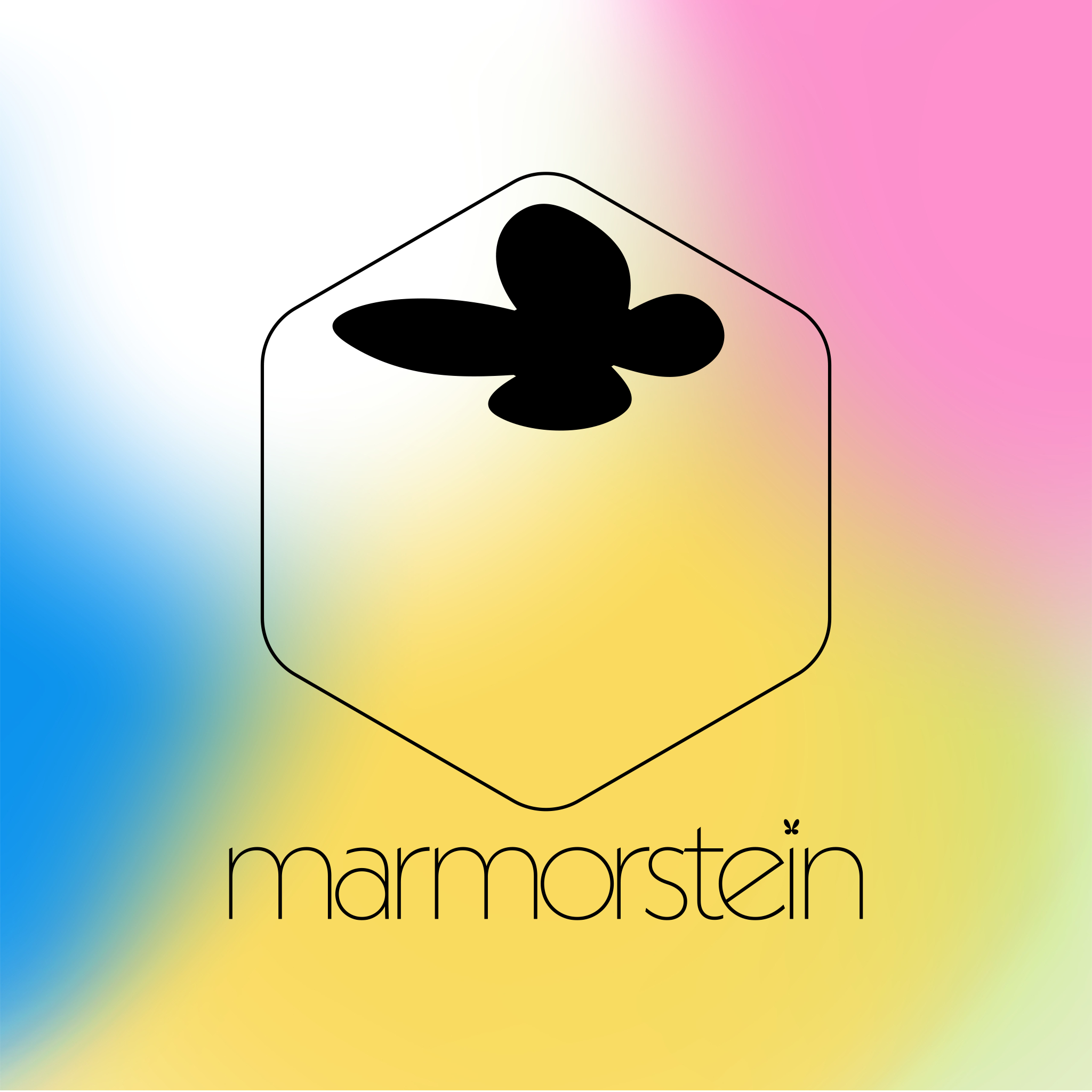
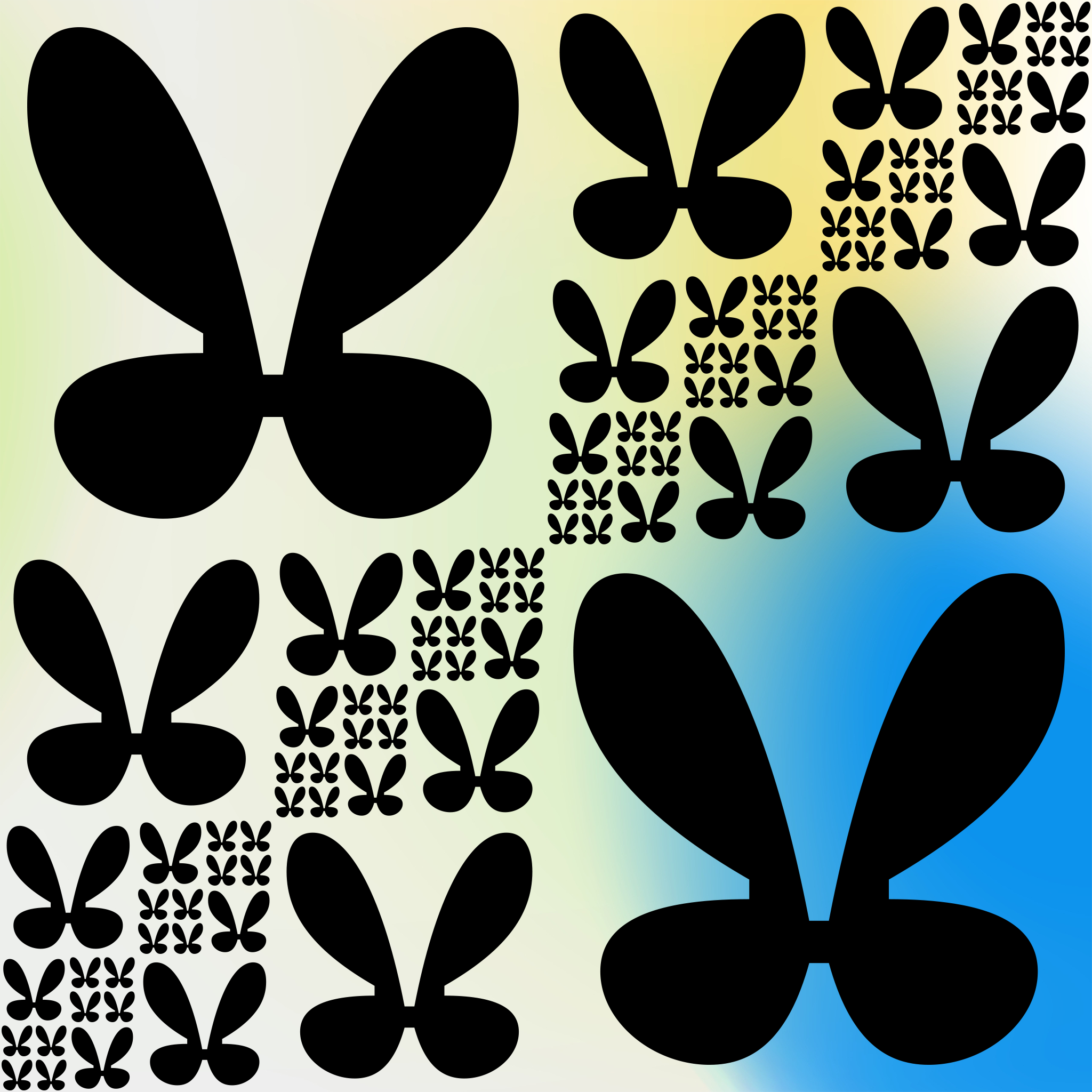
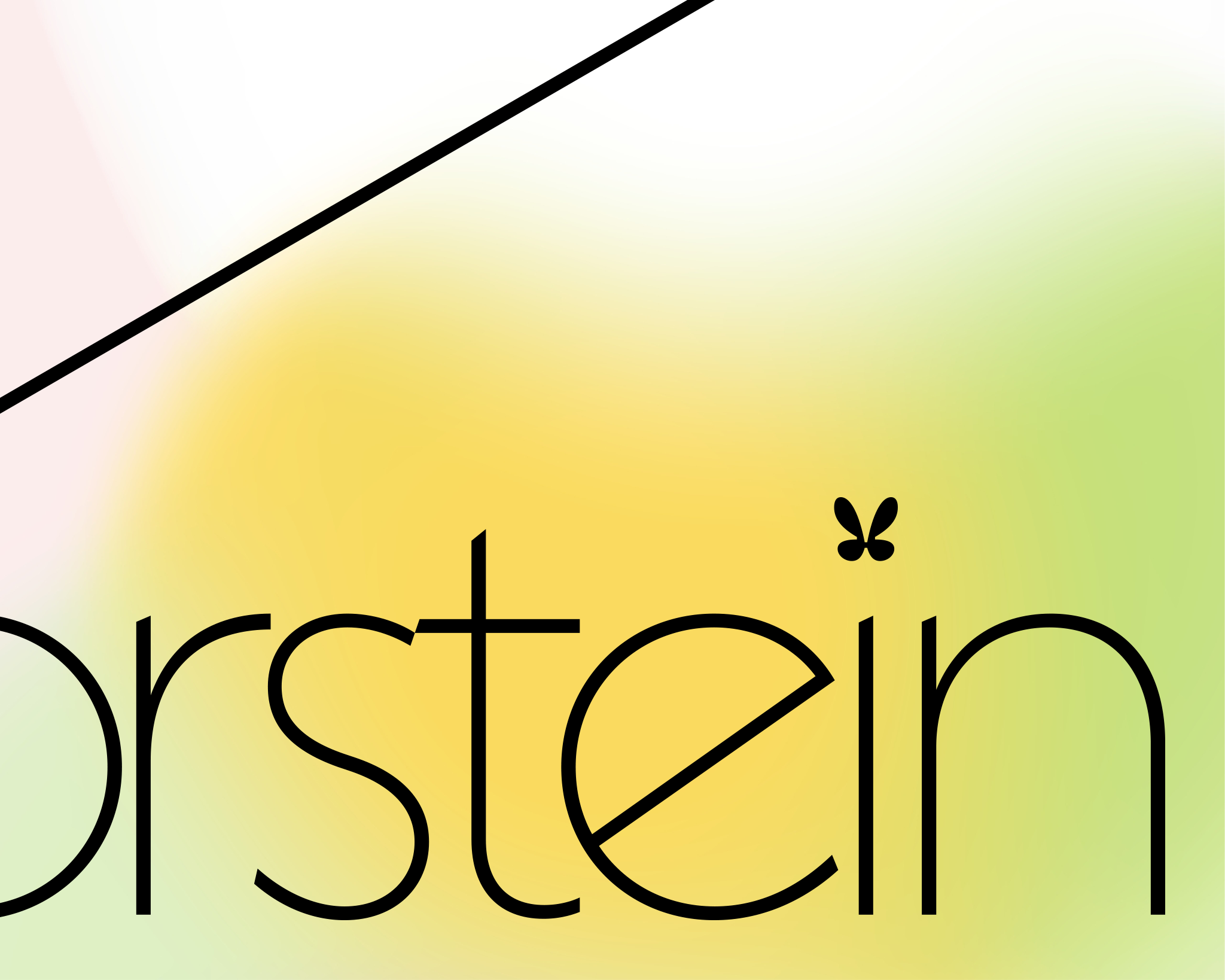
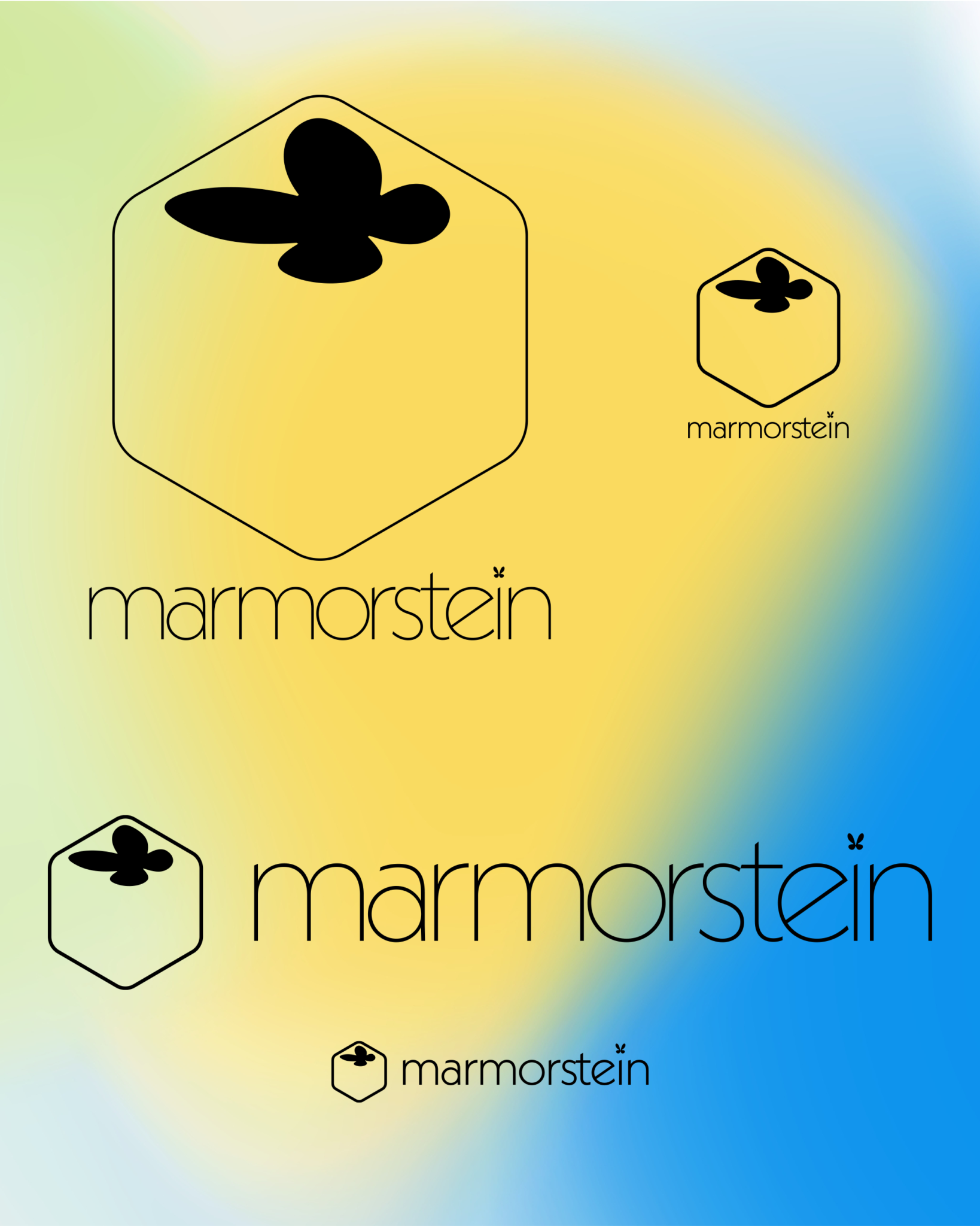
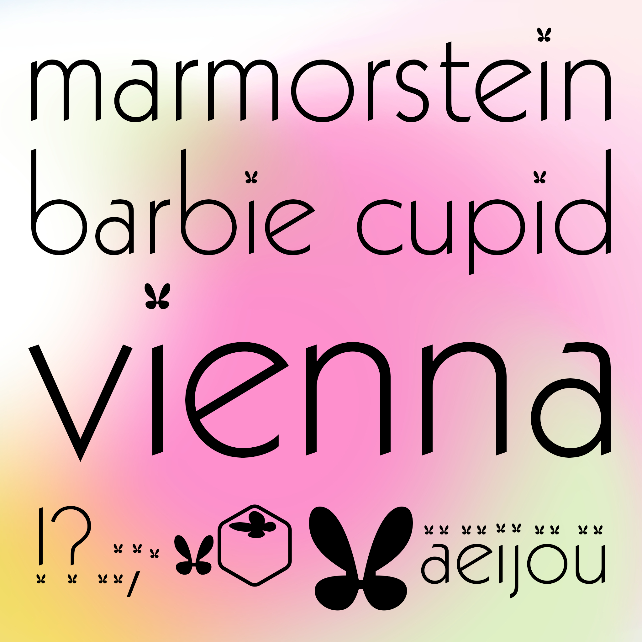
the stone and butterfly marks are contained within the font file for easy access.

animations
seamlessly looping header animations for web

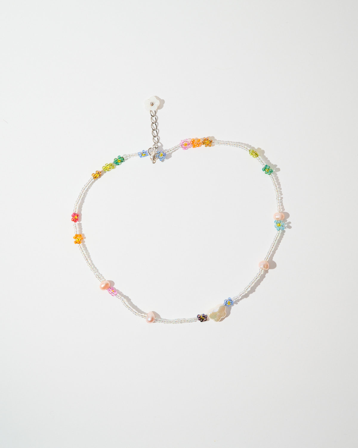
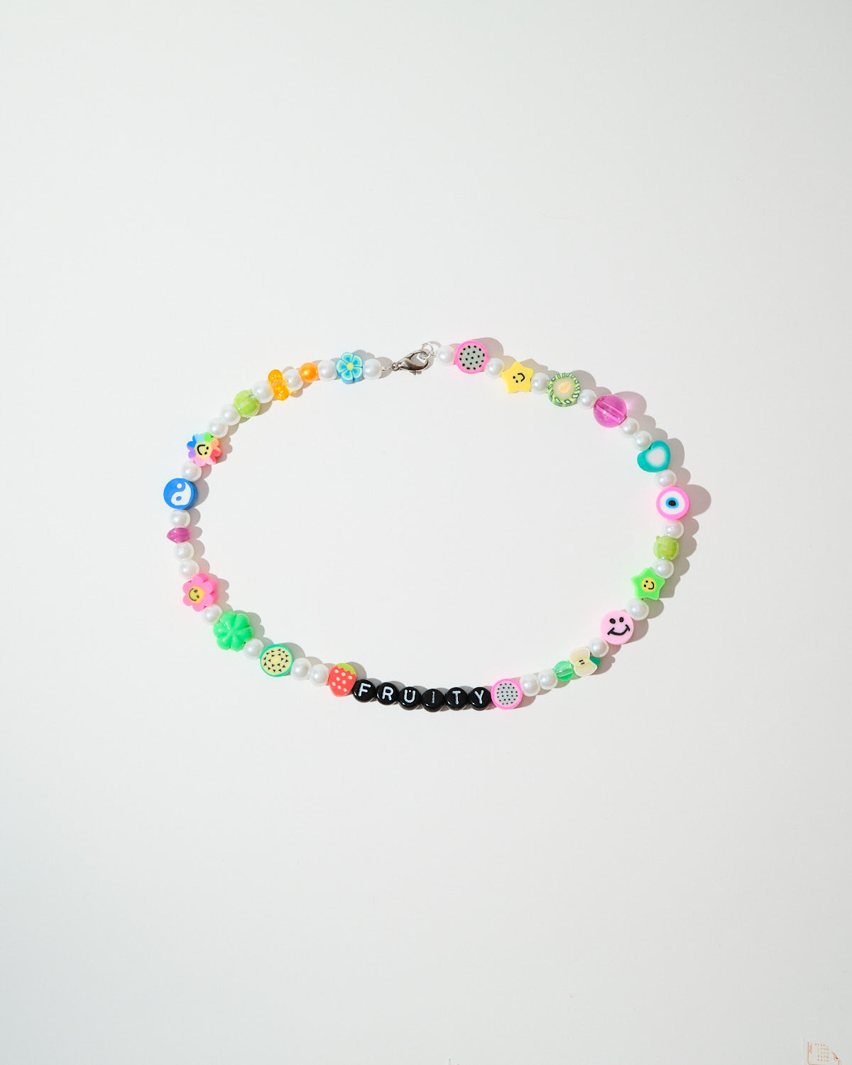
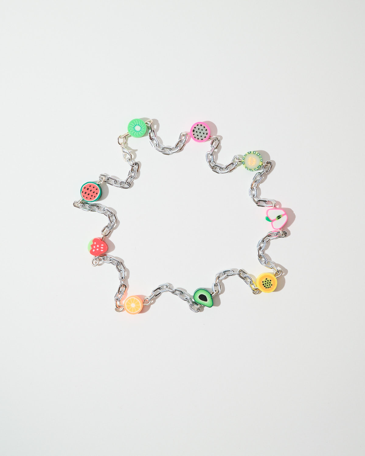
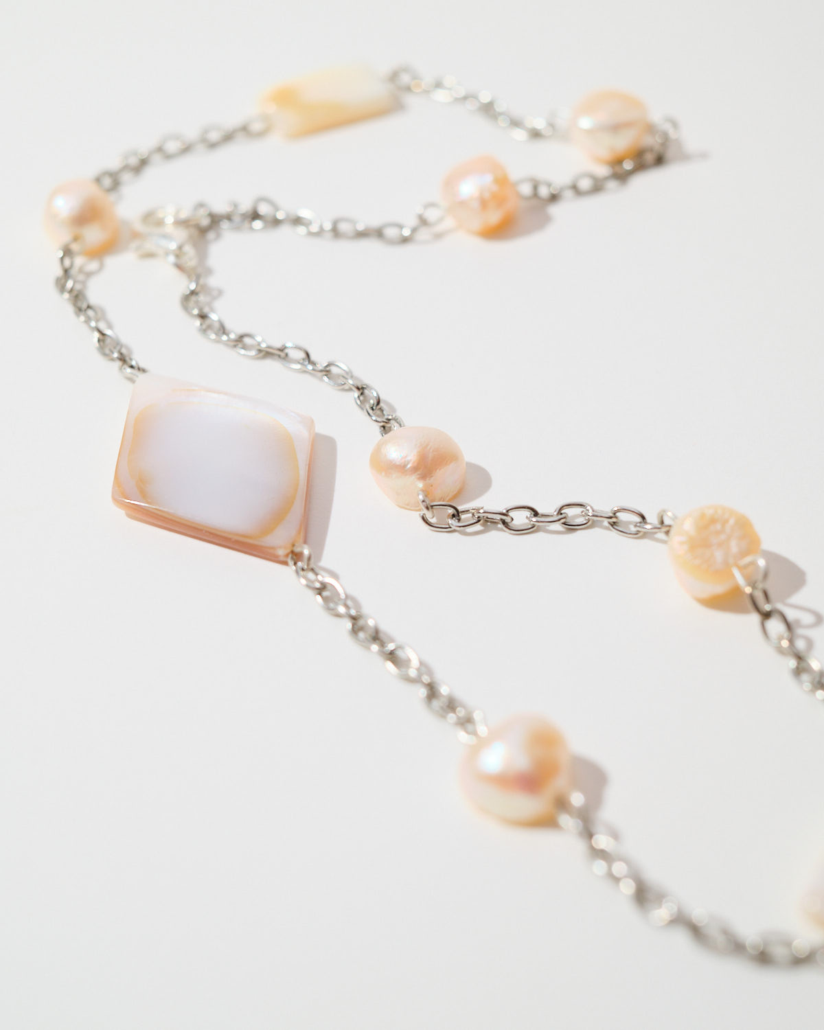
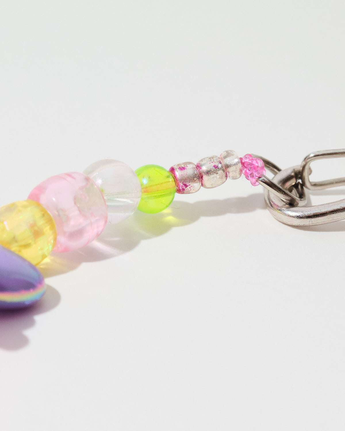
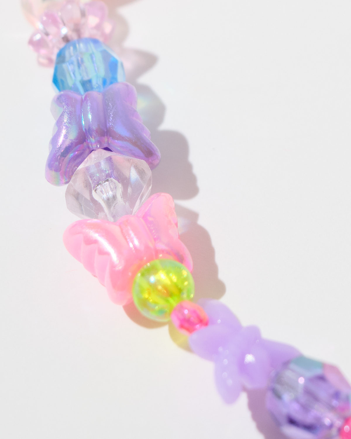
product photography
it was planned that i would photograph the products for the website, but after i had finished the first batch, lili decided on scanning the products herself. here are a few of my photos.


in: film work, graphic design, home
themes: fonts&lettering, identity, logo, motion design, ui/ux, web