
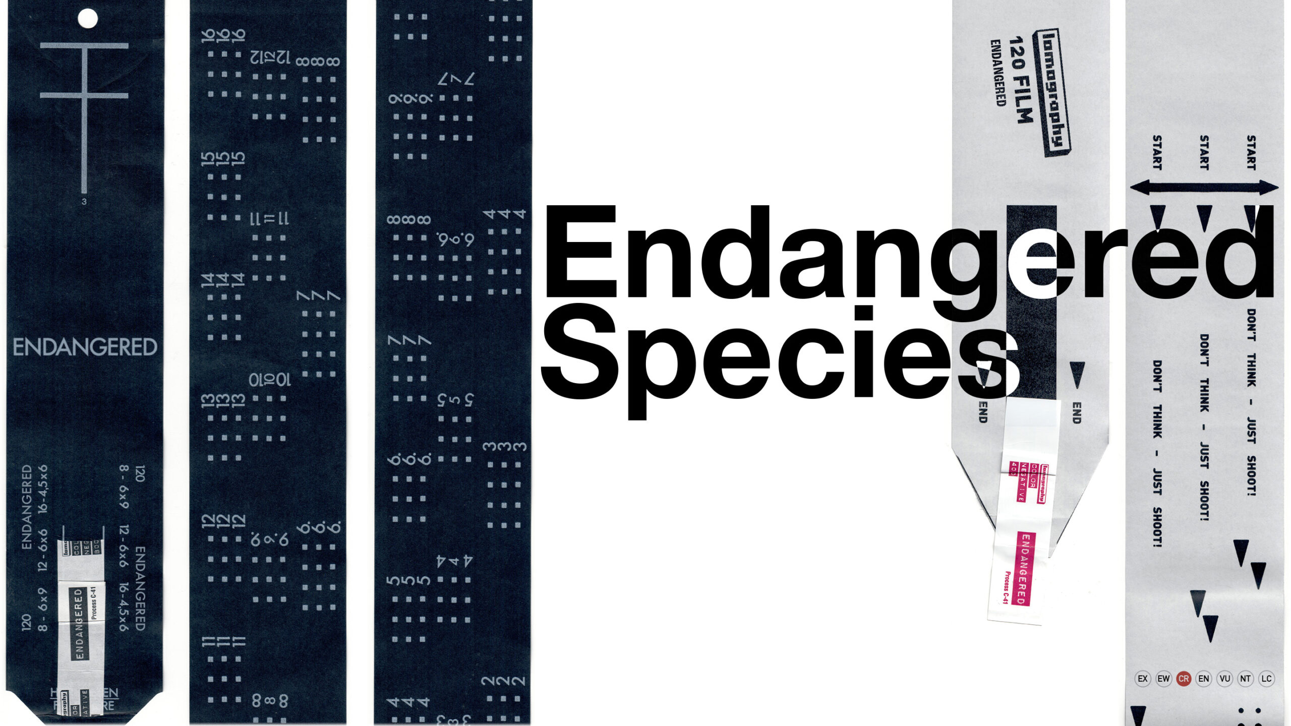
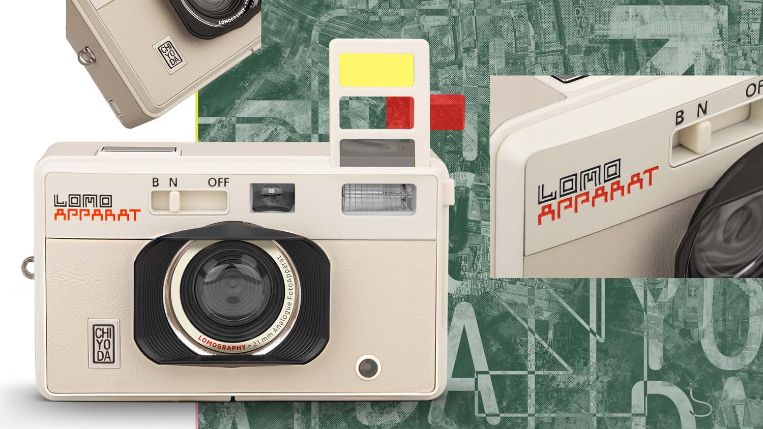
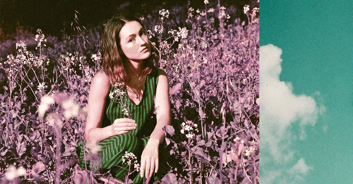
lomography
work from my employment as digital designer at the photographic equipment retailer lomography. in this time i created product identities, ad banners, social media posts and animations, illustrations and newsletters.
themes: animation, fonts&lettering, identity, illustration, logo, lomography, motion design, poster, print
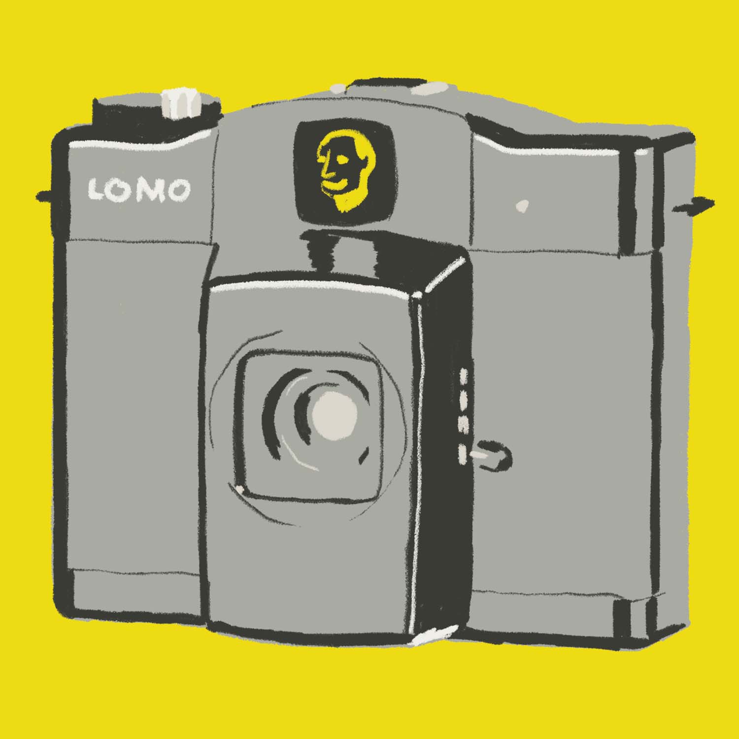
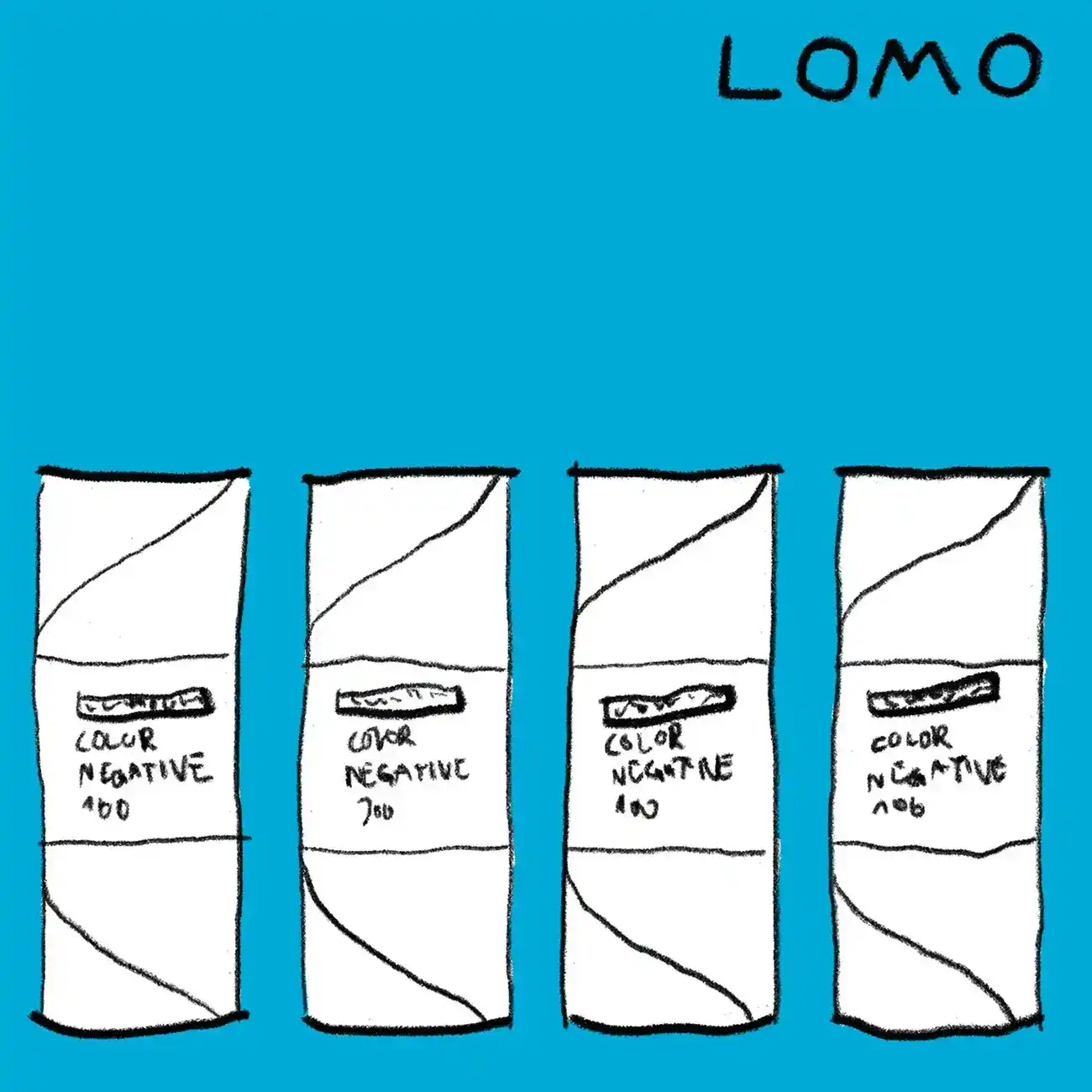
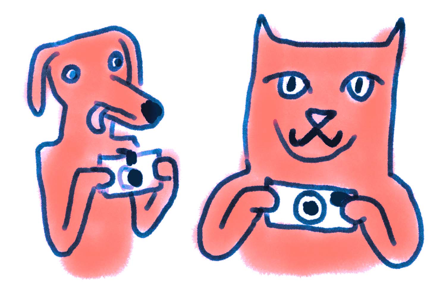
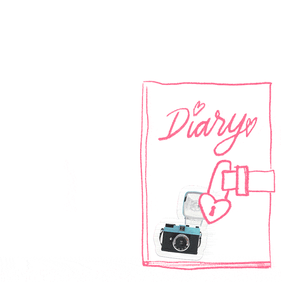
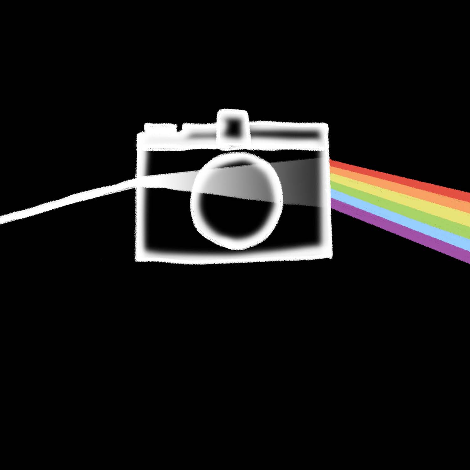
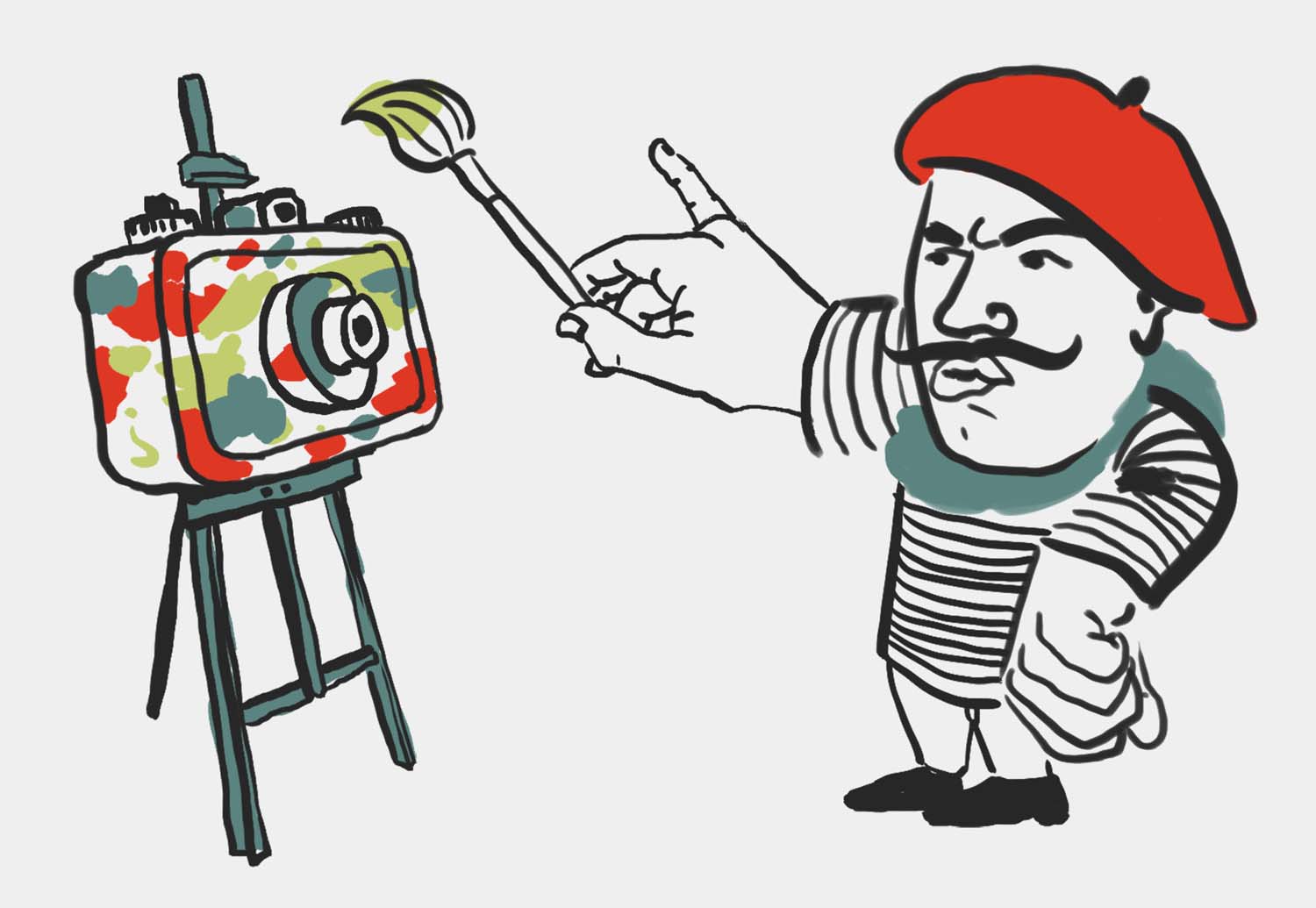
lomo illustrations
at lomography, i made a lot of illustrations for a wide range of applications: newsletters, banners, magazine articles, and social media posts. sadly most of these were never utilized to the extent i had hoped.
themes: animation, illustration, lomography, motion design
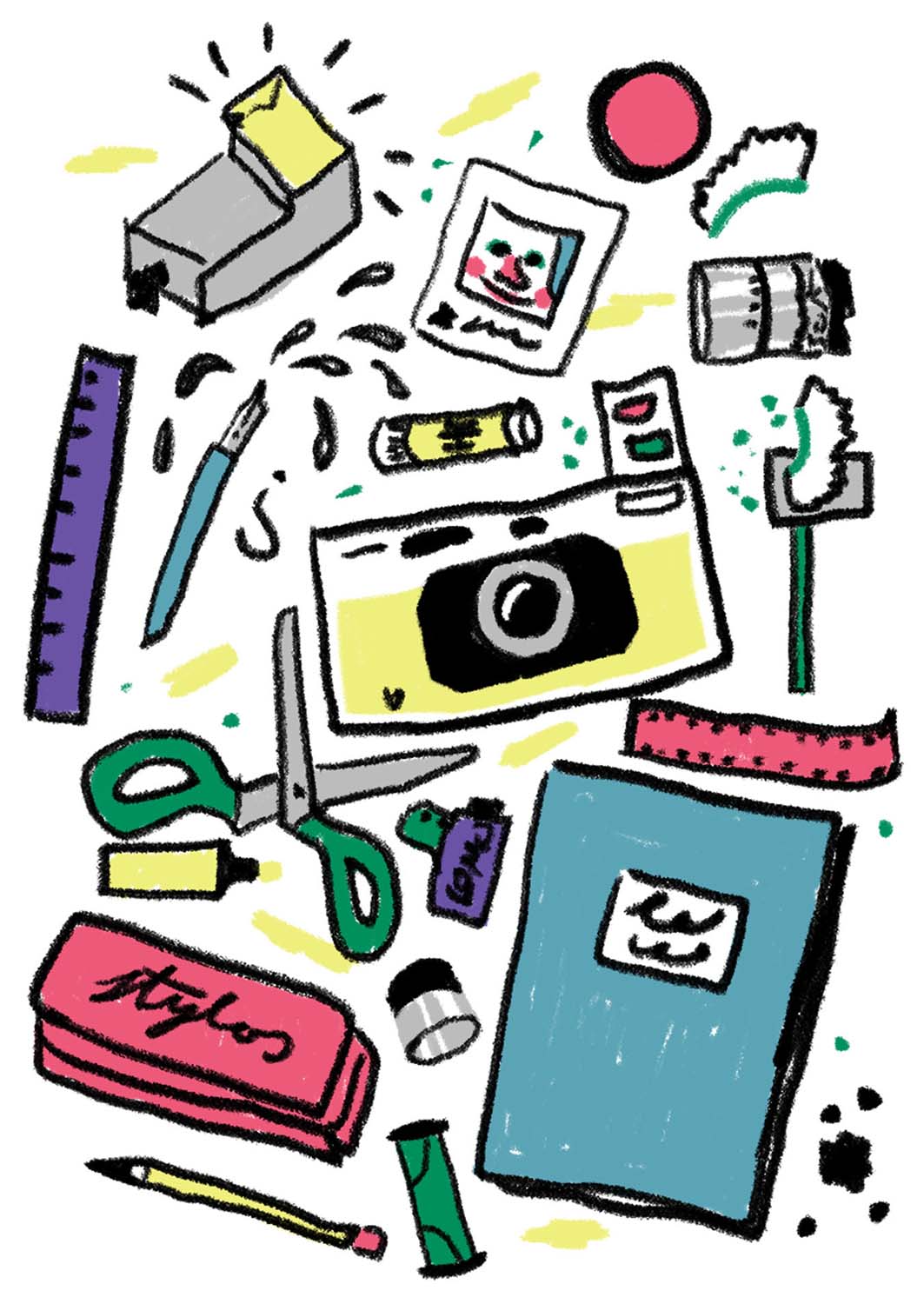
lomo school
marketing concept and design with hand animated school supplies for the seo optimized magazine section “lomo school”. this playful animation paired with strong, friendly graphic design was used for social media, advertisements and newsletters.

themes: animation, fonts&lettering, identity, illustration, lomography, motion design
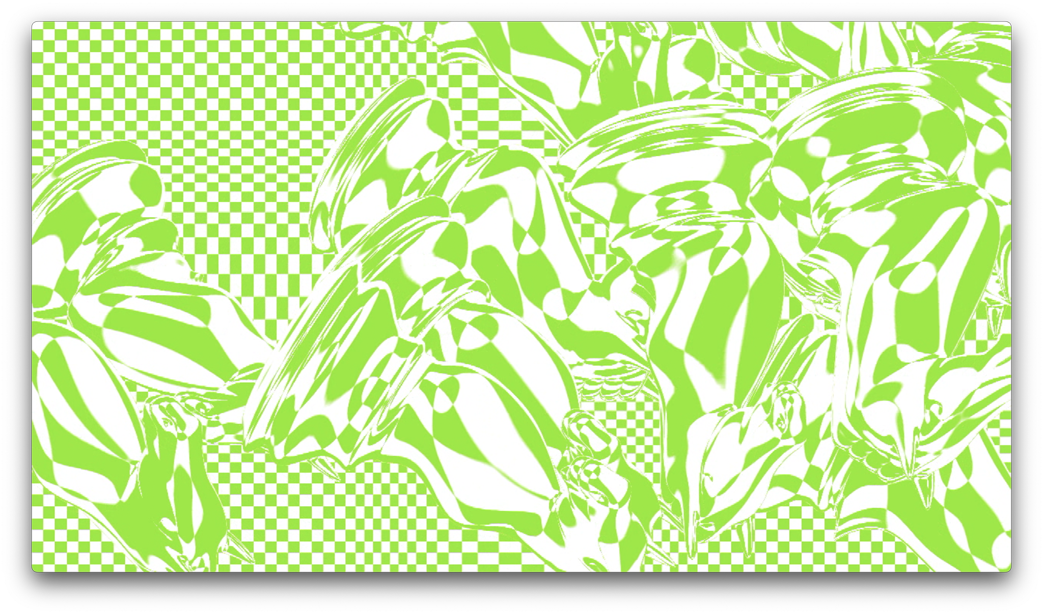
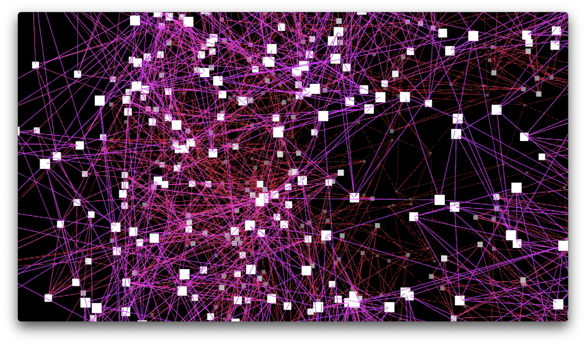
music visualization
live music visualization for my new year’s party, made in touchdesigner.
themes: animation, motion design, music