
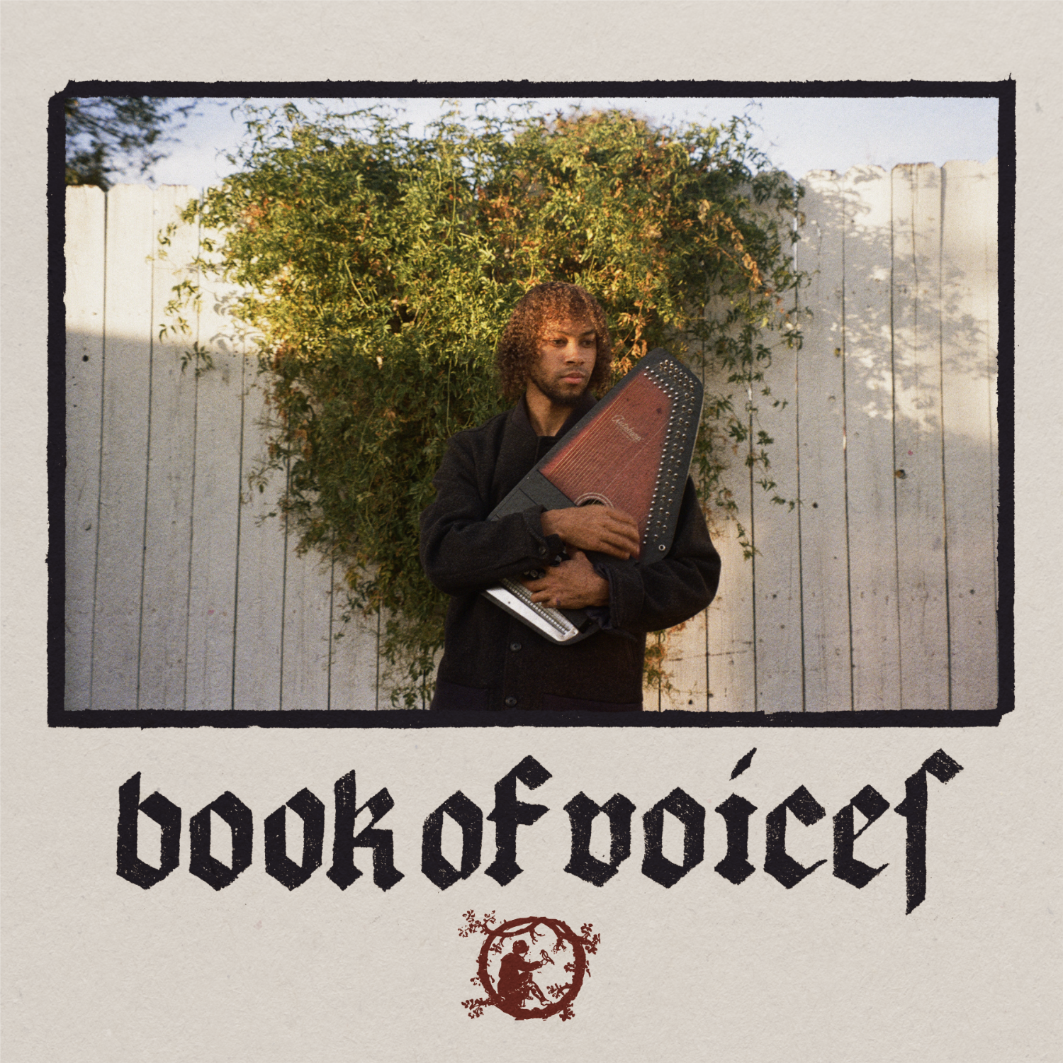
book of voices album cover
album cover for the self-titled ep. book of voices is a side project of muco, where he plays medieval songs in old and middle english. that’s why i decided to unpack my calligraphy skills and write the title in an appropriate blackletter style.
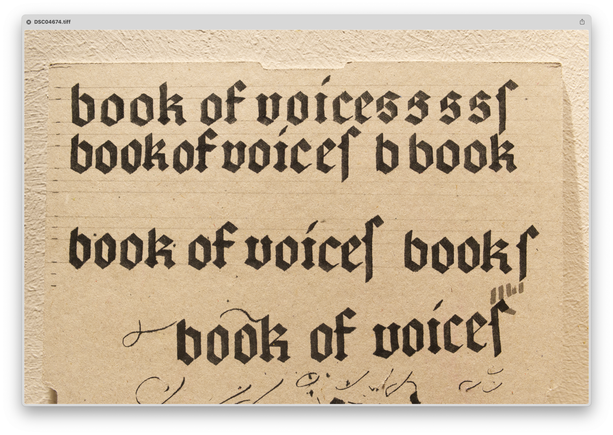
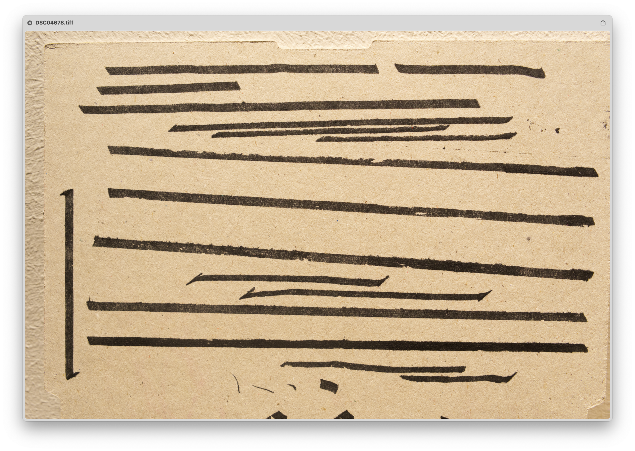
themes: fonts&lettering, muco, music
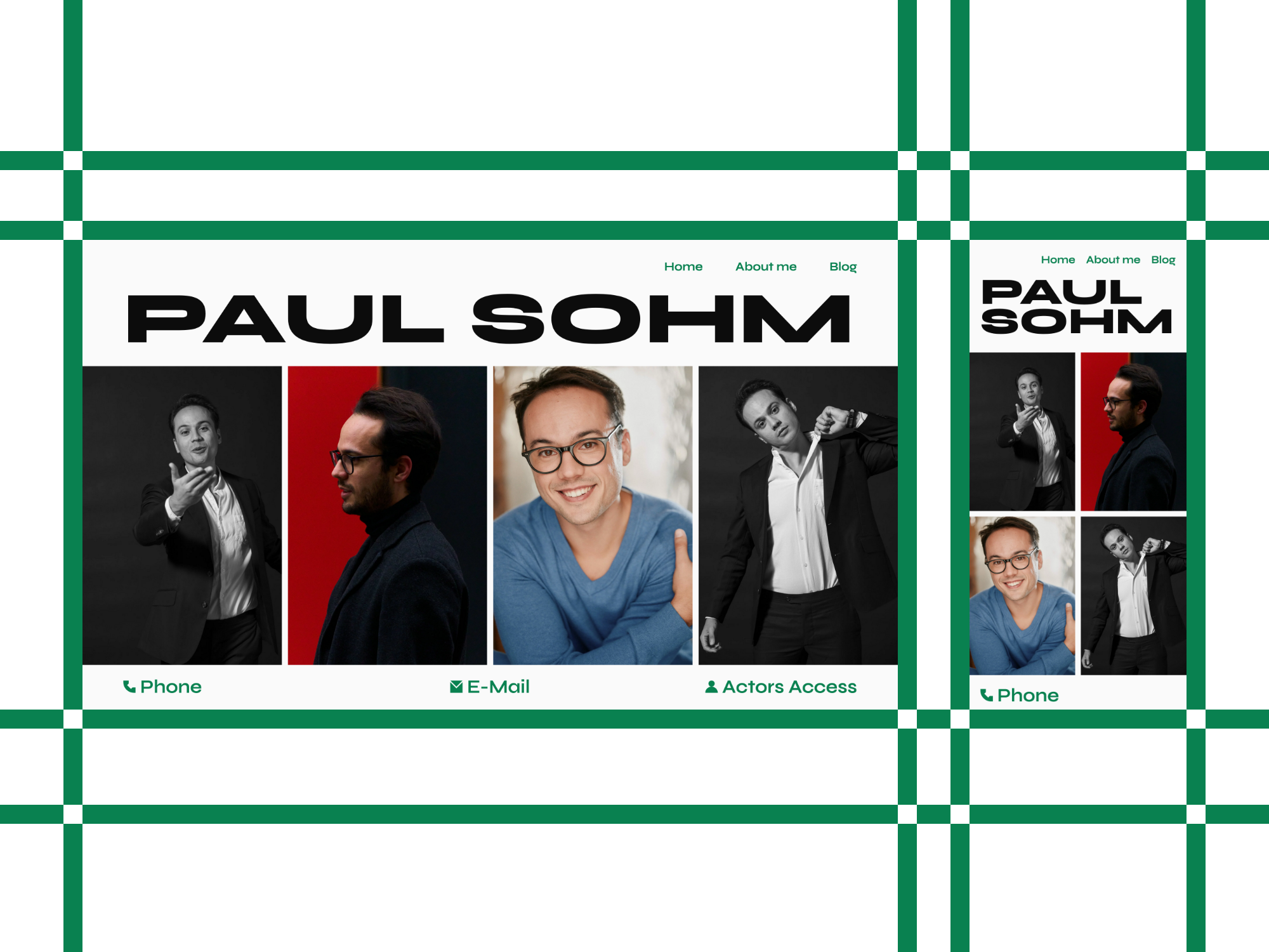
paulsohm.com
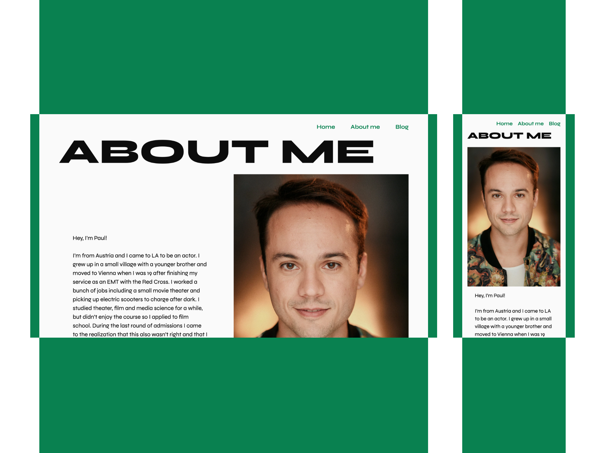
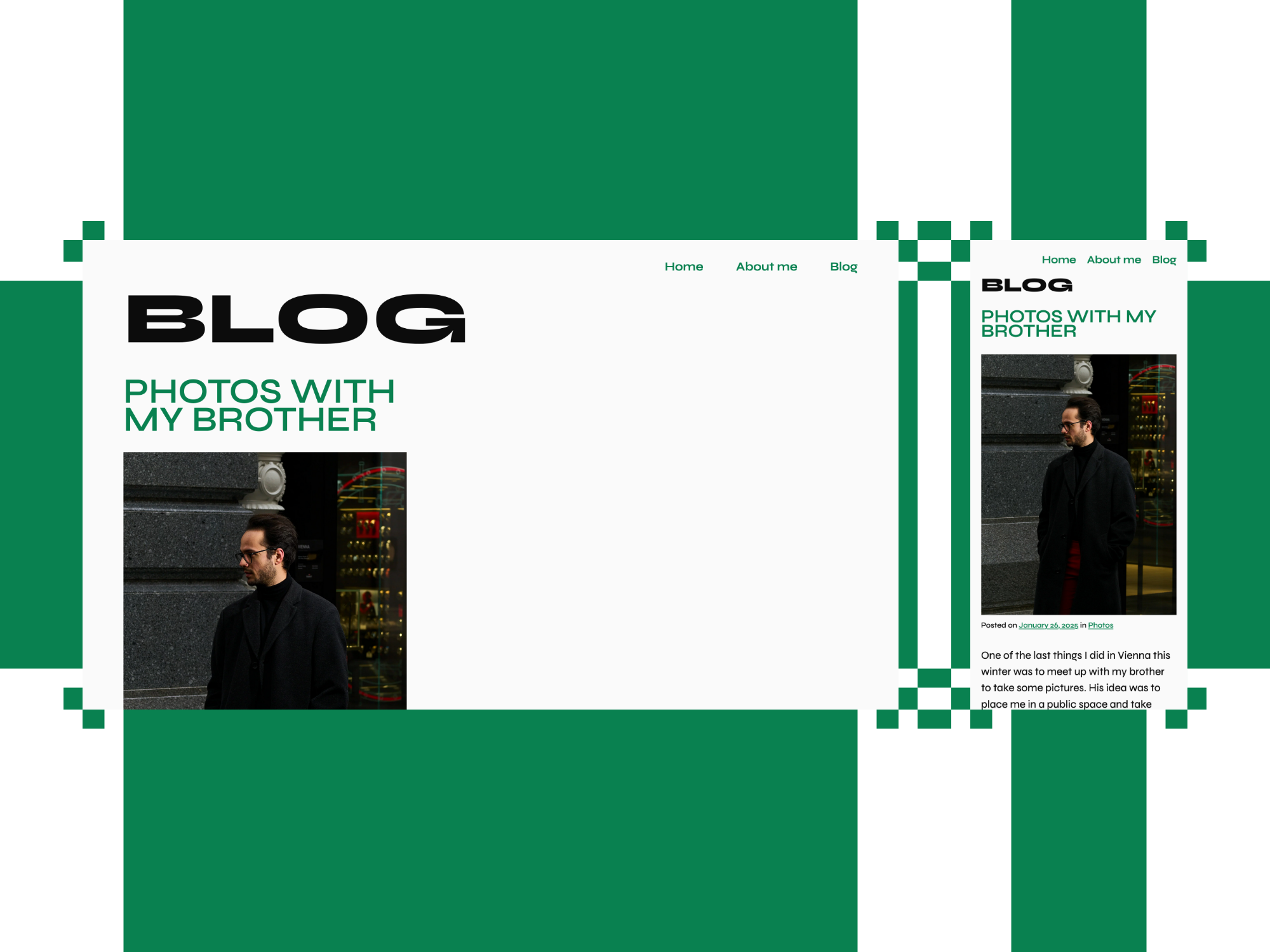
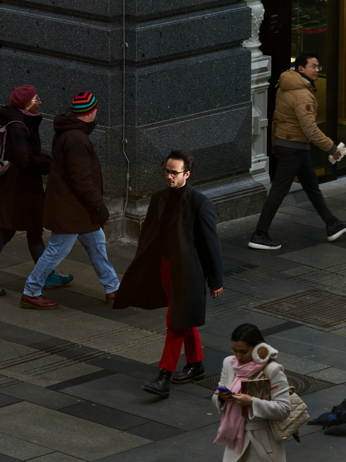
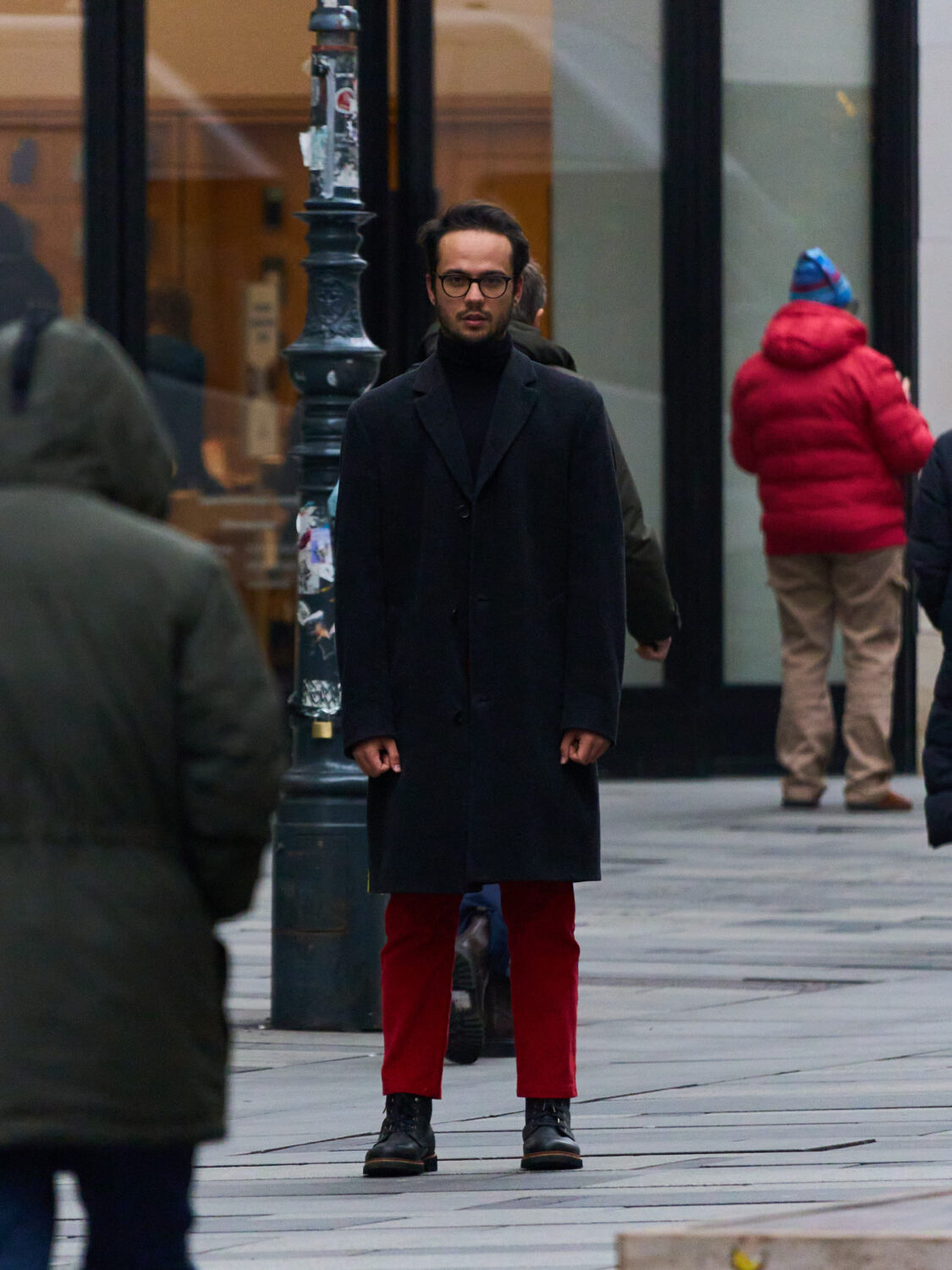
website and photos for my brother paul, who is an actor living in los angeles.
visit the website: paulsohm.com

rainbow media
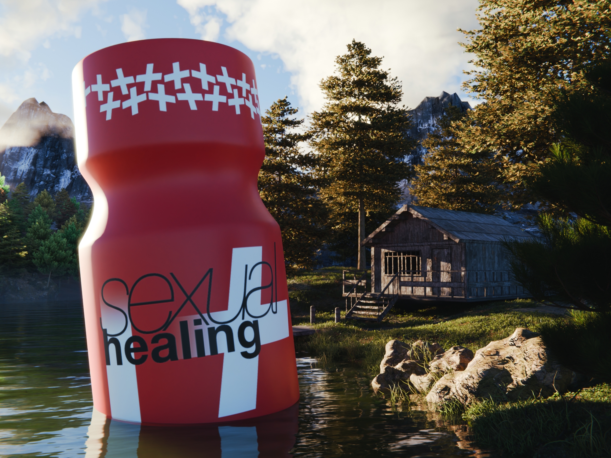
work from my employment as graphic designer at the lgbtqi+ focused marketing company rainbow media. in this time i redesigned two brands and their e-commerce sites, created new brandings, packaging designs, ad banners, social media posts and videos, illustrations and newsletters.
warning: mild sexual content ahead
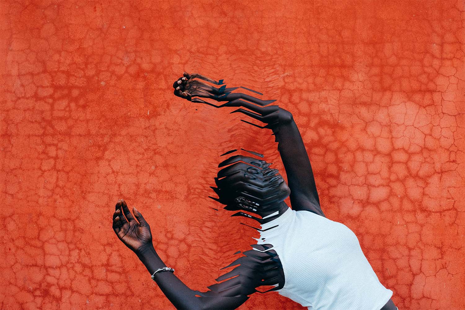
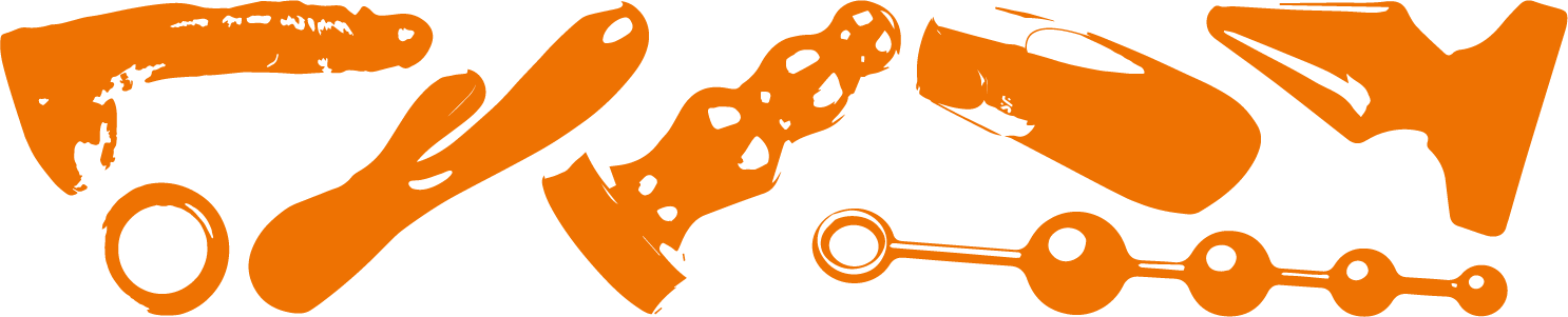
themes: fonts&lettering, identity, illustration, logo, print, product design, ui/ux, web
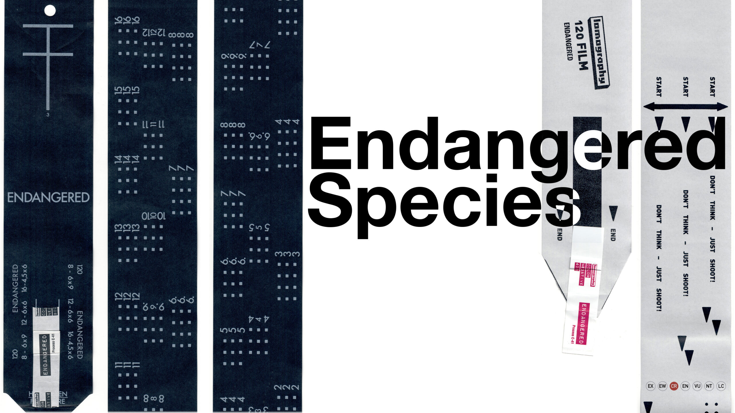
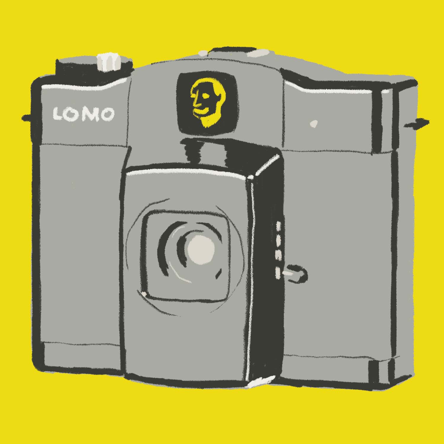
lomography
work from my employment as digital designer at the photographic equipment retailer lomography. in this time i created product identities, ad banners, social media posts and animations, illustrations and newsletters.
themes: animation, fonts&lettering, identity, illustration, logo, lomography, motion design, poster, print
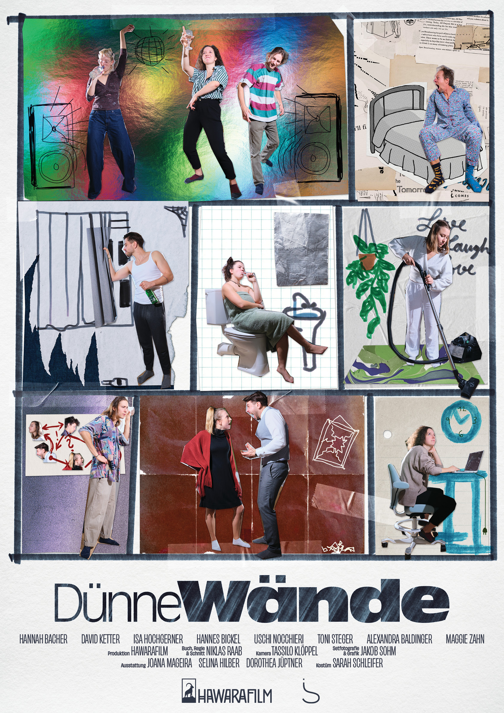
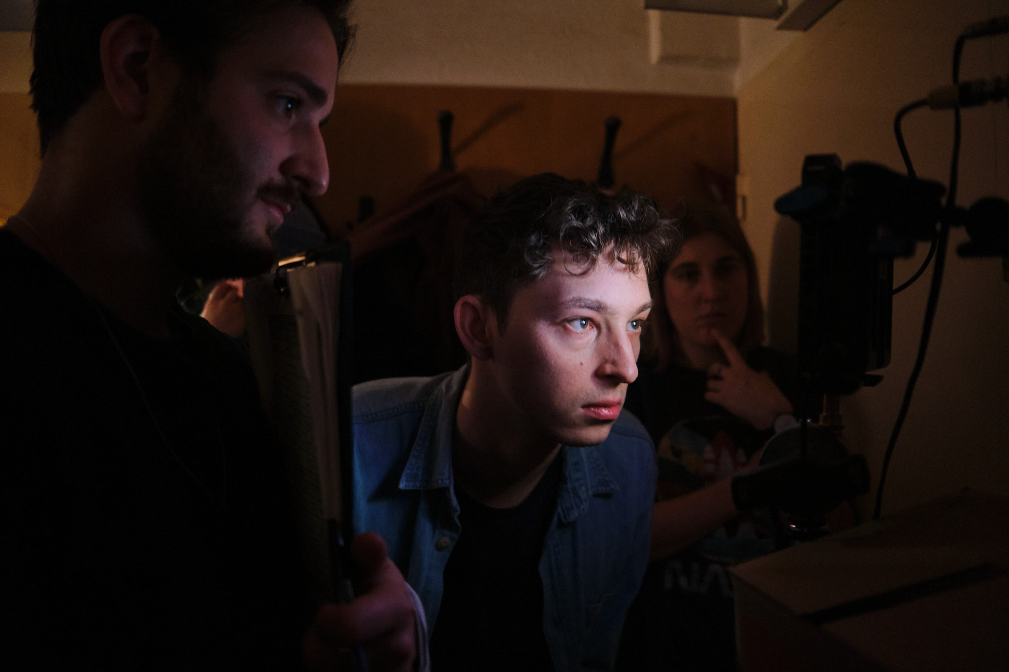
dünne wände
graphic design and set photography for „dünne wände“ (thin walls), a short film about how city residents affect, annoy, anger each other — through their walls.
written and directed by niklas raab. read more about the film on hawarafilm.com
the poster was designed to look like a collage — a reference to the home improvement intro
read the project folder and admire the design here
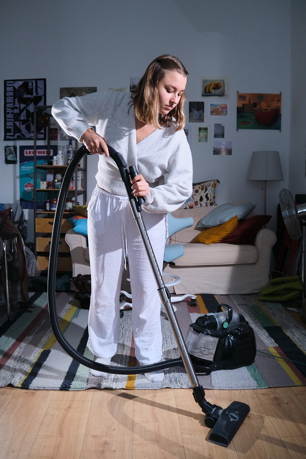
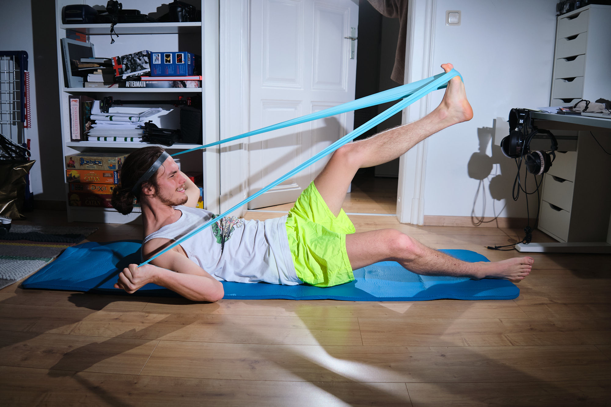
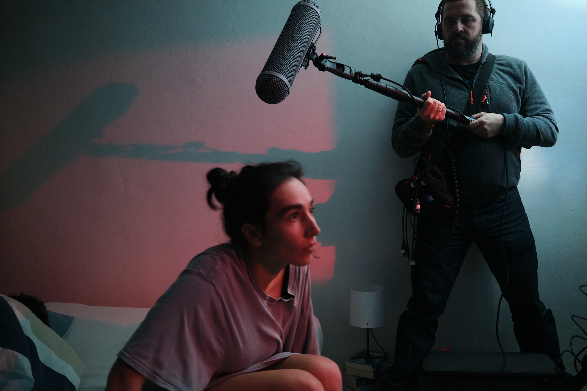
themes: portrait, poster, print, short film, vienna
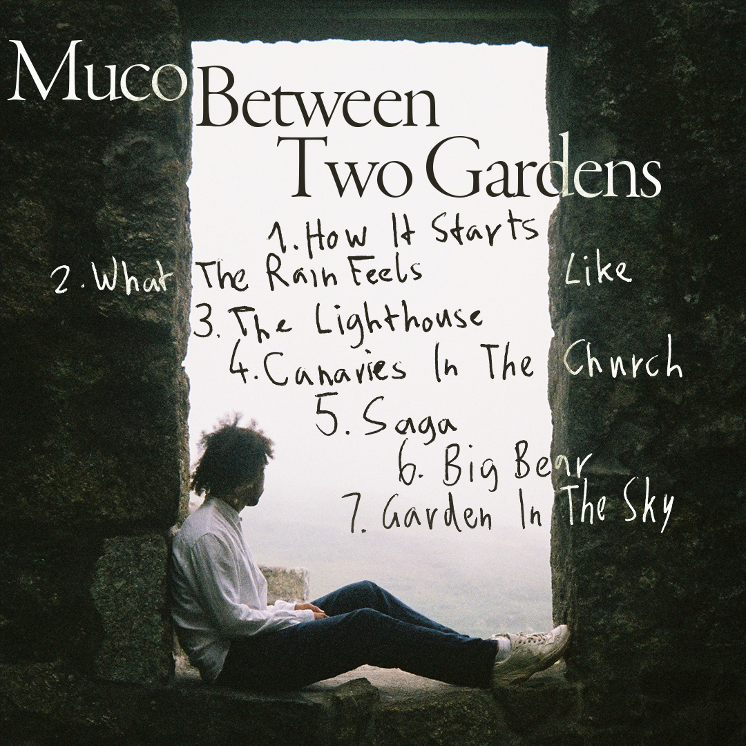
between two gardens
tracklist and concert announcement design for social media, for the artist muco
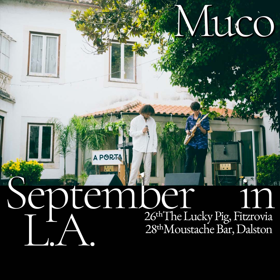
themes: fonts&lettering, muco, music
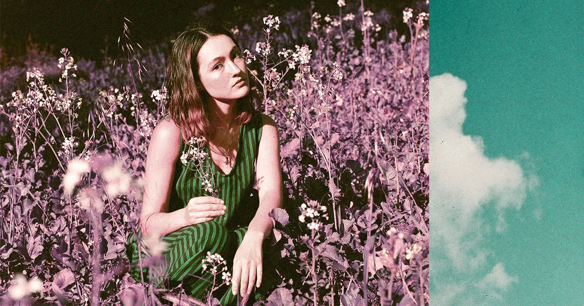
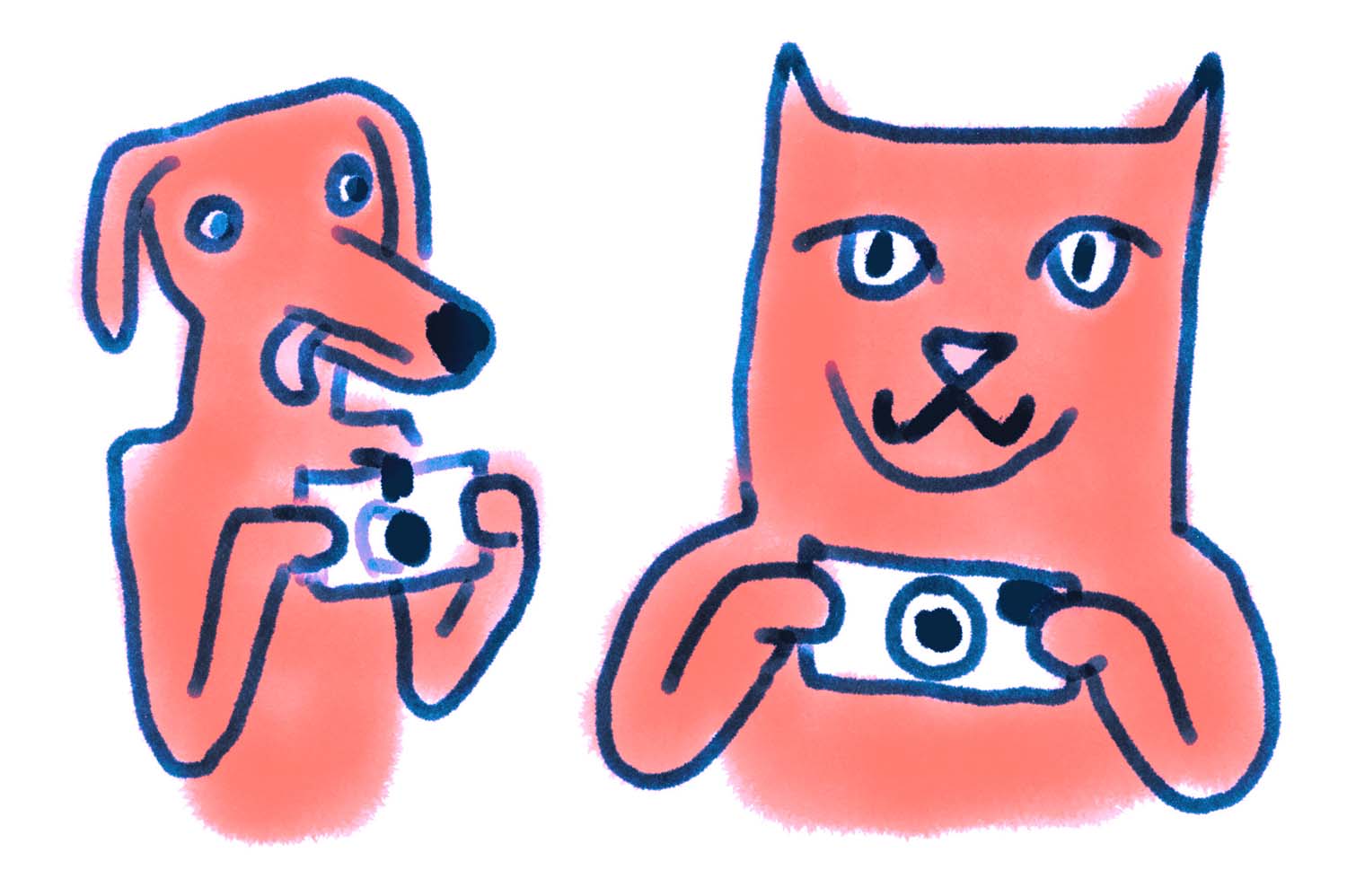
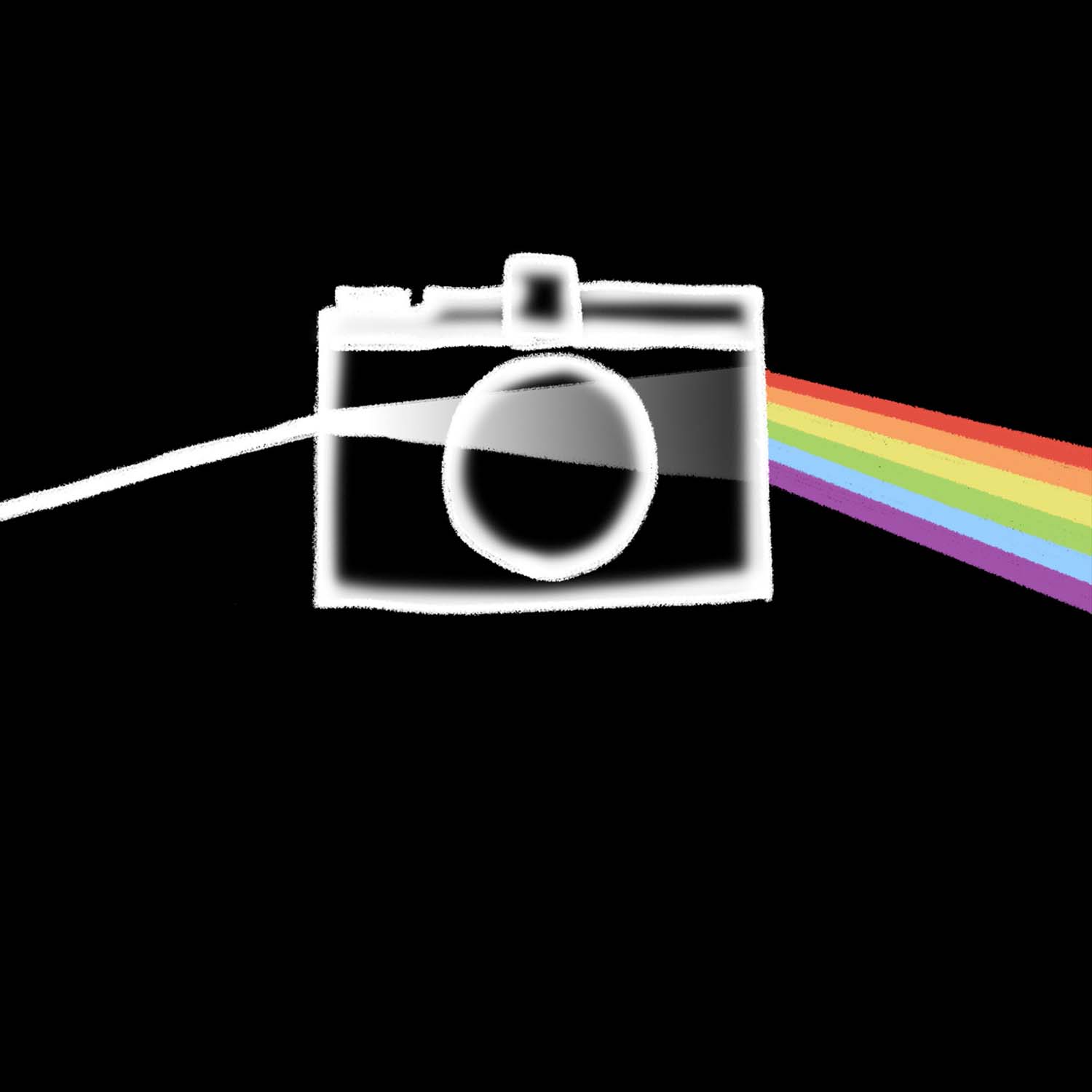
lomo illustrations
at lomography, i made a lot of illustrations for a wide range of applications: newsletters, banners, magazine articles, and social media posts. sadly most of these were never utilized to the extent i had hoped.
themes: animation, illustration, lomography, motion design
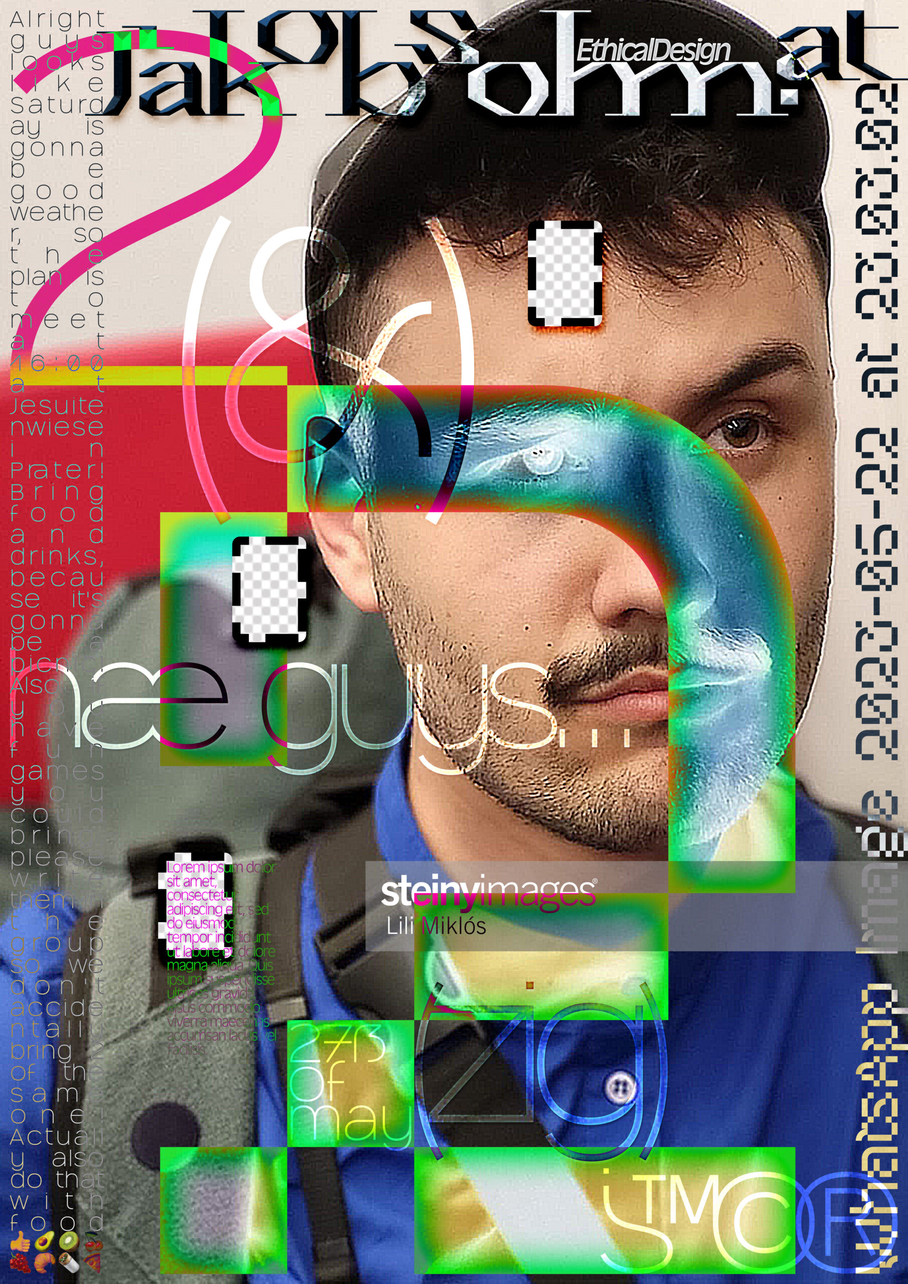
poster for my twenty-second birthday
for my 22nd birthday, i decided to make a fun little poster to commemorate the occasion. for my birthday, i wished for everyone to make me a drawing or artwork, and the best three would win a poster.

themes: fonts&lettering, friends, personal, poster, print, vienna

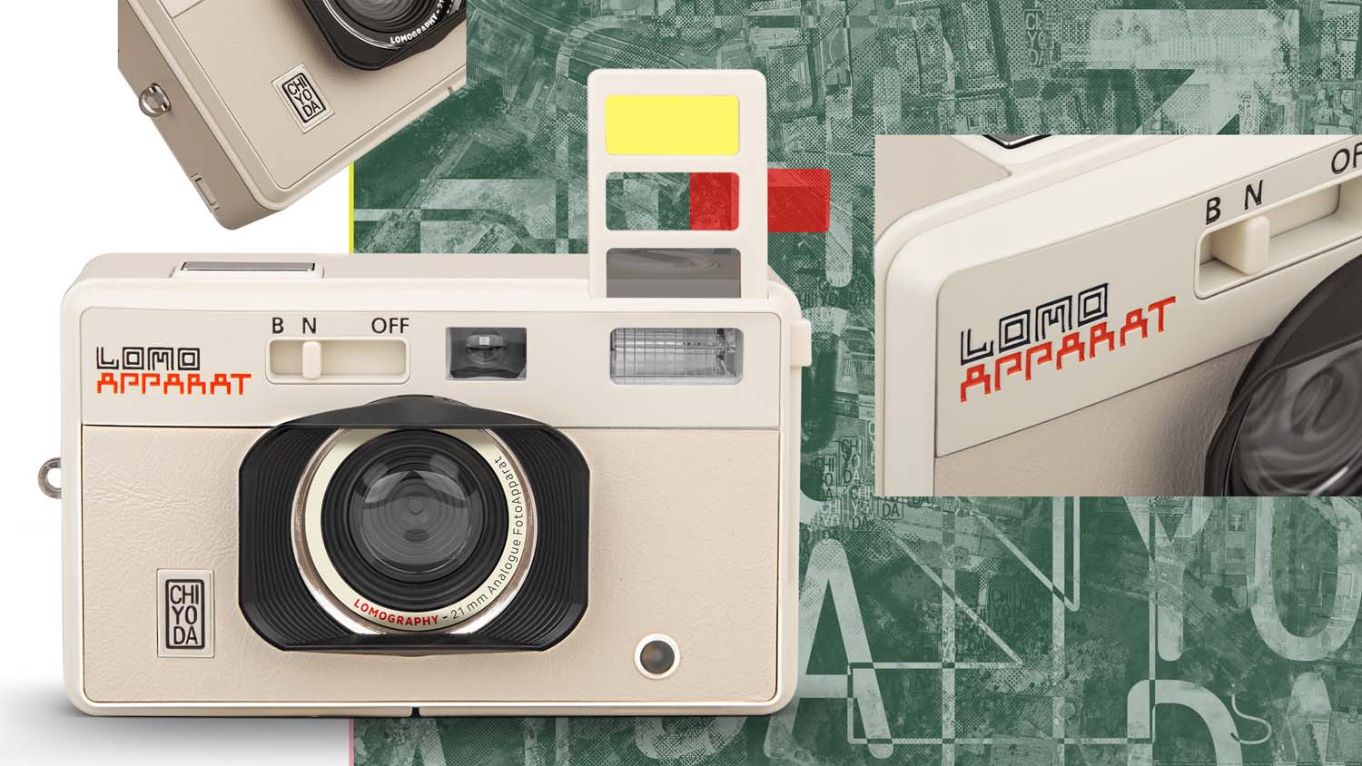
lomoapparat chiyoda
accompanying visual system for the lomoapparat chiyoda, a special edition of the lomoapparat point and shoot camera.

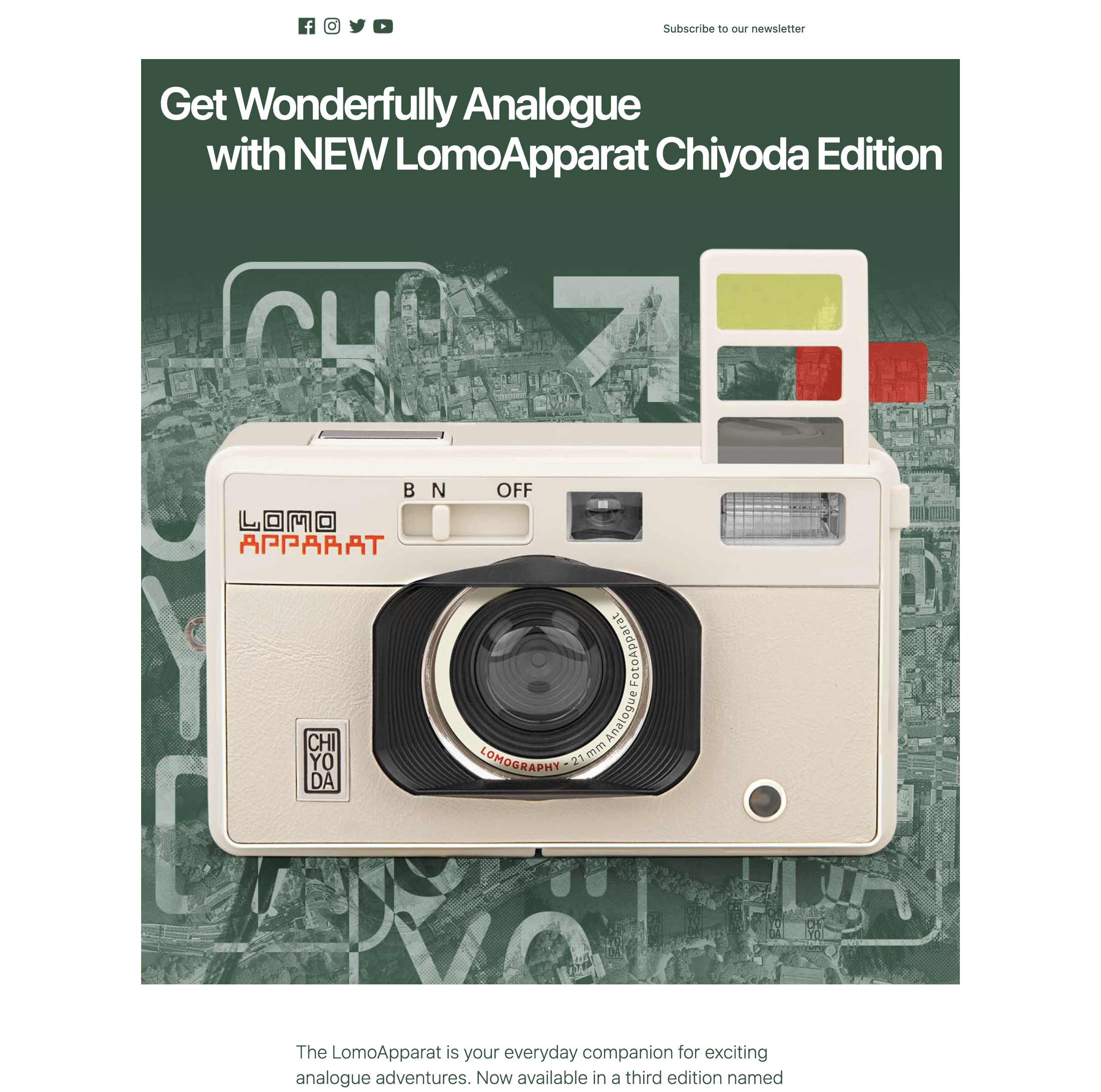
themes: identity, lomography
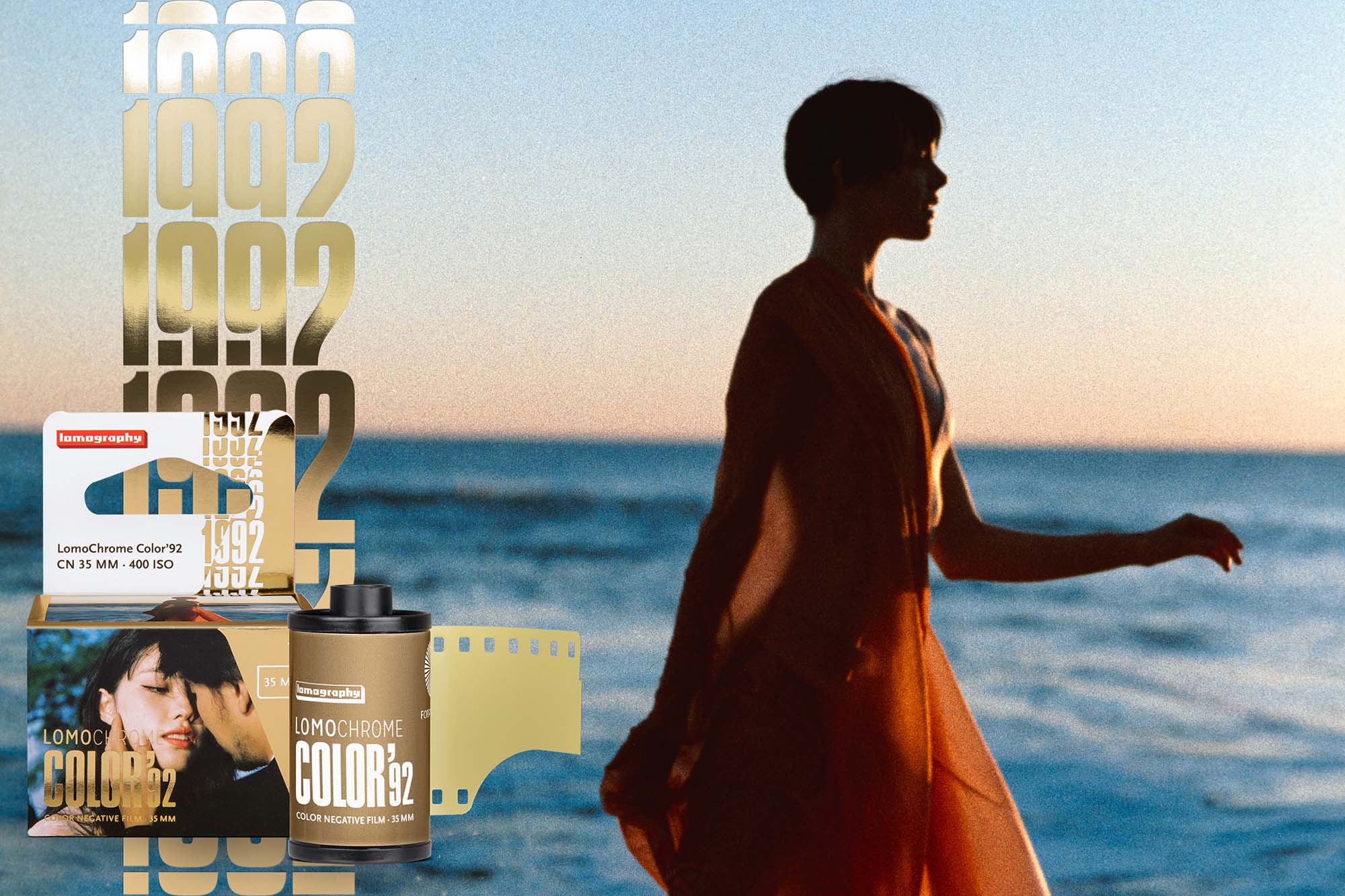
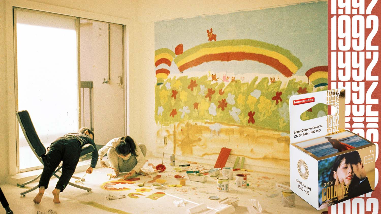
lomochrome ’92
animated logo and superrealistic gold effect for lomography’s newest film “lomochrome ’92”, mimicking the gold foil of the packaging. this attention grabbing effect and smooth animation were used for social media, advertisements and newsletters.

themes: fonts&lettering, identity, lomography, motion design