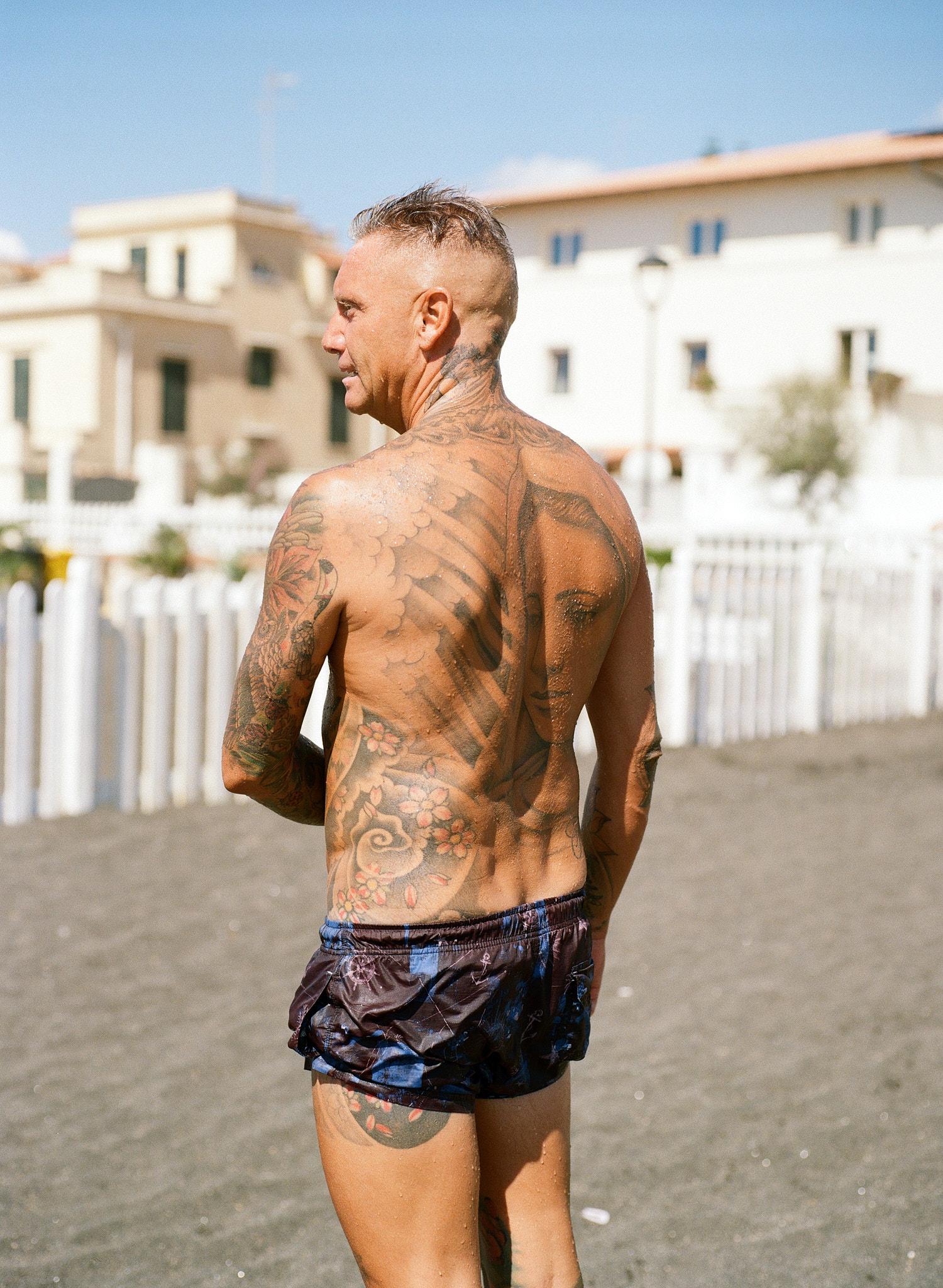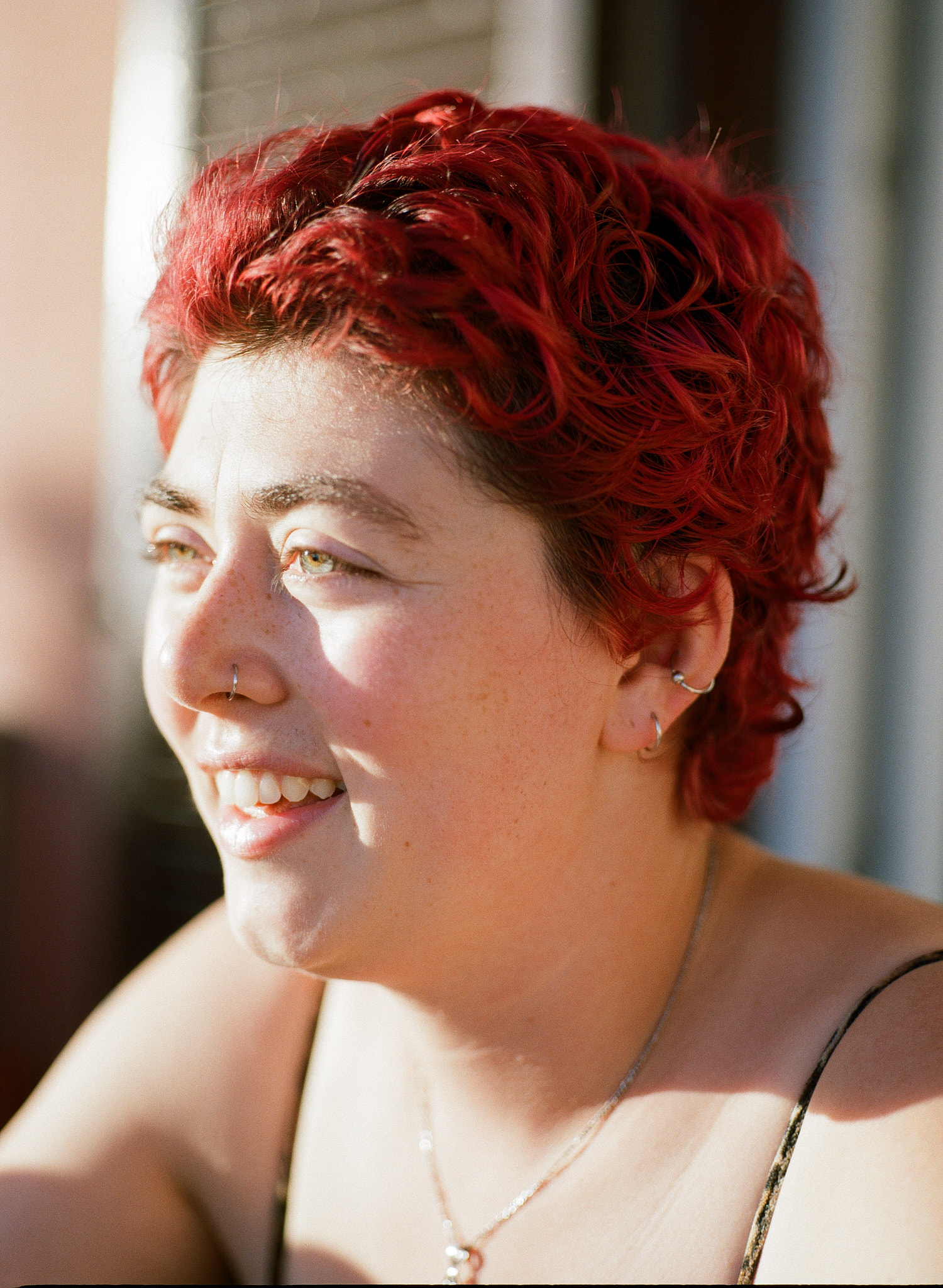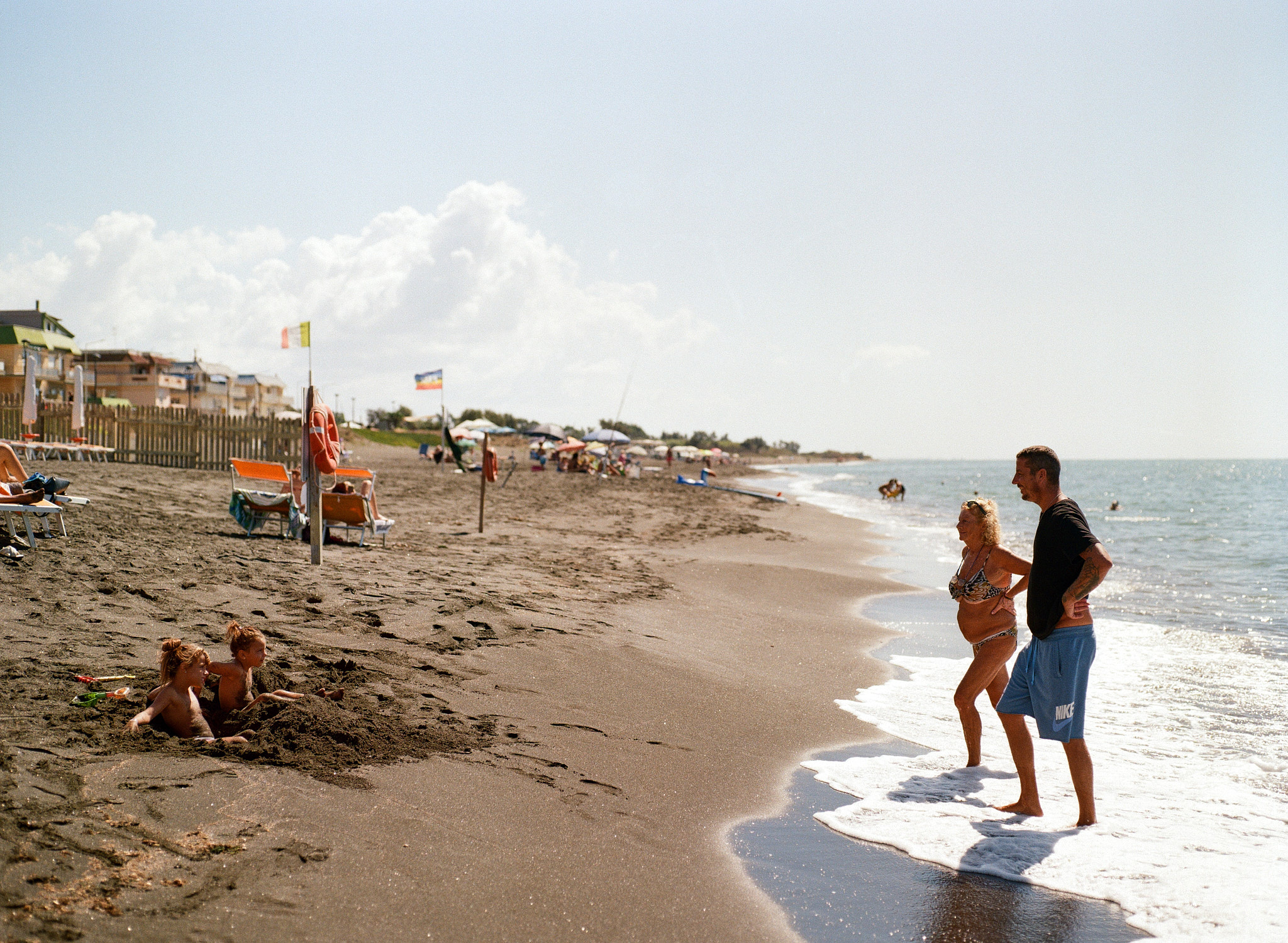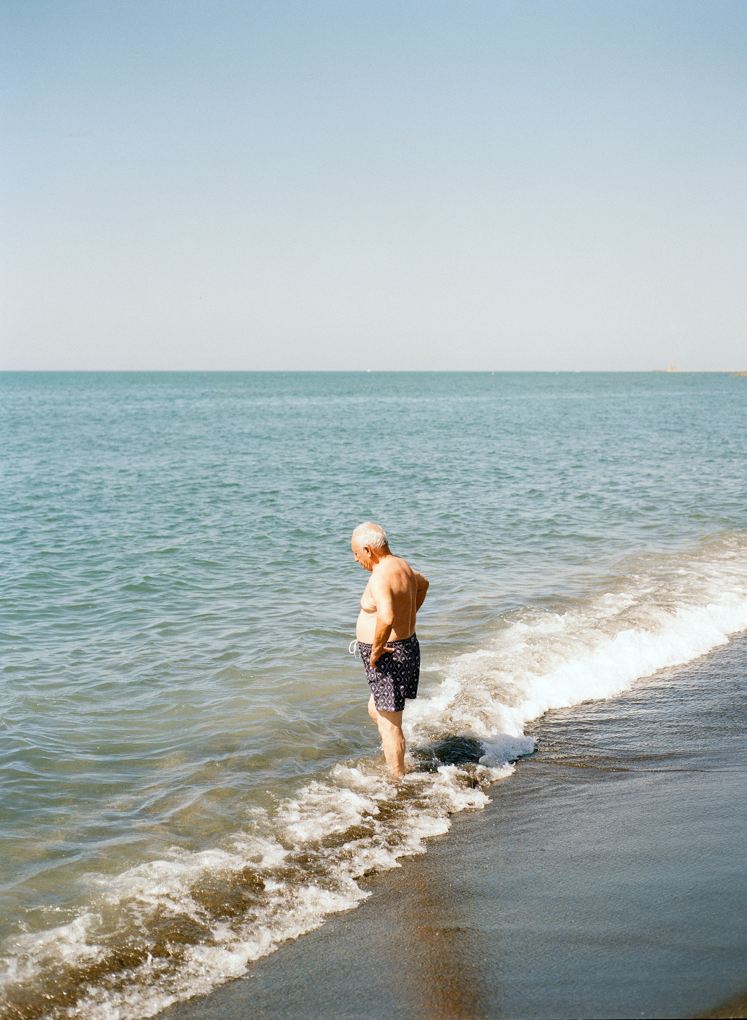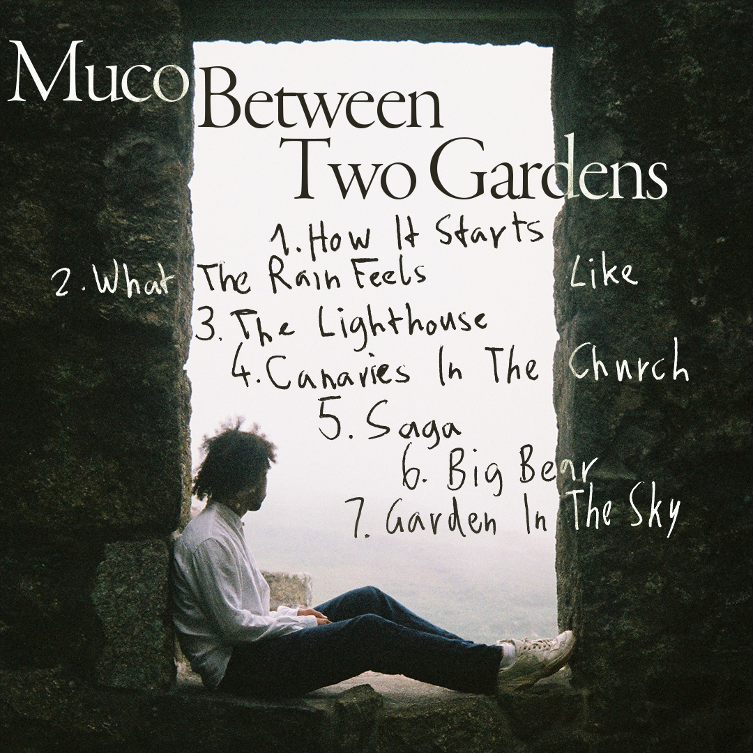
between two gardens
tracklist and concert announcement design for social media, for the artist muco
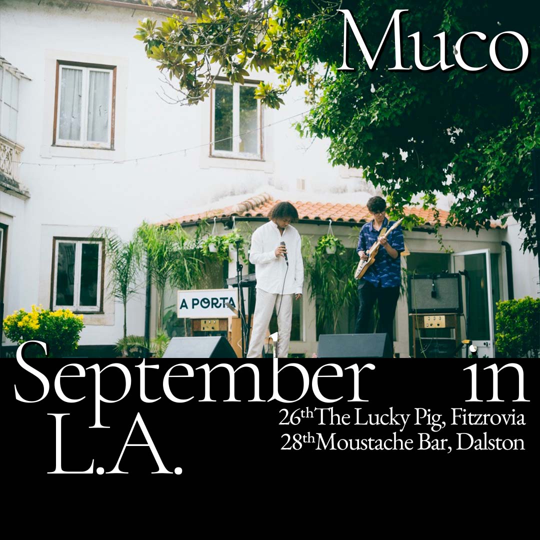
themes: fonts&lettering, muco, music
docu magazine
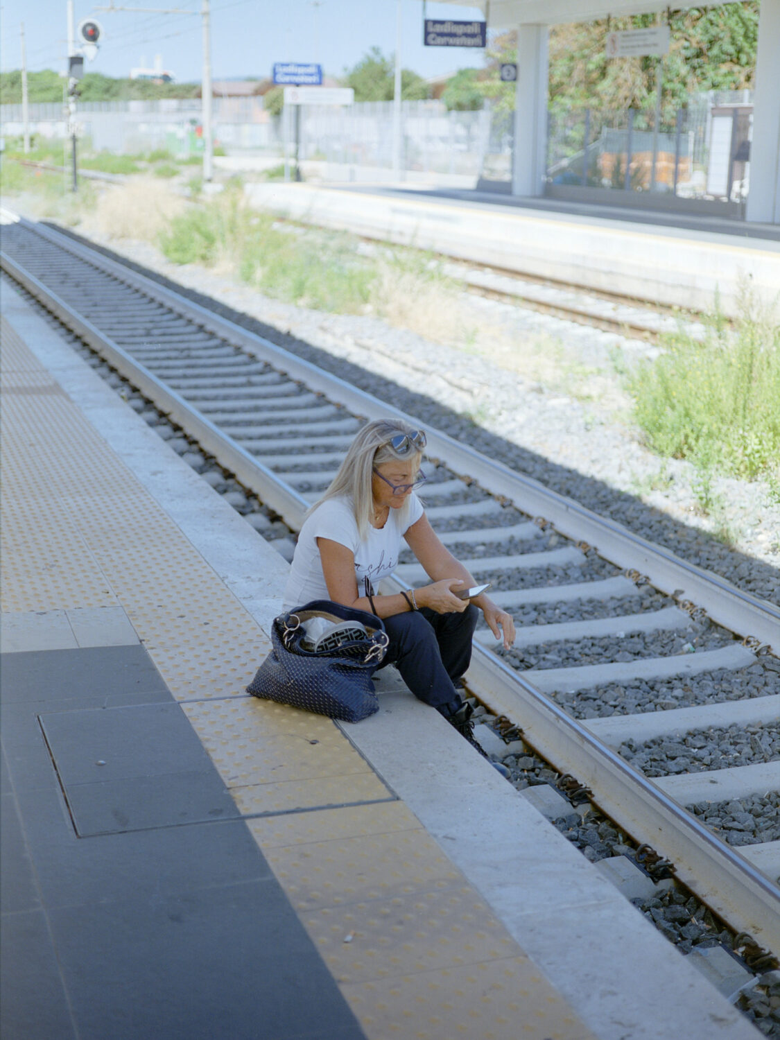
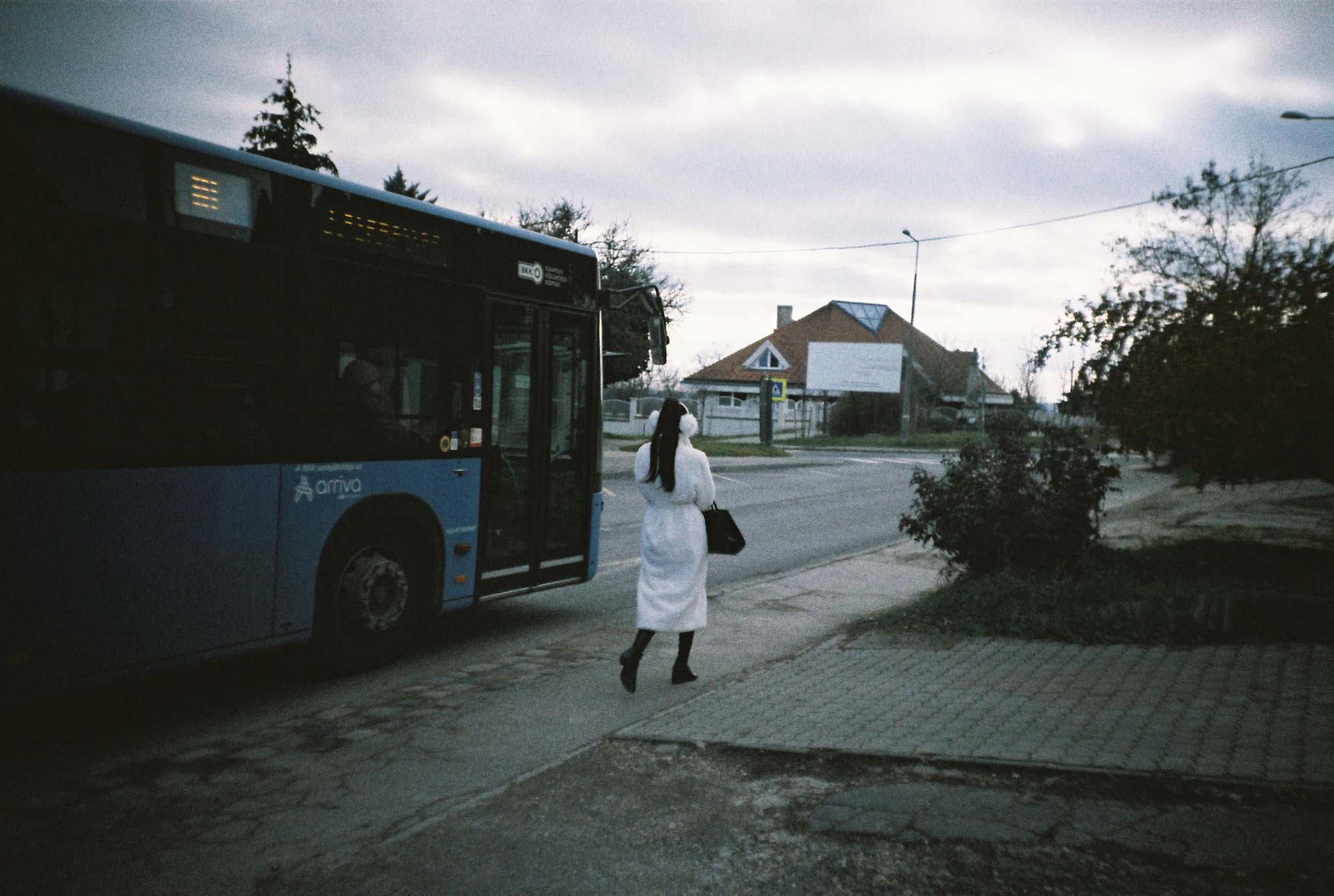
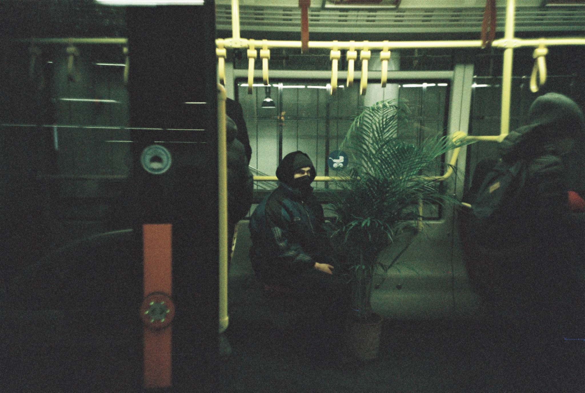
2 photographs and an interview published in vol. 35 of docu books. docu magazine is a non-profit organization for documentary and street photography.
marmorstein jewelry
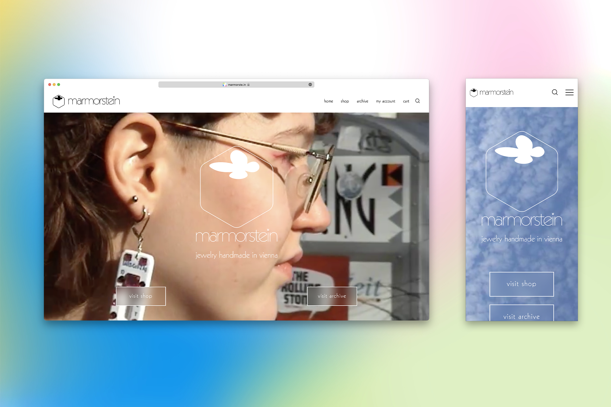
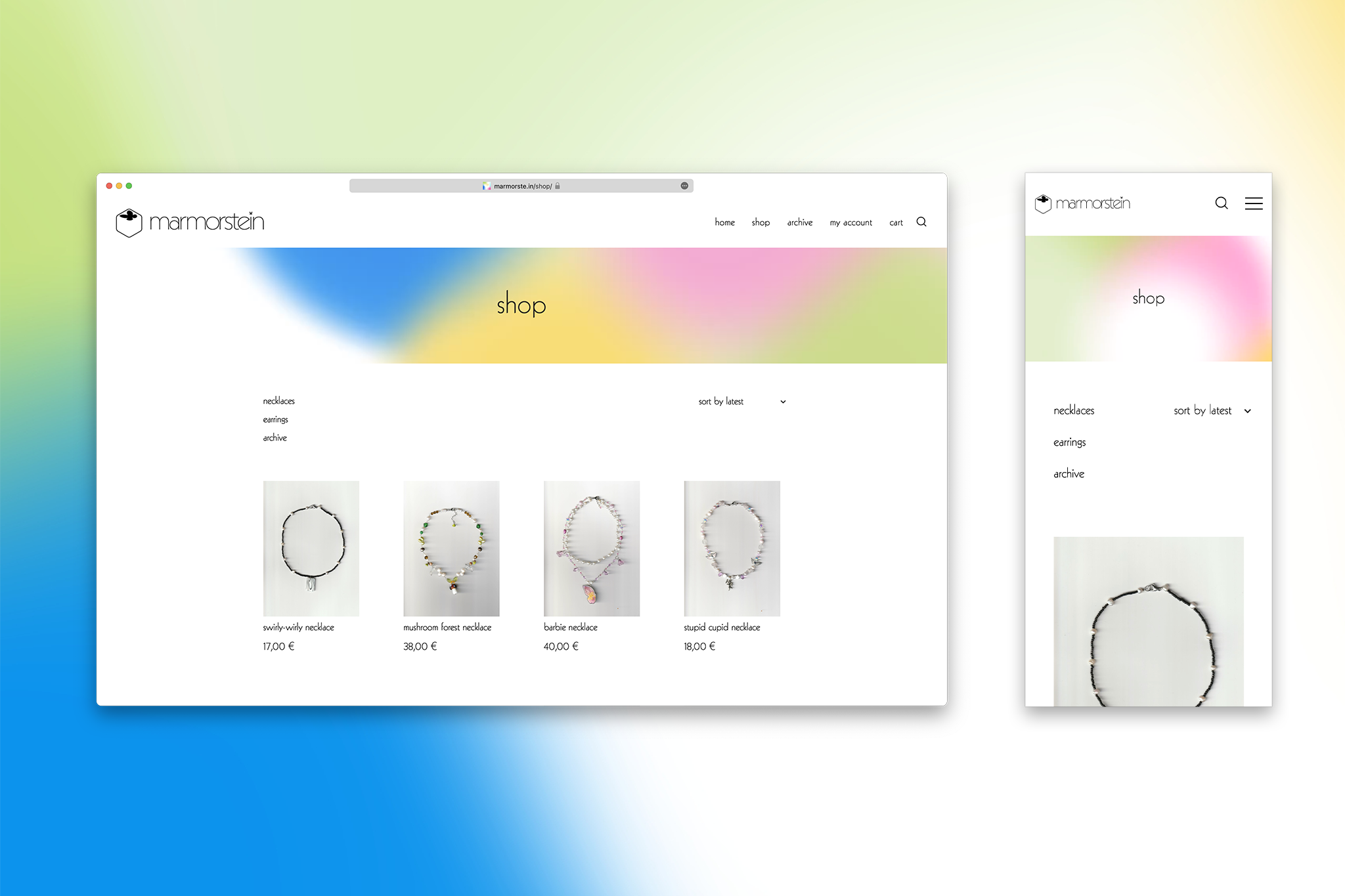
identity, graphic design, business card, customized font, videography, website design with shop and programming for marmorstein jewelry. for the shop, visit marmorste.in (web archive link)
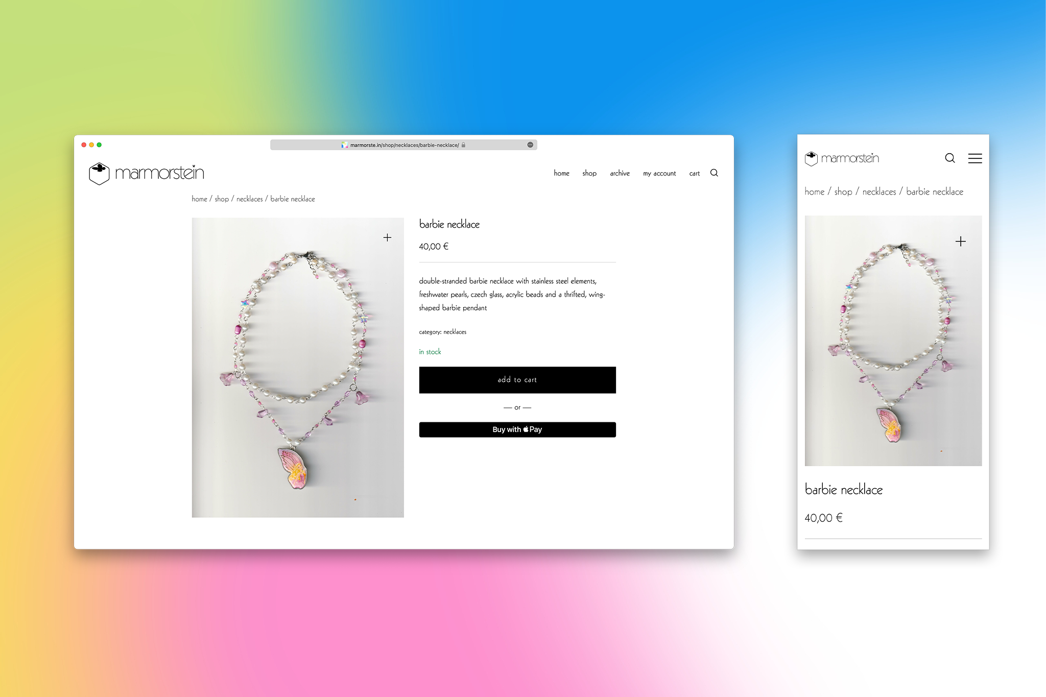
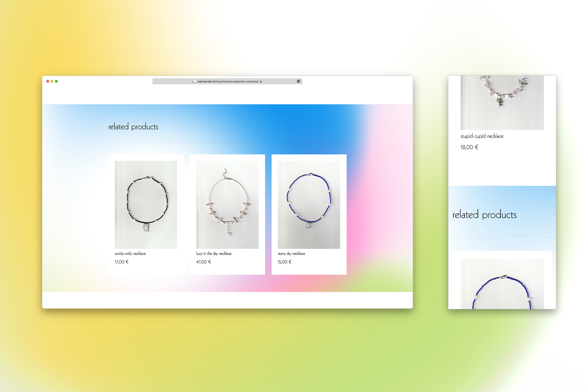
themes: fonts&lettering, identity, logo, motion design, ui/ux, web

ligne sans
a geometric sans-serif typeface with a uniform line-like thickness, very high x-height and custom ligatures. this website is set in ligne sans.
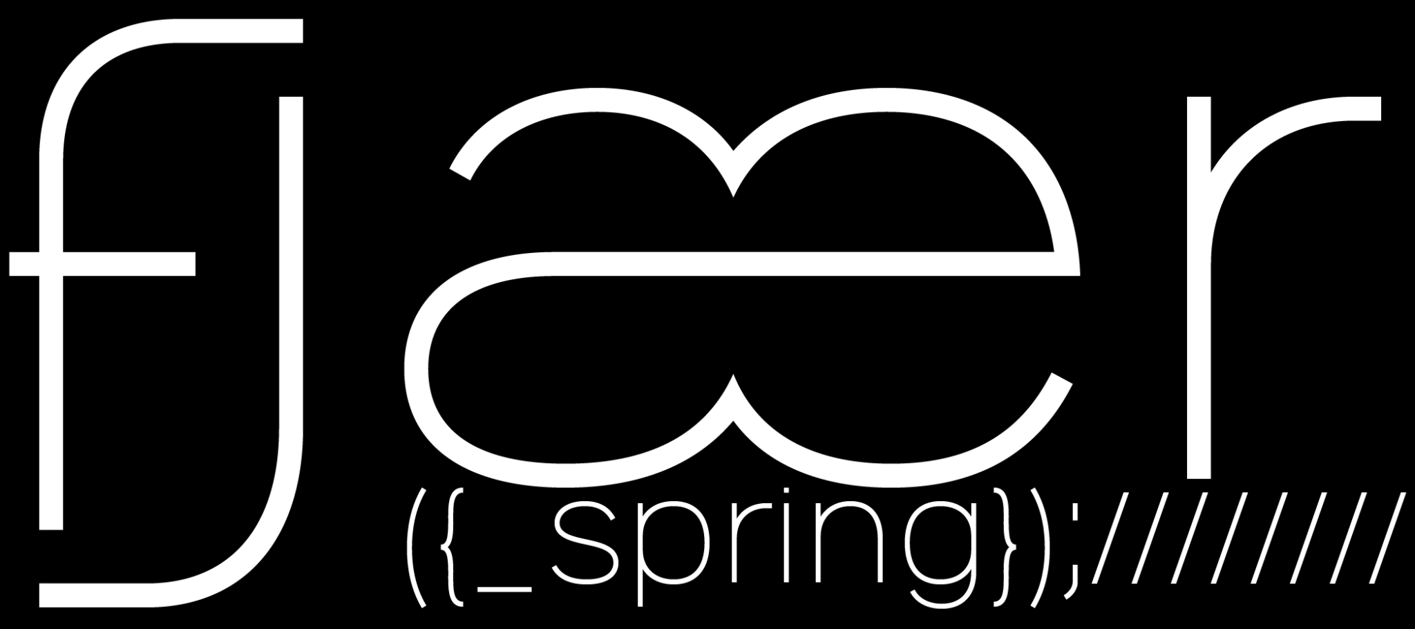

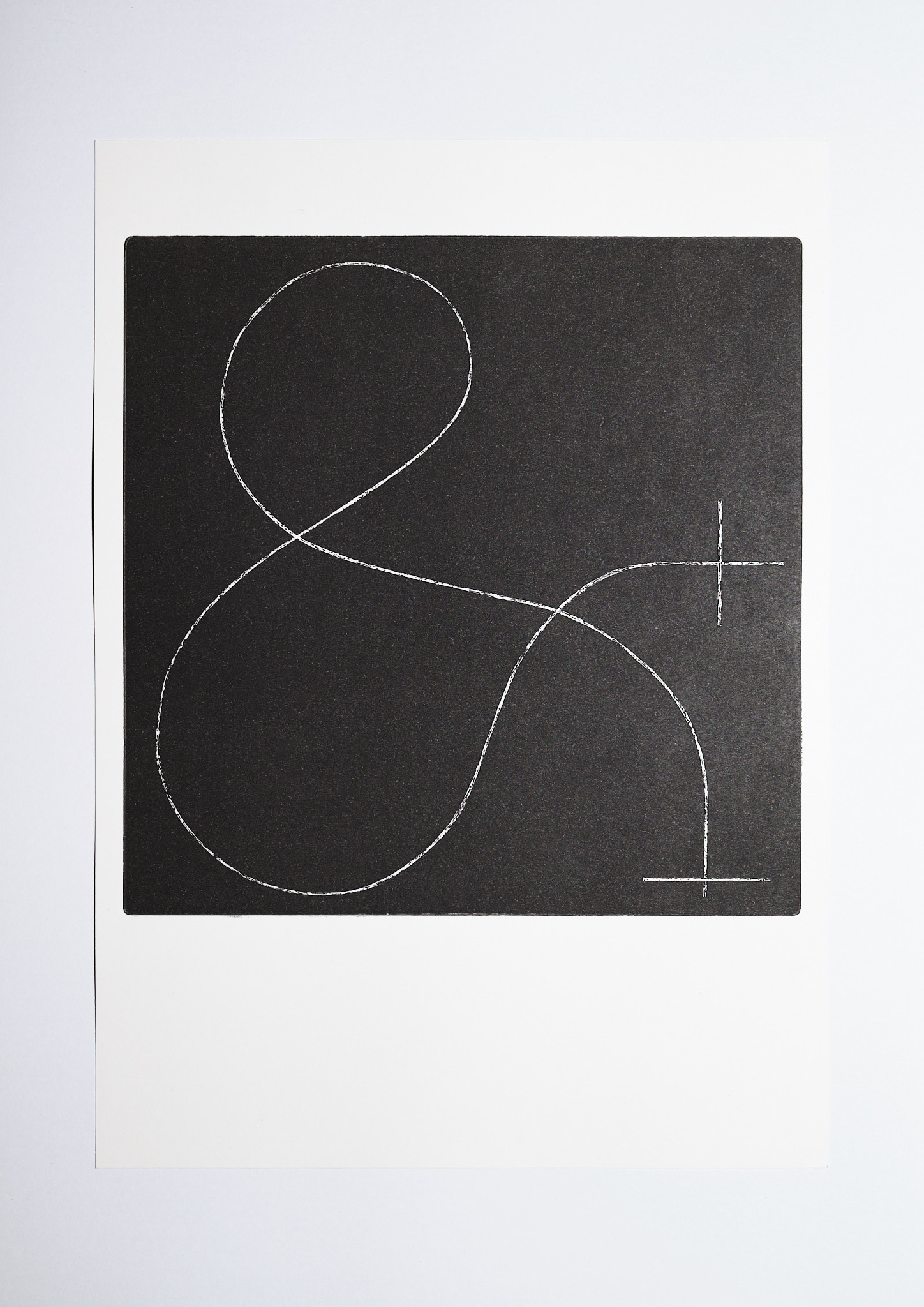
ligne sans was based on a series of ampersand prints.
contact me to purchase.
themes: fonts&lettering, print
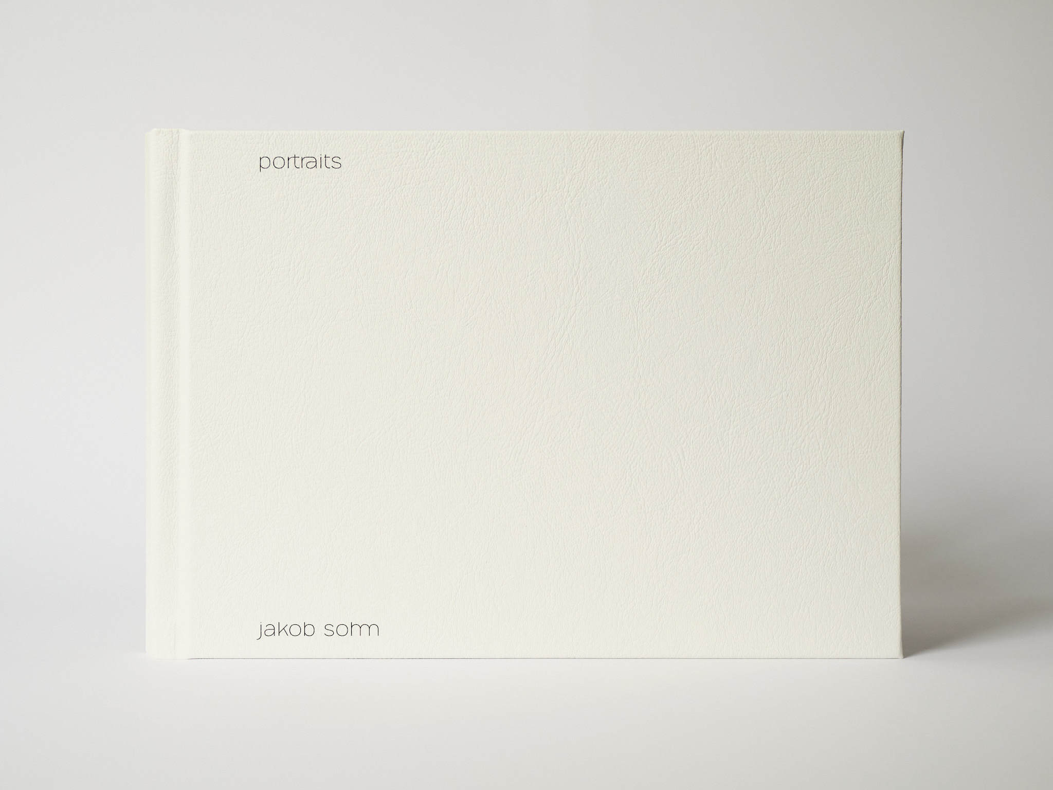
portraits book
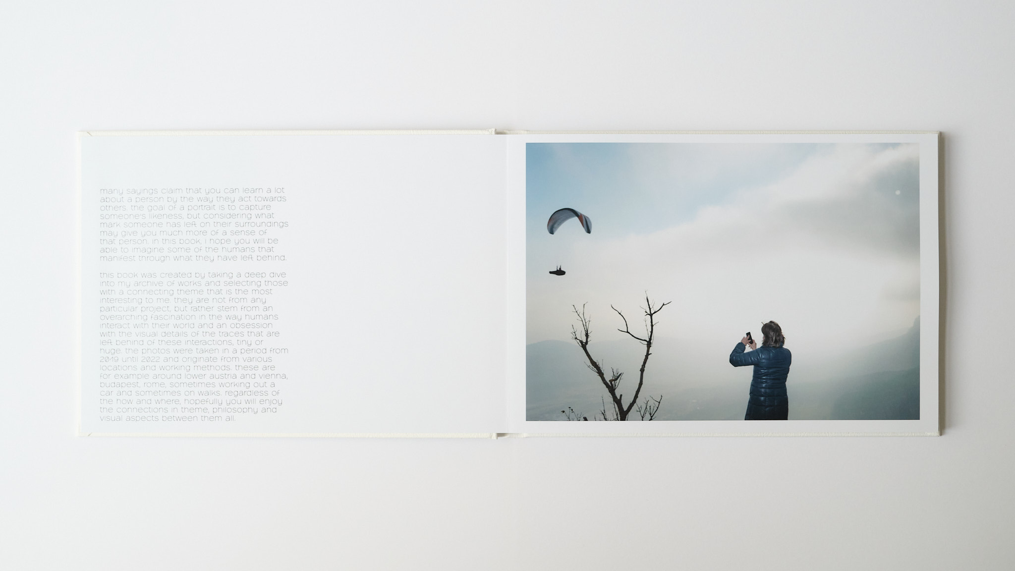
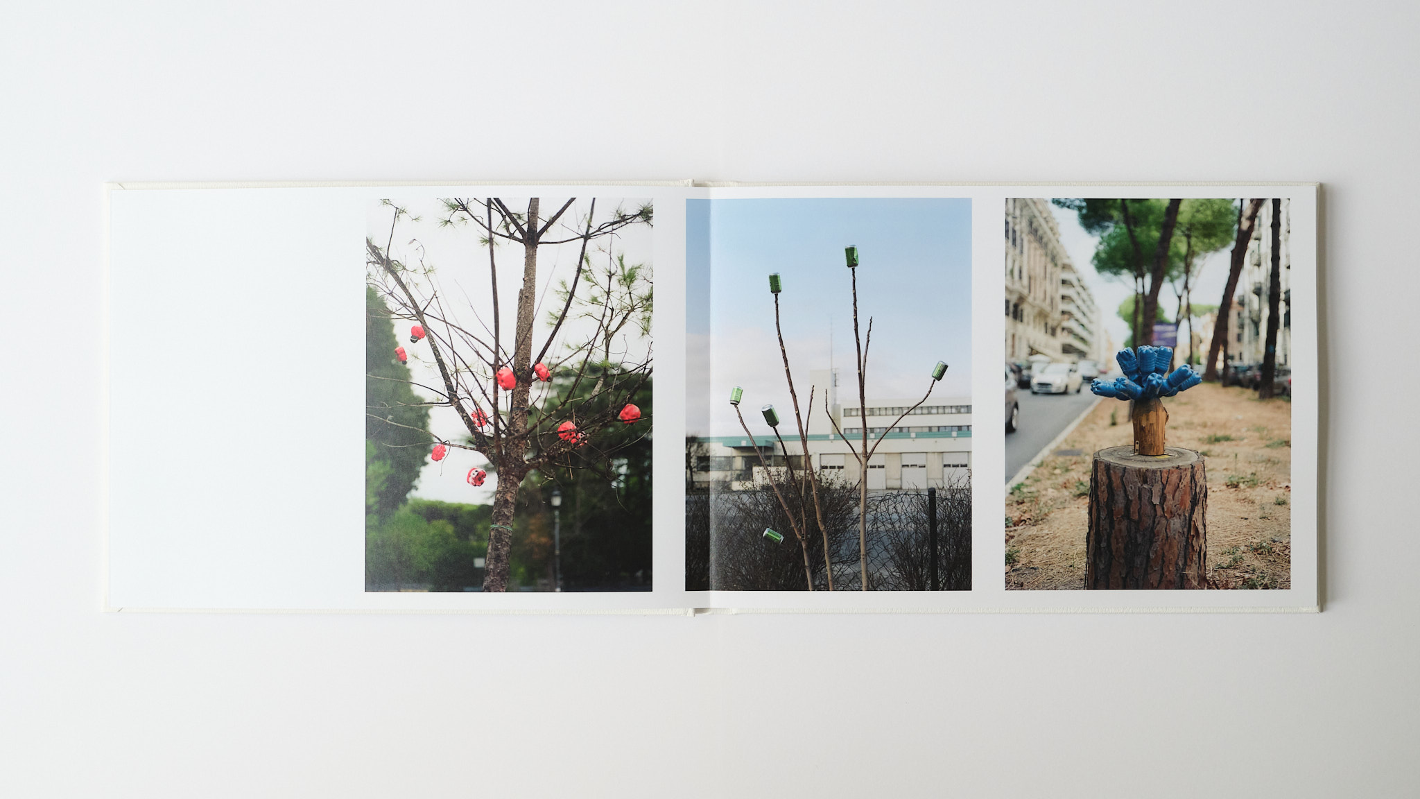
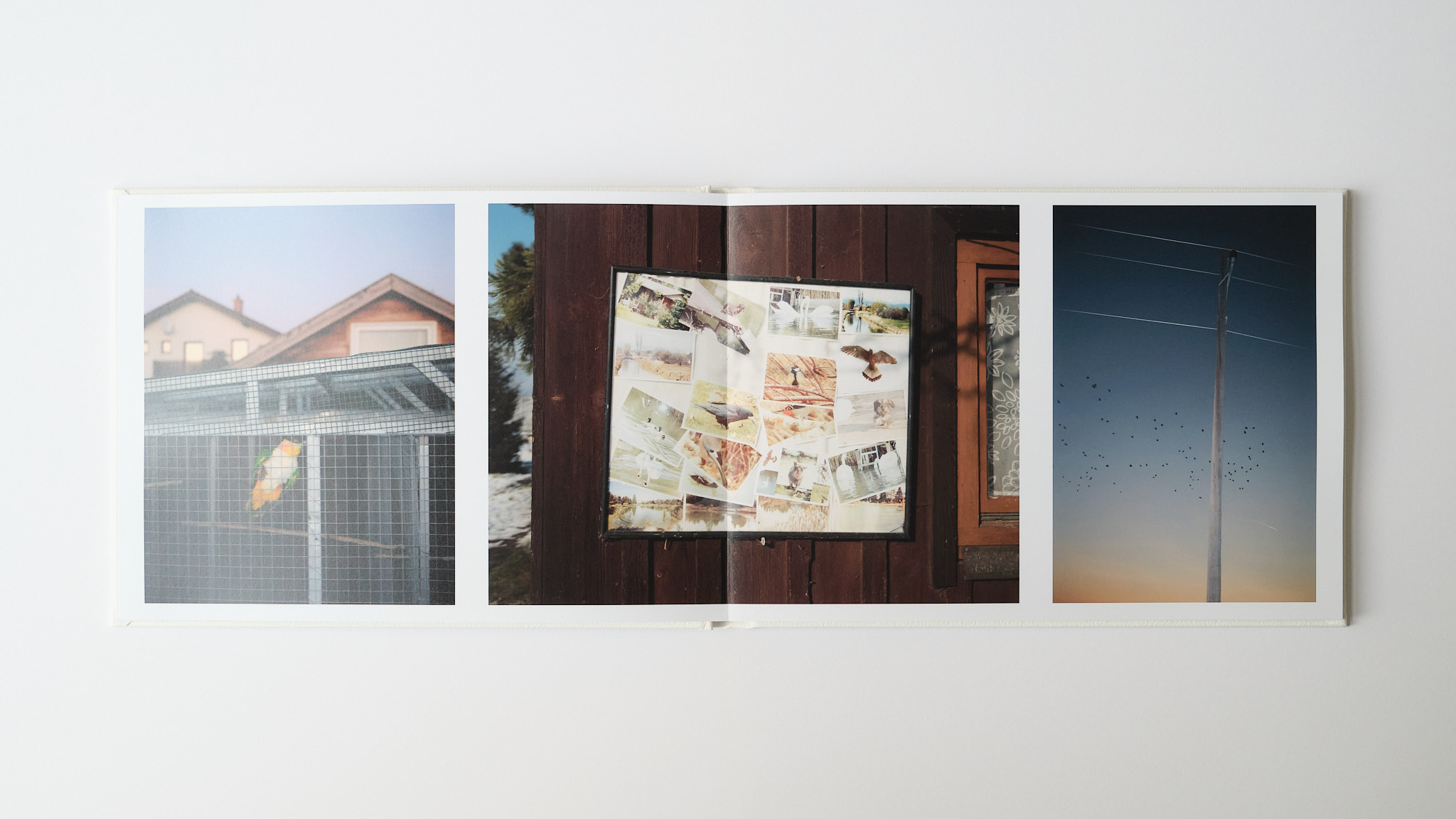
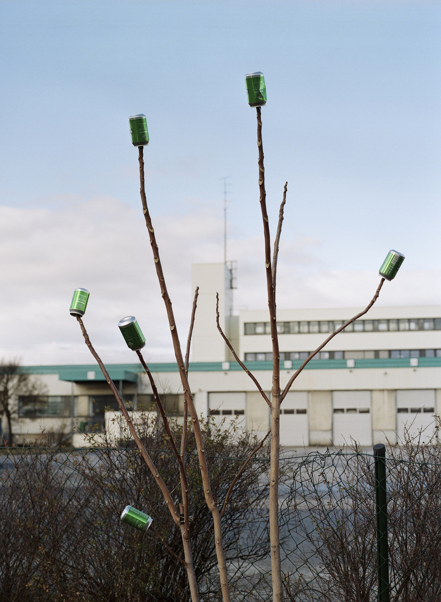
this book is about the ways in which people inadvertently leave their mark on our shared environment. it comprises pictures made with an interest in lost, left, broken, repaired or otherwise changed objects and environments.
contact me to purchase.

themes: print
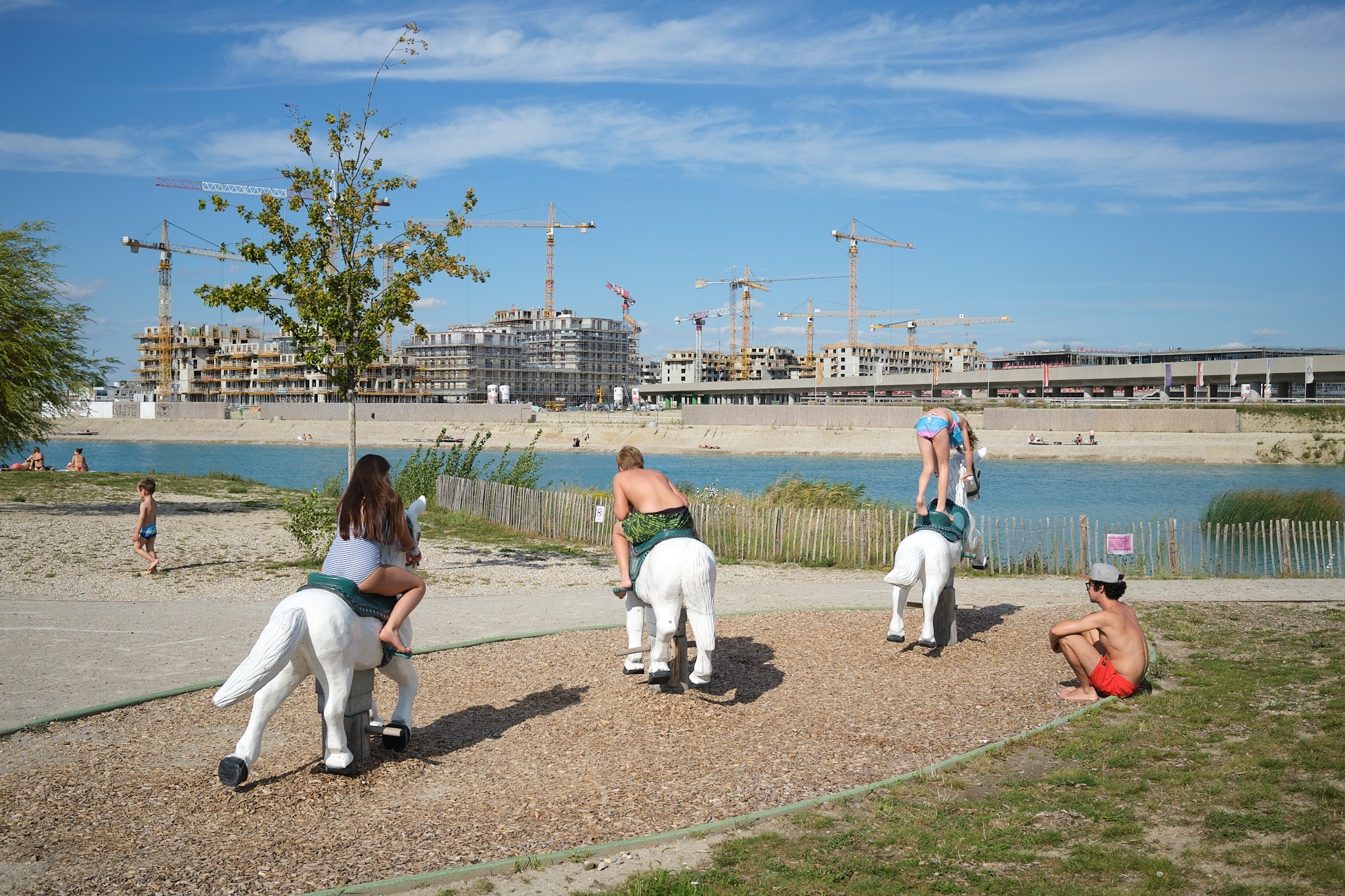
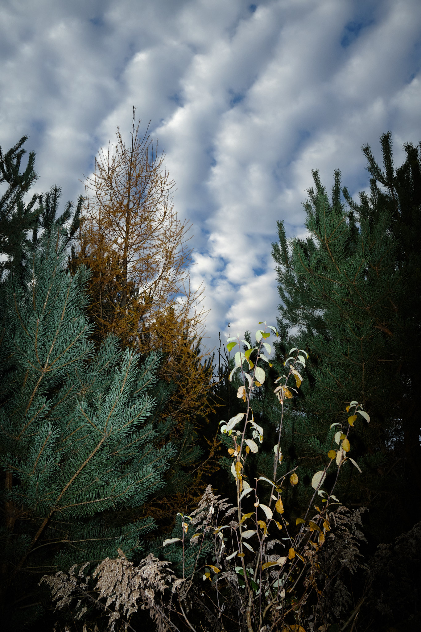
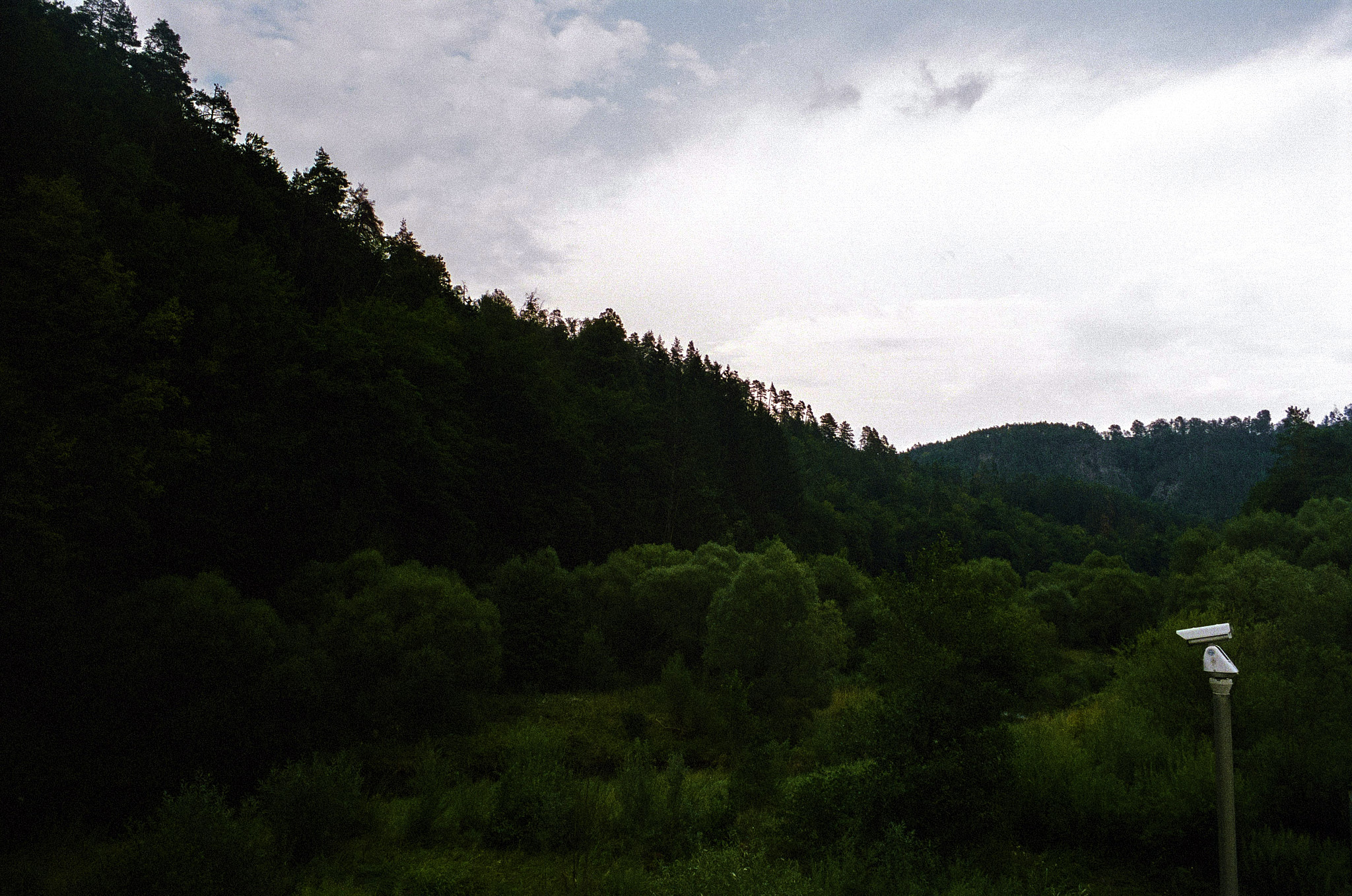
“rethinking nature” exhibition at foto wien
selected photos on the topic of nature, exhibited on 9.-27. march 2022
read more about the exhibition on fotowien.at (internet archive link)
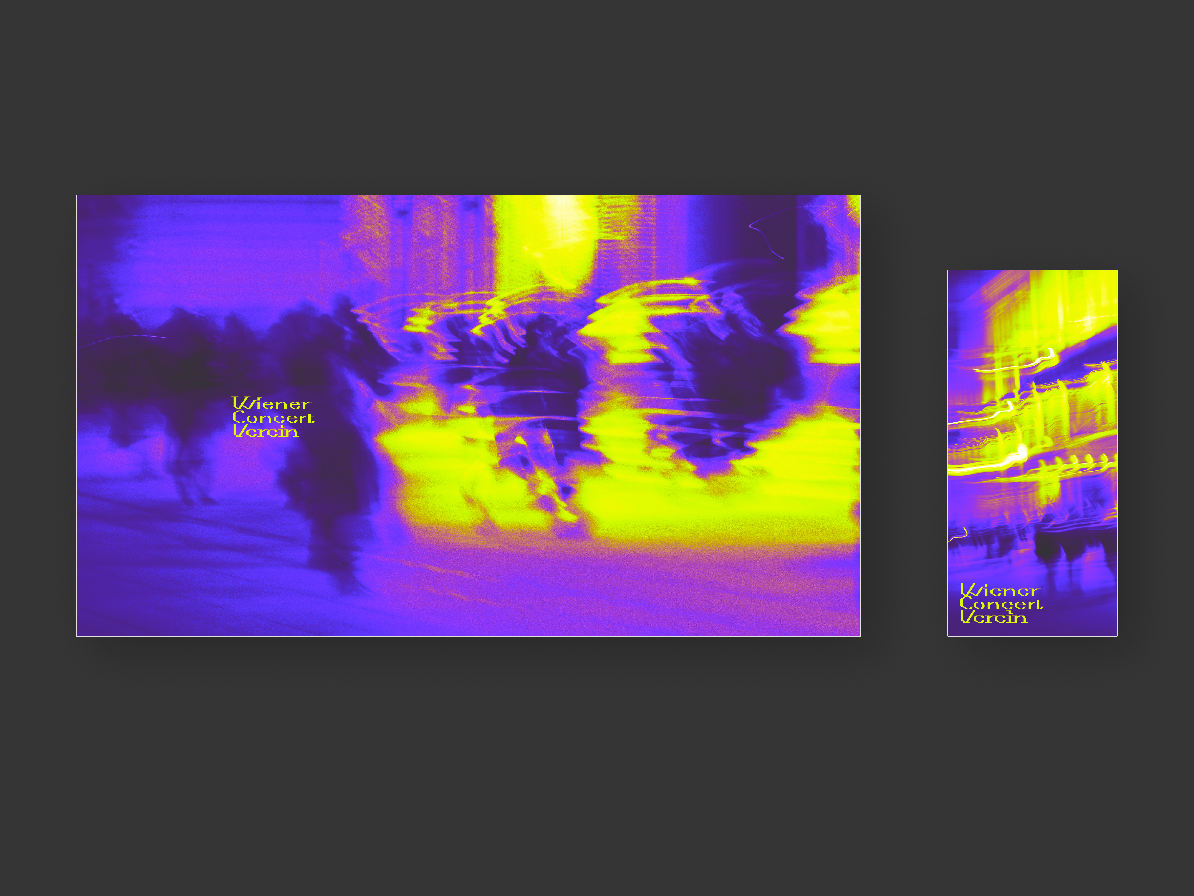
da capo
spec work of corporate identity and website redesign for the orchestra wiener concert verein, subject of my diploma project at the höhere graphische lehr- und versuchsanstalt (with patrick green and luca laimer)
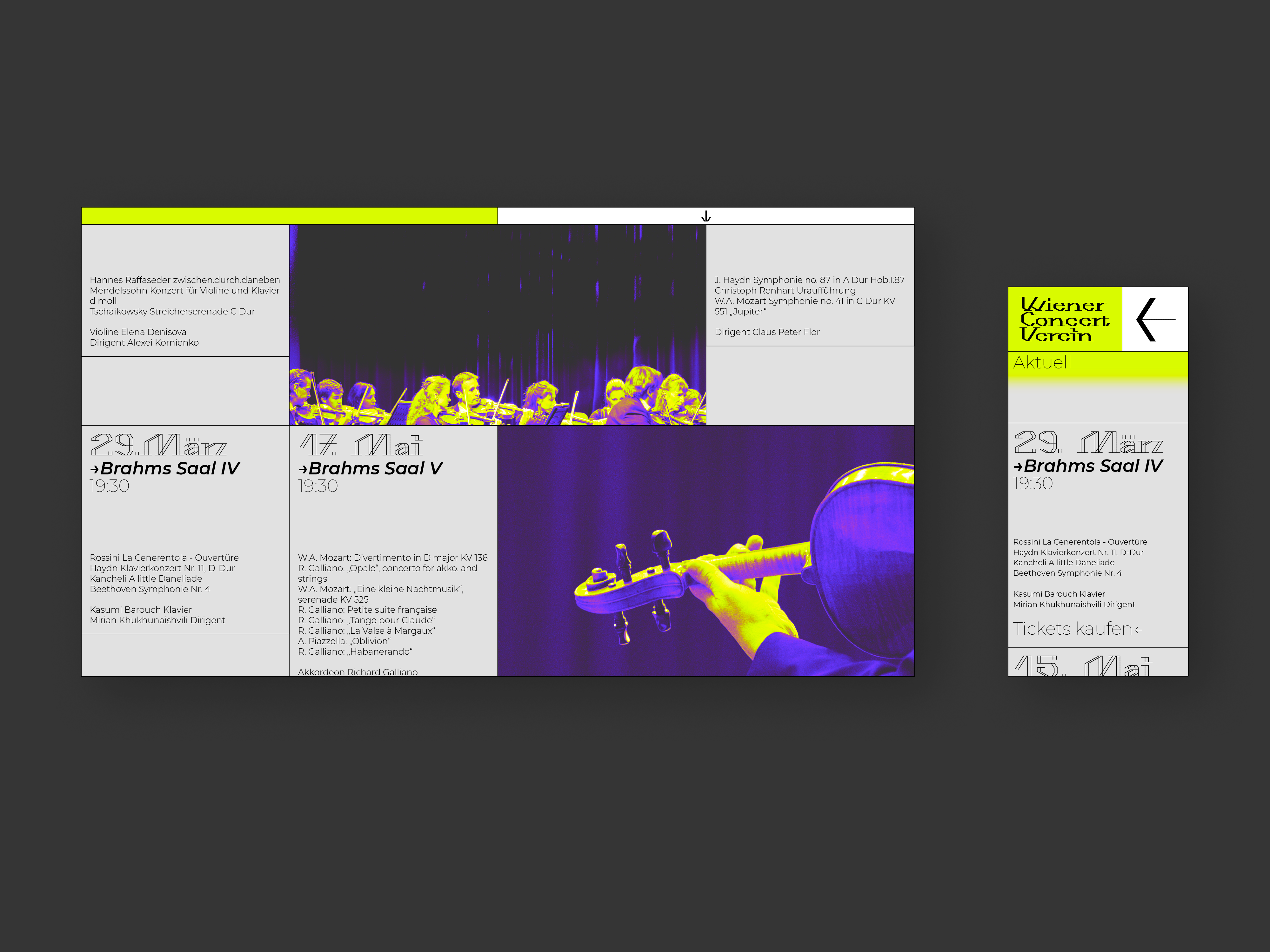
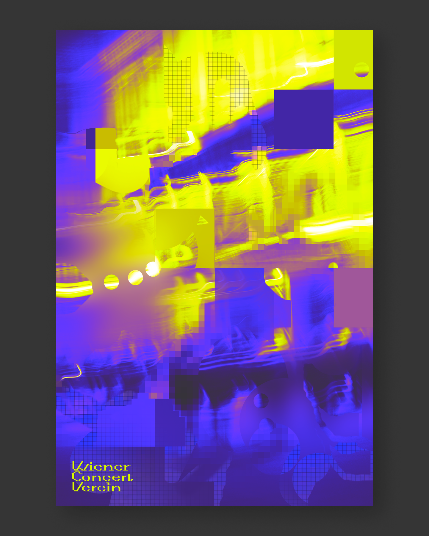
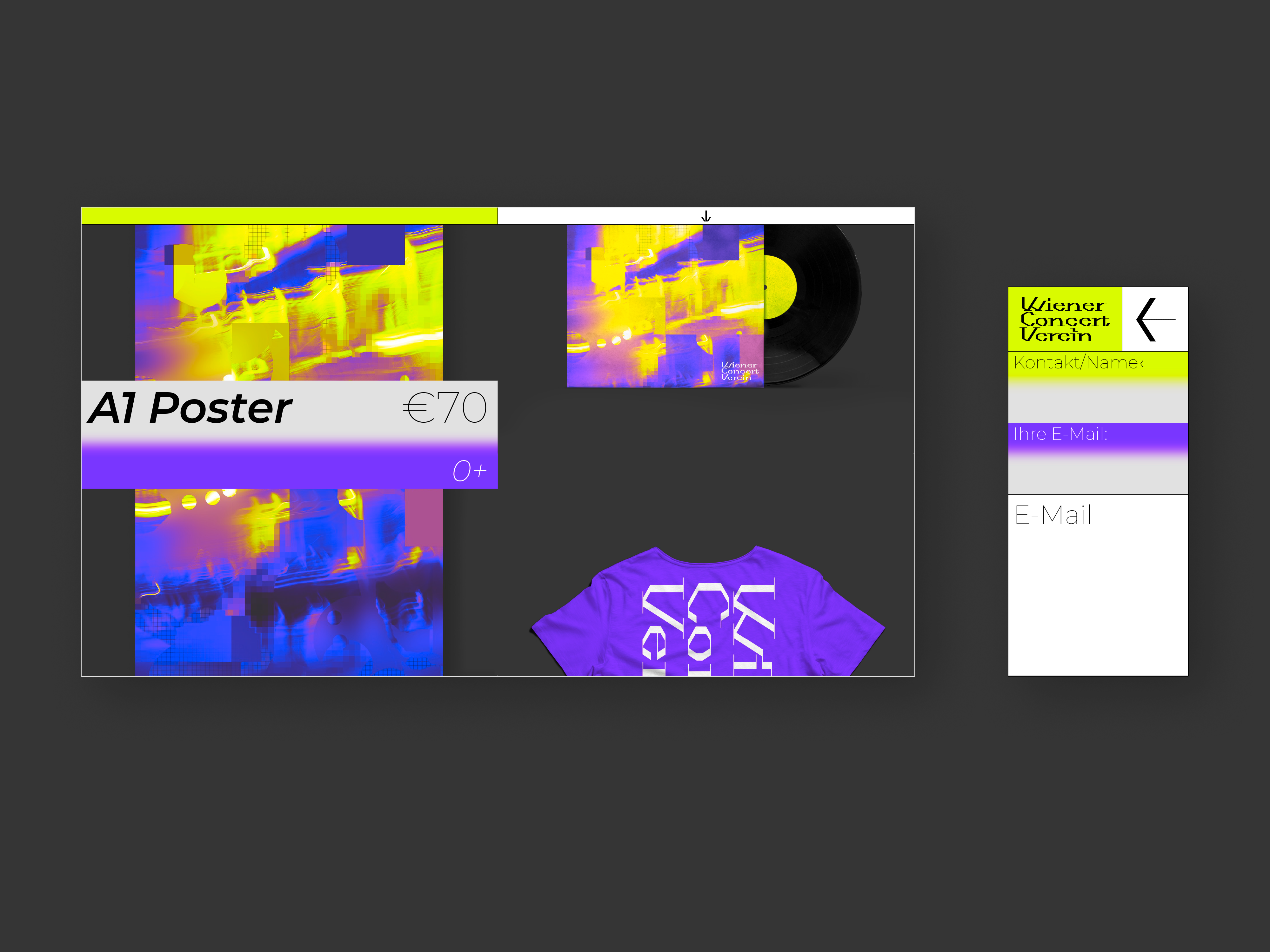
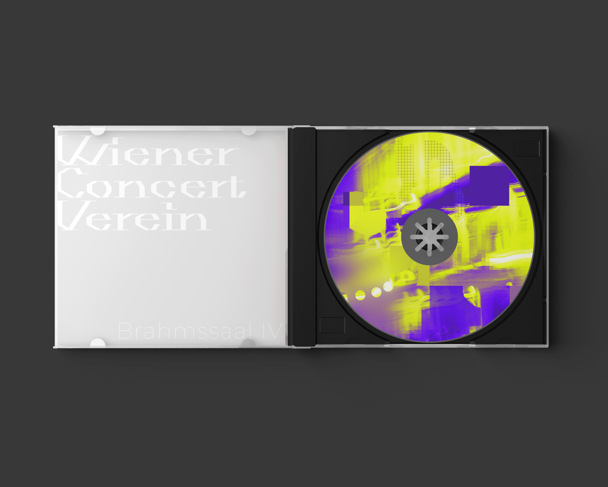
themes: fonts&lettering, identity, logo, motion design, music, poster, print, product design, ui/ux, web
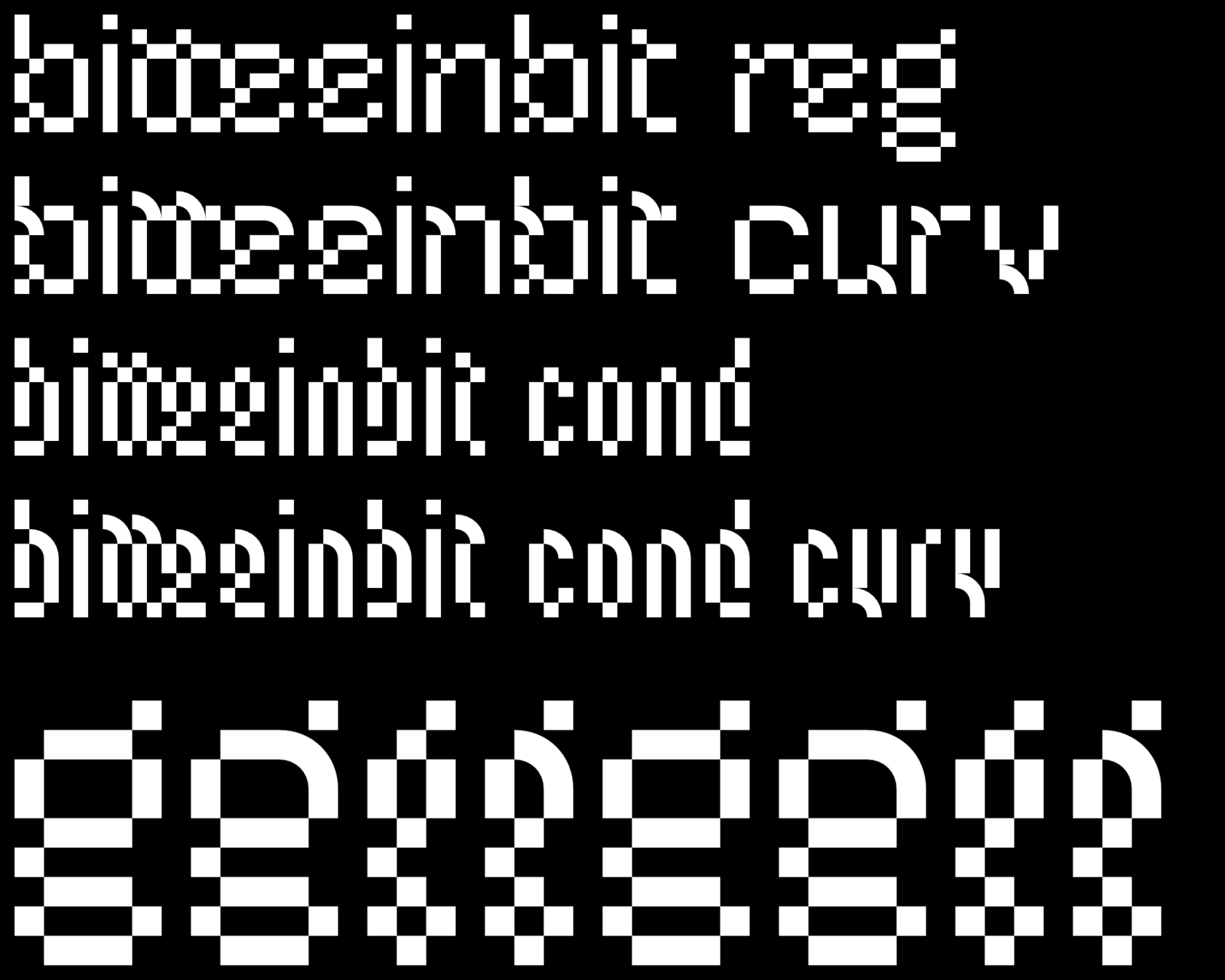
bitte ein bit
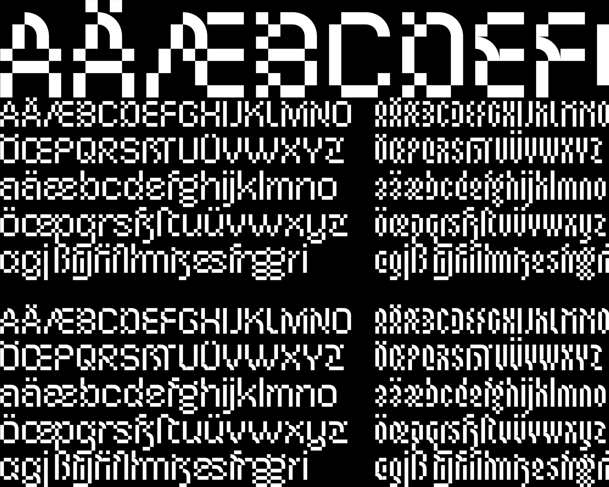
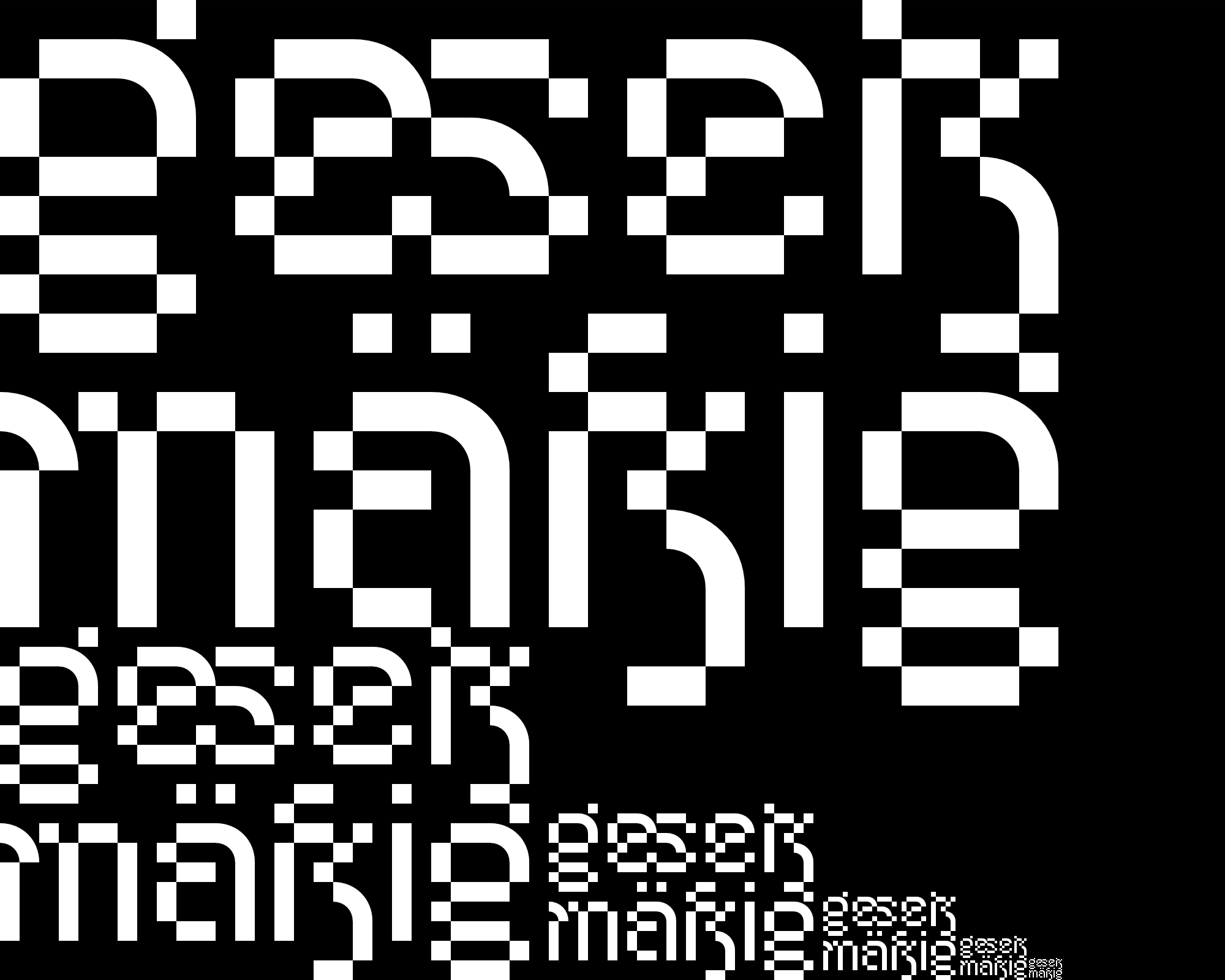
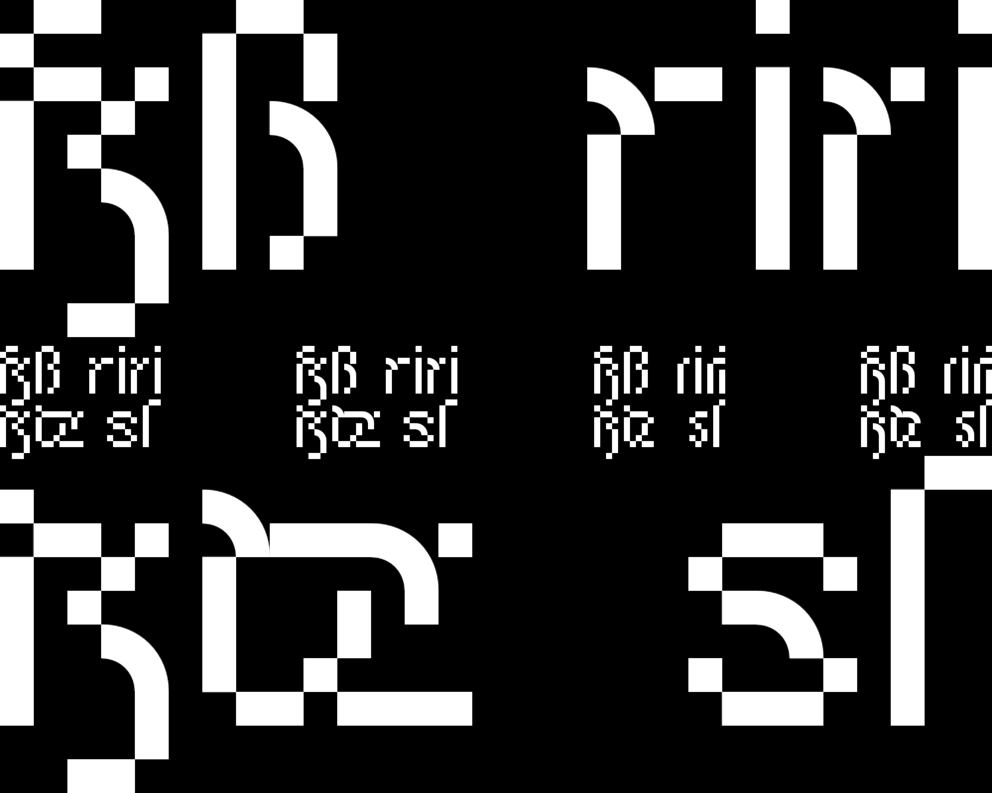
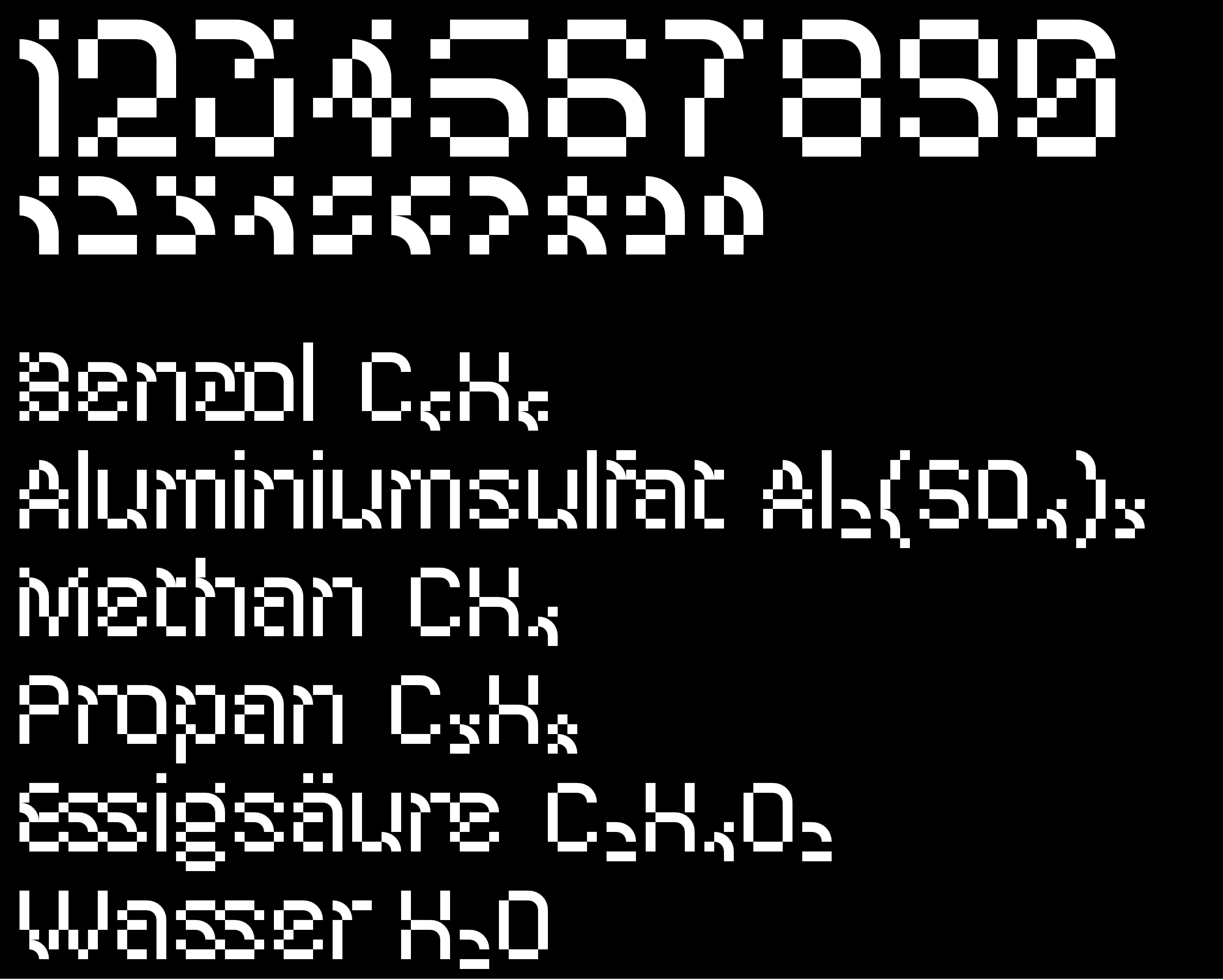
a futuristic pixel font with letters and ligatures (some based on blackletter), in 2 widths (reg and curv), each with the variant curv,
which also contains curve elements.
in order for these elements to have space, there are never
three pixels that border each other.
themes: fonts&lettering
